Typography
Typography CSCI 348 10/01/2002 References Web Style Guide : Basic Design Principles for Creating Web Sites by Patrick J. Lynch, Sarah Horton Multimedia: Making it Work by Tay Vaughan typoGraphic User Centered Web Site Design by Dan McCracken and Rosalee Wolfe Text in Multimedia

Typography
E N D
Presentation Transcript
Typography CSCI 348 10/01/2002
References • Web Style Guide : Basic Design Principles for Creating Web Sitesby Patrick J. Lynch, Sarah Horton • Multimedia: Making it Work by Tay Vaughan • typoGraphic • User Centered Web Site Design by Dan McCracken and Rosalee Wolfe
Text in Multimedia • Many different words express the same ideas • Aim for precise and clear usage • Difference between go back and previous • Test presentation with users • Can they navigate intuitively? • Is there too much instruction?
Text Background • Square Pixels vs Rectangular Pixels • WYSIWYG • Aspect Ratio • EGA 1.33:1 (taller than wide) • VGA and Mac 1:1 640x480
Safe dimensions for Web page graphics 13-15 inch screen (640x480 pixels) Browser safe area (600x350) 350 pixels 600 pixels • Use blue dimensions to fill the maximum safe area on most screens. • Use red dimensions for pages that will print well. 670 pixels 535 pixels
How Can You Make Your Web Page More Legible? • Use downstyle (capitalize only the first word, and any proper nouns) for your headlines and subheads.
Text on the Computer Screen • Hard to read. • Because of the low resolution of computer screens. • Because the lines of text in most web pages are much too long to be easily read.
Text on the Computer Screen • Magazine and book columns are narrow for physiologic reasons. • At normal reading distances the eye's span of movement is only about 8 cm (3 inches) wide. • Designers try to keep dense passages of text in columns no wider than reader's comfortable eye span.
Text on the Computer Screen • Most web pages are almost twice as wide as the viewer's eye span • Extra effort is required to scan through long lines of text • To encourage your web site users to read a document online, shorten the line length of text blocks to about half the normal width of the web page.
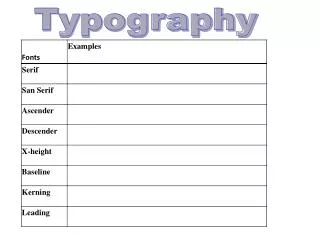
Fonts and Typefaces ascender TGzxhj midline serif baseline X-height descender
Fonts and Typefaces • Typeface family • Family of graphics characters, many sizes and styles • Typeface • Design for a set of fonts • Font • Characters of a single size and style belonging to a single typeface • Style • Boldface, italics, shadow, underline
Fonts and Typefaces • Body Type • Collection of text, from a few lines to hundreds in a relatively small size • Display Type • Larger than body type • Used for section headings, and page and section heading on the WWW
Cases • Uppercase and lowercase • handset history - 2 trays • Mixed upper and lowercase letters are easier to read than all capitals. • Watch out for case sensitive file names in UNIX.
Serif vs Sans Serif • Serif • Decorative accent at the end of a letter stroke • Preferred for print media • Sans serif • Easier to read on color monitors
Times New Roman vs Georgia • Web Typography • Web Typography
Arial vs Verdana • Web Typography • Web Typography
Proportionally Spaced vs Monospaced • Proportionally Spaced • Each character received an amount of horozontal space proportional to its width. • Monospaced • All characters receive the same horozontal space
Where Monospaced Type Works function pad(workString, numChars, padChar) { trace ("workstrings " + workstring + " length = " + workString.length); while (workString.length < numChars) workString = padChar + workString; return workString; } function pad(workString, numChars, padChar) { trace ("workstrings " + workstring + " length = " + workString.length); while (workString.length < numChars) workString = padChar + workString; return workString; }
Text - the Proper Balance • Too much • overcrowded screen • Too little • too many page turns and/or user interaction
Text Guidelines • For small type use the most readable font available (sans serif) • Use as few different typefaces as possible but vary the weight and size and style • Make sure the fonts are well spaced • Leading • Kerning • The size of the font should vary with the importance of the message
Text Guidelines • What do your users say? • Centered text blocks are difficult to read. Keep them small. • Try bending, stretching and otherwise manipulating text. Then evaluate whether it works for your piece. • Is your text hard to read because of too little contrast with the background? Try drop shadows.
Problems with Text • Text displayed on a monitor • harder to read than print • slower to read • print generally has portrait orientation • screen has landscape orientation
What If Your Text Is Taller Than Wide? • Modify it • Put it in a scrolling window • Break it into screen sized chunks • Buy an expensive portrait monitor
We’ve got it easy! • 26 Latin or Roman Characters • 10 Arabic Numbers • 3000+ kanas for Japanese • kanji (each of the 3000 has two renderings: Japanese and Chinese) • romaji
Localization • Process of reworking computer based material to another language • Dates • Language • Special characters • Unicode • 65,000 characters • Supports most written languages for Americas, Europe, Asia, Africa and middle east
What We Don’t Know When Designing for the WWW or User Defined Window • Resolution of the monitor • Size of the browser window • Is it 4x7 inches or does it fill the entire 21 in monitor? • How the user has set type size • Younger users may set type size small to reduce scrolling. • Older users may set type size large to see it.
What We Don’t Know When Designing for the WWW or User Defined Window • Settings and quality of the monitor (brightness, contrast, color balance…) • Ambient lighting in the room • Background and font colors may looked washed out • What fonts are available to the user • Differ on Macs and PCs
Suggestions for Body Type • For body text, use Georgia or Verdana • Trebuchet is also screen friendly (sans serif) • Use 12 pt type • 10 point is ok if you know your users have Georgia or Verdana. But if they don’t and it defaults to 10 pt Times Roman – that is too small.
Suggestions for Body Type • Use Roman, not Italic or Bold for body text style. • Use upper case only for first words of sentences, proper names, etc • ALL CAPS IS HARD TO READ • Use a maximum line length of 5 inches • Shorter is better
Suggestions for Body Type • Use two point of leading between lines unless its already there • Use left alignment • Don’t use underlining for emphasis (Users might assume the underlined word is a link.)
Suggestions for Display Type • Use any size that fits • Use any typeface that is legible • Use the line height attribute for control of line spacing to get the effect you want (touching or spread widely) • Use letter spacing and word spacing to get the effect you want.
Suggestions for Display Type • Use kerning to make display type look right • Web • Don’t use animated text • Users hate it. Some develop animation blindness where they don’t see the moving text assuming it is an advertisement.
Back up your work • Disks and computers will fail. • Don’t trust them. • Version control.
Homework • Due Tuesday, 10/15/2002 • Reading from an external text file • Think of a subject you are interested. For example: cars, cooking, music. • Create two text files (subjectn.txt) and cut and paste descriptions of two examples of your subject. For cars, perhaps a VW Beetle and an Audi TT. For cooking, a recipe for cookies and a recipe for a cake. For music, reviews of two different cds. • Download a picture to go with each example, save as subjectn.jpg or subjectn.gif.

