Typography
Typography Johannes Gutenberg 1400-1460

Typography
E N D
Presentation Transcript
Johannes Gutenberg 1400-1460 • a Germangoldsmith and printer, who is credited with inventingmovable typeprinting in Europe and mechanical printing globally. His major work, the Gutenberg Bible, also known as the 42-line bible, has been acclaimed for its high aesthetic and technical quality.
Movable metal type, and composing stick, descended from Gutenberg's invention
Proportions of the letterforms • stroke to height ratio • contrast in stroke weight • expanded and condensed style
Optical relationship • pointed & curved (A & O) • extend beyond baseline and capline AEOV • 2-storied: center above, top narrower: E • horizontal strokes thinner H
tight junctions opened to prevent thickening at the joint M Q smaller than H • curved strokes are usually thinner at their Midsection than the vertical strokes, to achieve an even appearance.
Font • Set of characters of the same size and style containing all the letters, numbers and marks needed for typesetting: • UPPERCASE/CAPITALS • Lowercase • Small caps • Lining Figures: 1234567890 (numerals identical in size to the capitals and aligned on the baseline) • Old-style Figures 1234567890 (numerals that exhibit a variation in size • Ligatures ff fi fl • Punctuation • Symbols
Font: All the letters, numbers and punctuation of a single size of a single typeface (12-point Helvetica) • Typeface: The distinctive, design of an alphabet (and accompanying numbers and punctuation). All point sizes of that typeface.
Setting type • All caps • All lowercase • Cap first of every word/important word/first word only > Emotional IMPACT
Tracking = letterspacing • When too generous, legibility is reduced • Avoid letterspacing l o w e r c a s e • Avoid too much letterspacing with c o n d e n s e d l e t t e r s • Punctuation needs reduced spacing
Units of Measurement • 1 Inch = 72 pt (points) = 6 p (picas) • 1 pica=12 points • Points are the smallest unit of measurement. Type and leading are measured in points with 72 points to the inch. • Use picas for measuring column width and depth, margins, and other larger distances.
Type sizes • 5-72 • Text >14 (usually 9-11)(12> = eesh) • Display 14> • X-height changes Size Size perception • Bigger is not always better • use position, color, surrounding white space
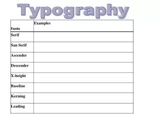
Visual features of typefaces • Serifs • Weight • Width (expanded, condensed) • Posture (Italic, oblique, script) • Thick/thin contrast • x-height x-height • Ascenders & descenders length
How to choose a typeface • Function • Audience • Mood • Roman: dignity, austerity, grace • Modern: forceful, assertive, presence and persistence • Sans serif: modern, business-like, efficient, no-nonsense • Scripts: imitate handwriting

