Typography
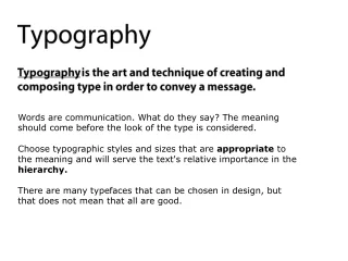
Typography What font am I? Typography Intro. Type is emotional on a subliminal level because of the connotations it conveys.

Typography
E N D
Presentation Transcript
Typography What font am I?
Typography Intro. • Type is emotional on a subliminal level because of the connotations it conveys. • Example: Helvetica is the typeface used on IRS forms. Now, how do you think you're going to feel when you read something set in Helvetica? You may not consciously realize that it's the same typeface the IRS uses, you may not even know it's Helvetica. What matters is that you've seen that typeface before, and not under the most pleasant circumstances. • In Switzerland, where virtually everything is set in Helvetica (and tax forms end up looking like catalogs for both lingerie and heavy equipment--the kind you're not supposed to drive, or wear, after taking most over-the-counter cold remedies), then it won't have the same connotations that it has in the U.S.A. What font am I?
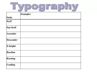
x Height • When two typefaces are set in the same point size, one often looks bigger than the other. Bigger x-height, introduced in the twentieth century, make a typeface appear larger. Differences in line weight and character width also affect the letters' apparent scale.
Font Size • (So, what’s a 12 point font mean?) • The point system, used to measure the height of a letter as well as the space between lines ( leading ), is the standard measurement for type. One point equals 1/72 inch or .35 millimeters. Twelve points equal one pica, the unit commonly used to measure column widths. • Typography also can be measured in inches, millimeters, or pixels. (A point is roughly equivalent to a pixel.) Most software applications let the designer choose a preferred unit of measure; picas and points are a standard default.
Font Families and Classification • What is a font family? • A complete family is one that has a bold, italic, regular, small caps, semi-bold, semi-bold italic, and expert numerals (123 vs. 123) • Classification: • Humanist (Old Style) = roman typeface • Transitional = sharper serifs (A) • Modern = thin straight lines (A) • Egyptian(slabserif) = bold and decorative • Humanist sans serif = sans serifs 1st appeared1928 • Transitional sans serif = uniform upright • Geometric serif = build around geometric forms (ie. The circle)
Leading, Kerning, & Tracking • L eading • The term kerning refers to adjusting the space between two letters. • K e r n i n g • Adjusting the spacing across a word, line, or column of text is called tracking, also known as letterspacing. • Tracking • Vertical spacing of lines
10 Rules of Thumb • 1. Body text should be between 10 and 12 point, with 11 point best for printing to 300 dot-per-inch printers. Use the same typeface, typesize, and leading for all your body copy. • 2. Use enough leading (or line-spacing). Always add at least 1 or 2 points to the type size. Example: If you're using 10 point type, use 12 point leading. Automatic line height will do this for you--never use less than this or your text will be cramped and hard to read. • 3. Don't make your lines too short or too long. Optimum size: Over 30 characters and under 70 characters. • 4. Make paragraph beginnings clear. Use either an indent or block style for paragraphs. Don't use both. Don't use neither, either. • 5. Use only one space after a period, not two. What font am I?
10 Rules of Thumb cont. • 6. Don't justify text unless you have to. If you justify text you must use hyphenation. • 7. Don't underline anything, especially not headlines or subheads since lines separate them from the text with which they belong. • 8. Use italics instead of underlines. • 9. Don't set long blocks of text in italics, bold, or all caps because they're harder to read. • 10. Leave more space above headlines and subheads than below them, and avoid setting them in all caps. Use subheads liberally to help readers find what they're looking for. What font am I?
One Last Rule of Thumb - for fun! • Sans serif typefaces are often less legible than serif typefaces. • Body text (text that is meant to be read continuously) serif typefaces are naturally better suited than sans serif typefaces. • Serifs are the small finishing strokes on the arms and stems of letters, and serve to form a link between letters. This link is important because when we read, our mind (in most western cultures anyway) is trained to recognize the shapes of words rather than reading letter by letter. • All of the serif text faces are appropriate for continuous reading. Many sans serif typefaces are as well. • Consider sans serif fonts such as Gill Sans, Goudy Sans, and Optima for setting text meant for continuous reading. • This isn’t to say that you shouldn’t use other sans serif fonts for body text, but generally speaking, avoid setting long passages of text in geometric sans serif typefaces such as Futura, for example, which is better suited for headlines, captions, and other short chunks. • When designing forms such as time sheets, invoices, expense reports and order forms, consider using sans serif typefaces rather than serifs. • Sans serifs naturally look better when aligned to vertical and horizontal lines, which are obviously very common in forms. For best results, use loosely spaced All Caps set at a small size (8 points and below). Typefaces such as Futura and Franklin Gothic are particularly well-suited to designing forms. What font am I?
Try it out! Interpret/ create the meaning of a word by adjusting the spacing, scale, and position of letters on a page. (Make 5).

