SmartVision - A New Turning Point for Responsive Web Design
60 likes | 230 Vues
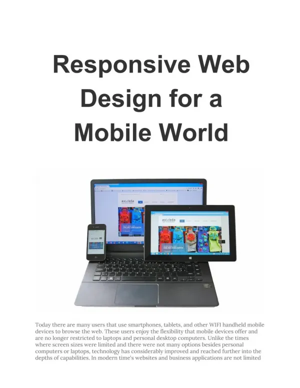
Fast image delivery and responsive web design has been an issue for most websites. At Instart Logic, the back-end infrastructure like Image Resizing and unique client-cloud architecture enables SmartVision. These optimizes the whole delivery pipeline around content being delivered, reduces load time and enhance user experience. Learn more about SmartVision technology at: http://www.instartlogic.com/technology/smartvision/

SmartVision - A New Turning Point for Responsive Web Design
E N D
Presentation Transcript
A NEW TURNING POINT FOR RESPONSIVE WEB DESIGN BY HARIHARAN KOLAM
The buzz around Response Web Design (RWD) has been quite intense over the past few months. The good news is that its latest incarnation is looking a lot less chaotic and a lot more structured, now that the major browser community (Google Chrome/Mozilla Firefox) have agreed to adopt the HTML picture element after a keenly fought battle. This news created quite a stir last week, and rightly so.
RWD, at the 10,000-foot level, is a design strategy whereby the web application is flexible enough to adjust itself depending on the target device that it is being displayed on. One of the key aspects of RWD is to formulate a solution to make the images adapt to varying device characteristics, popularly known as Responsive Images. With the picture element and, more recently, the srcset attribute finding major adoption, the implementation of Responsive Images now seems to be graduating from the chaotic "tool land" to the more standardized and structured native "browser land. The signal-to-noise ratio in the Responsive Images solution strategy should go up significantly with this unequivocal support. Images have always been a critical component of the web over its more than two-decade history. But images are not naturally "nimble." Most aspects of images, like their size, resolution, crop and format, as well as the associated ecosystem and delivery infrastructure, have been painfully static. This is in complete contrast to textual content which naturally adapts to the target container. Any truly functional RWD solution has to address this fundamental limitation.
A complete Responsive Images solution at its core involves building a complex decision tree around each image prior to browser download/render activity. Some aspects of this decision tree are captured in the figure above. Each of the filters described above does one of two things: • they reduce the image payload, thereby improving network performance and hence improving the user experience, or • they ensure that the right image variant is displayed, uncropped and unstretched, resulting in significant improvements in the user experience • It is important to note that the impact of each of the filters described in the figure above is strictly complementary. They broadly fall into two broad categories: • filters applied to determine the right image to render — a critical aspect of responsive image solution implementation was so far dominated by a bunch of JavaScript/CSS tools. Standardization and browser adoption of several of the key interfaces (like the ones described above) should significantly ease the implementation. • filters applied by the delivery pipeline while downloading that image — this is an important aspect of effectively using the available network pipe to expedite the delivery time.
The Responsive Images solution is an essential ingredient in building a complete RWD — it’s also the most painful part to implement. Native browser support significantly eases part of the pain — implementing the set of filters to determine the right image to download and render on the browser becomes a lot easier. Managing, resizing and optimizing the images on the back end based on browser and device capabilities is still highly complex. Instart Logic's back-end infrastructure and features likeImage Resizingas a service have been designed to address exactly this. Our configuration system tightly integrates with these features to provide an expressive, programmatic set of interfaces to considerably ease the entire workflow of image content management and transformation. Furthermore, the delivery piece — which is again a critical piece in the whole RWD workflow — is much smarter with our service. Our unique client-cloud architecture enables us to build features likeSmartVisionfor the streaming of images, which can substantially impact the user experience by optimizing the whole delivery pipeline around the content being delivered. The impact on user experience due to delivery traditionally has been quite limited, as solutions such as content delivery networks perform no better than the available downstream network bandwidth on the end user's device. Features such as Image Streaming with SmartVisionexploit the notion of relative prioritization of bytes within image content to download much less data and the most important data — up front, thus enhancing the user experience.