
Responsive Web Design for a Mobile World
Ksoft Technologies is one of the best leading website development company based out of India. We have highly qualified and trained engineers with post qualification hands on development expertise in WordPress, PHP, code ignitor, woo-commerce & Magento.<br>www.ksofttechnologies.com

Responsive Web Design for a Mobile World
E N D
Presentation Transcript
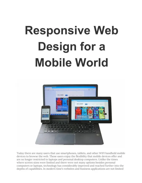
Responsive Web Design for a Mobile World Today there are many users that use smartphones, tablets, and other WIFI handheld mobile devices to browse the web. These users enjoy the flexibility that mobile devices offer and are no longer restricted to laptops and personal desktop computers. Unlike the times where screen sizes were limited and there were not many options besides personal computers or laptops, technology has considerably improved and reached further into the depths of capabilities. In modern time's websites and business applications are not limited
to being viewed or used on laptops and desktop computers but are being engaged by users to being viewed or used on laptops and desktop computers but are being engaged by users using other devices including netbooks, palmtops, smartphones, tablets, and other handheld mobile WIFI devices. Each mobile device renders the user interface and layout of websites and internet based applications differently based on the screen resolution, platforms, and technology differences for every model and make. This has made designing websites and applications more difficult because of the considerations to create responsive user interfaces to respond to the device and display the web interface in an optimized state for the mobile devices screen resolution. Thanks to the innovative concept of responsive web design (RWD) websites and web apps can be developed to run gracefully in the user's device of choice. The user of a website or web application can now engage and interact with the user interface as if it was built for their device and its screen resolution. This ultimately leads to a more enjoyable user experience. Unlike the time where websites were scaled to pixels, responsive web design uses percentage and EM. This means the website will automatically align to the user's screen, popularly dubbed user interface design. There is no need for users to keep scrolling to view a webpage when using smartphones, tablets, or their mobile device of choice. When smartphones were launched business owners resorted to coming up with unique mobile websites and mobile apps separately while still developing and maintaining a version tailored for desktop and notebook use. This means the websites can be viewed from mobile devices; however, with the wide array of options with reference to screen resolutions, platforms, and devices it was no longer economically feasible to just restrict with two versions, nor from a resource and cost perspective was it sensible to create infinite versions of websites and web apps for different platforms because of resource consumption and maintenance costs. That is why responsive web design came into play. Now it is possible to create a fluid design of a website that is compatible and displays gracefully in an optimized state across all platforms to create a tailored, enjoyable, and memorable user experience. Responsive web design is an advanced web design strategy where a website is designed in a way to accommodate Cascading Style Sheets 3 with media queries. Media queries can be used to tailor the website or applications dimensions, fonts, and appearance to the mobile device. The user interface and layout just syncs so the website is automatically resized and optimized for better viewing across different devices. The three most important technical aspects of responsive web design are fluid grids, media queries, and flexible images. Not just the content but the images used and even the user interface and layout should align according to the screen resolution. Since it is a challenge to set fixed and specific dimensions with the wide assortment of different screen size preferences, the availability of media queries that detect the device and its screen resolution improve user experience. Ever since the evolution of GUI (graphical user interface) that stemmed from Xerox parc the recognition and significance of the user interface has grown and is the key to unlocking a memorable experience. The user experience is all about how a user feels about a product or service they use. All user centered designs strive to improve user experience and create products, services, designs, graphics, etc., around the needs of the mobile website and mobile app users. That is one reason why technology is constantly improving and revolving around making things better for users. According to a recent study over 50% of browsing activity is done with smartphones and tablet users have considerably increased. The mobile web is expanding
and businesses should consider how to be economical in their approach to include and businesses should consider how to be economical in their approach to include responsiveness into their creative web design and computer programming practices to develop websites and web applications that deliver an enjoyable user experience. Only websites that load well in these platforms are likely to stand out, creative competitive edge, and encourage continued use. Developing websites and web applications through creating stunning user interfaces and layouts by applying responsive web design principles is a solid design strategy to enhance user's online experience and ensure users enjoy a memorable experience that will be the talk of the web. Visit Empellex to get more responsive web design tips and use their services to help your business achieve online success by providing a responsive, fluid, and engaging user experience to your customers. www.ksofttechnologies.com Article Source: http://EzineArticles.com/expert/Don_Jenkinson/1226667


