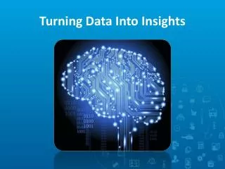
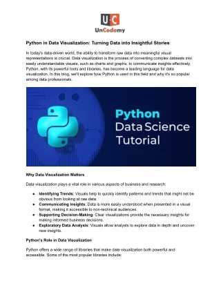
Python in Data Visualization: Turning Data into Insightful Stories
In today's data-driven world, the ability to transform raw data into meaningful visual representations is crucial. Data visualization is the process of converting complex datasets into easily understandable visuals, such as charts and graphs, to communicate insights effectively. Python, with its powerful tools and libraries, has become a leading language for data visualization. In this blog, we'll explore how Python is used in this field and why it's so popular among data professionals.

Python in Data Visualization: Turning Data into Insightful Stories
E N D
Presentation Transcript
Python in Data Visualization: Turning Data into Insightful Stories In today's data-driven world, the ability to transform raw data into meaningful visual representations is crucial. Data visualization is the process of converting complex datasets into easily understandable visuals, such as charts and graphs, to communicate insights effectively. Python, with its powerful tools and libraries, has become a leading language for data visualization. In this blog, we'll explore how Python is used in this field and why it's so popular among data professionals. Why Data Visualization Matters Data visualization plays a vital role in various aspects of business and research: ● Identifying Trends: Visuals help to quickly identify patterns and trends that might not be obvious from looking at raw data. Communicating Insights: Data is more easily understood when presented in a visual format, making it accessible to non-technical audiences. Supporting Decision-Making: Clear visualizations provide the necessary insights for making informed business decisions. Exploratory Data Analysis: Visuals allow analysts to explore data in depth and uncover new insights. ● ● ● Python's Role in Data Visualization Python offers a wide range of libraries that make data visualization both powerful and accessible. Some of the most popular libraries include:
1. Matplotlib: A foundational library that allows users to create a variety of static, animated, and interactive plots. It’s flexible and highly customizable, making it a favorite among those who need detailed control over their visualizations. 2. Seaborn: Built on top of Matplotlib, Seaborn provides a more intuitive interface and creates attractive statistical graphics. It’s especially useful for visualizing complex datasets with its easy-to-use functions. 3. Plotly: This library is known for its ability to create interactive graphs and dashboards, which can be shared online. It supports a wide range of chart types and is ideal for those who need to create dynamic, web-based visualizations. 4. Bokeh: Bokeh is another library that excels in creating interactive visualizations. It allows users to generate elegant and informative graphics that can be embedded into web applications. 5. Pandas Visualization: Pandas, a popular data manipulation library, also includes built-in capabilities for creating basic visualizations directly from data tables, making it a convenient choice for quick, exploratory data analysis. Key Concepts in Data Visualization To effectively create data visualizations with Python, it's important to understand several key concepts: ● Choosing the Right Chart: Different types of data are best represented by different types of charts. For example, bar charts are great for comparing categories, while line graphs are better for showing trends over time. Color Schemes: The choice of colors in a visualization can greatly impact its readability and effectiveness. Python libraries offer various color palettes that enhance the visual appeal of charts. Interactivity: Adding interactivity to visualizations allows users to explore the data more deeply, which can be particularly useful for complex datasets. ● ● Practical Applications of Data Visualization Python-powered data visualization is widely used across many industries: ● Business Analytics: Companies use data visualization to track performance metrics, forecast trends, and identify business opportunities. Healthcare: Data visualization is used to analyze patient outcomes, monitor the spread of diseases, and improve healthcare services. Finance: Financial analysts use visualizations to track stock prices, analyze market trends, and monitor portfolio performance. Marketing: Marketers rely on data visualization to analyze customer behavior, measure campaign effectiveness, and optimize strategies. ● ● ●
● Education: Teachers and researchers use visualizations to explain complex concepts, making learning more interactive and engaging. Conclusion Data visualization is an essential tool for making data-driven decisions, and Python provides a rich ecosystem of libraries to create anything from simple charts to complex, interactive dashboards. Whether you’re in business, healthcare, finance, marketing, or education, Python’s data visualization capabilities can help you turn data into actionable insights. Python Course in Greater Noida, Delhi, Bangalore, Pune, Mumbai offers additional opportunities to enhance your skills in this area, making it a great choice for local learners.