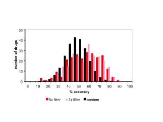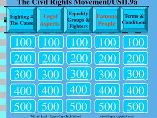
Statistical Analysis Definitions and Examples
Understand mean, median, mode, range, and frequency tables with clear examples. Learn how to interpret graphs like bar, circle, and line graphs to represent data effectively.

Statistical Analysis Definitions and Examples
E N D
Presentation Transcript
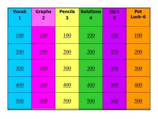
100 100 100 100 100 100 200 200 200 200 200 200 300 300 300 300 300 300 400 400 400 400 400 400 500 500 500 500 500 500
Same as the “average” in statistics - It is found by adding the data and dividing by the number of data items.(400)
Difference between the greatest and the least values in a set of numerical data (500)
Most appropriate graph to compare parts to a whole. Each wedge represents a part of the whole (300)
85 In this set of data -- 85,80,60,85,70(100)
16 In this set of data -- 10,6,14,20,22(200)
12 In this set of data-- 13,6,10,12,13(300)
81 In this set of data-- 70,80,82,85 (400)
75 In this set of data-- 70,60,80,82(500)
30 In this set of data-- 80,86,70,100(100)
50 In this set of data-- 50,42,50,32,50,60(200)
20 In this set of data-- 25,25,30,10,10 (300)
25 In this set of data-- 40,10,30,20(400 )
80 In this set of data-- 20,40,60,80,100,100 (500)