Download
1 / 15
150 likes | 170 Vues
This text discusses the importance of graphological features in understanding and interpreting meaning. It explores layout, typeface, graphemes, and graphics and their impact on the overall presentation of a text. Challenge yourself to analyze texts for their graphological features and to develop an understanding of how they can change meaning.

E N D
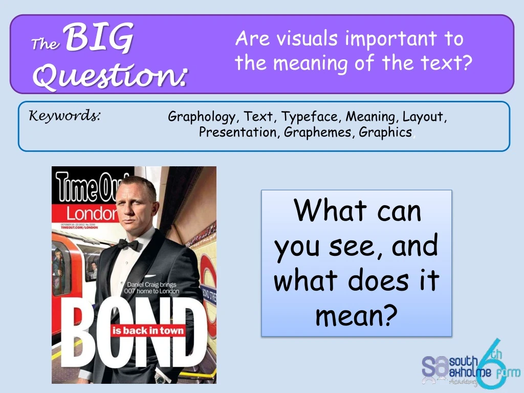
The BIG Question: Are visuals important to the meaning of the text? Keywords: Graphology, Text, Typeface, Meaning, Layout, Presentation, Graphemes, Graphics, What can you see, and what does it mean?
Challenge Yourself: To develop an understanding of how graphologicalfeatures can impact and change meaning. To analyse texts for their graphological features. Minimum Expectation: To understand the importance of graphological features
How much do you know about...? GRAPHOLOGY
Layout and Overall Presentation When you are examining graphological features, you should initially consider the general layout and overall presentation. Some questions you could ask are: • Is there a lot of dense text, or is the text broken up- if so how? Are parts of the text separated from the rest by the use of such devices as boxed sections and speech bubbles? Is there a reason for this? • Which part of the text immediately catches the eye? Does the design of the text encourage you to read particular parts of it first? • Is any use made of juxtaposition? This means placing words, ideas and pieces of information next to each other. Newspaper editors, for example, take care over the arrangement of stories on a page. Stories that link or contrast with each other might be juxtaposed. • Does the text adopt the layout conventions of another genre? An advertisement, for example, could take the form of a letter, a recipe or a comic strip. Graphology focuses on what texts look like, and how the layout can help get the meaning of the text across. Although your focus should be the primarily on the language of texts, graphological features should not be ignored.
Layout and Overall Presentation • Leading • * This is the amount of vertical space between lines of type. • * It can affect whether the text is dense and difficult to read, or very spaced out. • Ascenders and Descenders- • * These are the 'stems' of letters. • * The bits that extend upwards are the ascenders, on letters like 'd', 'h', and 'l'. • * The bits that extend downwards are descenders, on letters like 'j', 'q', and 'y'. • Why might a writer choose to use a font/typeface with long ascenders and descenders? e.g this is lovely Serif * These are small strokes on the ends of letters. * Typefaces that don't include them are called sans serif (without serifs).
Font/Typeface Look at each font/typeface, identify the connotations of each one and think about why the writer might choose to use it: Typeface is used to create different effects In any text, the typeface has been chosen for a particular reason, so you need to consider the effect it has. 1) The choice of typeface tells you about the tone of the text. Typefaces can seem traditional, informal, youthful, elegant. 2) Bold, italics and underlining can place emphasis on certain parts of the text to show that it's important. 3) The use of upper and lower case letters can also be significant. Words can be capitalised to draw attention to them. Sometimes the typeface is all lower case, which can appear stylish, modern or experimental.
Think, Pair, Share Typeface • Several different techniques are associated with the typeface used for the written text: • The size of the words and individual letters can be important - most obviously larger lettering used to give prominence to certain words. • Use of upper and lower case letters. Upper case letters may be used for individual words to add emphasis or to reflect meaning in some way: • Sometimes in advertisements only lower case letters are used, often in an attempt to appear stylish and unconventional. • Different typefaces have different connotations. Look at the mastheads of 'The Daily Telegraph' and the 'Daily Mail' and compare them to those of 'The Sun' and 'The Daily Mirror'.
Graphemes • Graphemes are the smallest units that can create contrasts in meaning, e.g like letters of the alphabet, and symbols such as ( ) ^ • For linguistic analysis they're usually written in brackets e.g. <m> <?> • They can appear in loads of different forms, depending on things like typeface and handwritingn style. • A different form of a grapheme is called a glyph, when different glyphs can be used for the same grapheme they're called allographs. • Most graphemes don't mean anythiong on their own - their role is to combine and contrast. • However, some graphemes can be interpreted in more than one way. The grapheme <x> has many uses, how many can you think of?
Graphics • Graphics can be cartoons, illustrations, photographs and diagrams. They can help to break up dense text, making it more accessible and less formal. • They are usually visual representations and help to: • w illustrate and develop a text's meaning • set the tone of a text • help learning • make meanings more clear.
Think, Pair, Share Compare these newspaper covers, what does the graphology tell us?
Think, Pair, Share Graphologically speaking, the cover of this album, ‘Definitely Maybe’ by Oasis, employs several interesting features. The band’s name is set in a black rectangular frame in stylized lower case white writing, making it stand out clearly and making a bold visual impact. The logo as a whole is reminiscent of the pop art style of the nineteen sixties which may also indicate a certain sixties bias to the music contained within. The album title, ‘Definitely Maybe’ is rendered in joined up handwriting, adding a personal touch, and also perhaps indicating the off the cuff spirit of the music, as well as suiting the title, an obvious oxymoron. The band is photographed in a posed yet natural manner, with each member seeming unaware of the camera, insouciant expressions upon their faces. This lends an intentional rock star devil may care attitude to the proceedings. The props such as an ashtray, glass of red wine and guitars are all obvious references to a rock and roll lifestyle. Meanwhile, the framed photograph of Burt Bacharach, a famous songwriter, might indicate that they too are skilled songwriters, whilst the photograph of the Manchester City player gives a clue as to the band’s home town. Although the colour palette of the album cover is relatively small, the neutral greens, blues and beiges give a unified feel and a sense of the everyday. The album cover as a whole is extremely successful in giving an immediate idea of what kind of band made the album.
Artwork: • Illustrations • Images • Charts • Diagrams • Logos • Signs • Photographs • Letters / Print: • Upper / lower case • Italic / bold print • Serif / sans serif font • Capitalisation • Typeface / font choice • Underlining • Punctuation: • Heavy/light use • Parentheses • Ellipsis • Asterisk • Inverted commas (e.g. semantic nuance) • Spelling: • Archaic • Errors (sic) • Deliberate mis-spellings (Kwik Save) • Abbreviations • Layout: • Organisation of the text to guide the reader: • Columns • Paragraphs • Headings • Captions • Spacing


