Folk Rock Revelation
90 likes | 168 Vues
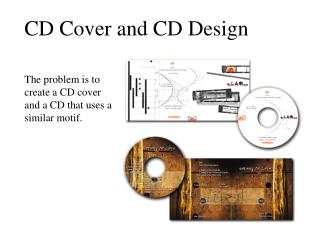
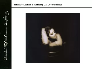
This groundbreaking album cover challenges conventions with controversial imagery and a unique design, appealing to folk rock enthusiasts and rebellious audiences alike. The unconventional approach of showcasing the band in a shop window and featuring instruments like guitar and accordion hints at the band's genre. The minimalist font choice and grayscale color scheme add a touch of sophistication to the overall aesthetic. The cover cleverly balances imagery and text, making it distinctive on the shelf and attracting potential buyers.

Folk Rock Revelation
E N D
Presentation Transcript
CD Cover Research By Kirsty Lever
The album cover is the band’s name. Its their first album so it allows the audience to become familiar with the bands name and therefore become more well know. Moreover people who don’t buy the CD but see the cover will become familiarise with the bands name. For a first album a picture of the artists is usually on the album cover so the public can associate the band with the artists. This cover challenges this convention (You might say this is rebellious which could attract an audience). However this picture is very controversial, has a lot going on and is very unusual. Because of this it would attract people to the CD compared to other CDS on the shelf which means people are more likely to buy it. The Name of the album has a plain font but is big and takes up ¼ of the CD cover, it is also bold which helps make it stand out White Font, Blue background It is ¾ Imagery, ¼ text.
Has a speckled effect behind the text this may be to help it stand out a bit more Font is in black with white background Name of the album is on the spine List of their song. Top to Bottom. Text is all in capital letters Barcode bottom right hand corner Logos Production details in small print
Unusual cover instead of the band covering most of the album, they are in a shop window – this is different which may attract people to the CD Bands clothes in away look like farmer clothes this shows that the band is a folk rock band. More imagery (7/8) then text (1/8) Therefore people who like folk rock will be more likely to want to buy this album Band are on the cover Has the bands name with the album name underneath The instruments show it is a folk rock band – Guitar, accordion, banjo, cello. The font is slightly fancy. However it is quite small which is unusual for a first album as you want to attract the audience to your name The black font is infront of a light colour which helps it stand out a bit
Imagery has a relationship to the front cover. The back cover imagery is of a window. In the front cover they are in a shop window and there are two windows on the top Barcode top right hand corner Roughly 50/50 Text to Imagery List of the song names. Right to Left. Spine has bands name, album name and logos Production details in small Logos
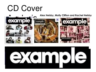
Band takes up most of the CD cover. Audience who see this cover may recognise the band and want to buy it. Compared to if they didn’t see the band and recognise them they would be less likely to want to buy the album Font is quite small. The bands name is in a different colour to the albums name. Font is simple Has the bands name with the album name under it Instruments reflects the genre of the band – Acoustic guitar, Electric guitar, Banjo, Accordion More Imagery (7/8), then text (1/8) Clothes reflects genre – Smart casual
Medium shot of the band. Takes up most of the CD cover. Black and grey colour theme. The band is well known and therefore they don’t have to do anything special and can just do something very simple like this cover Simple Font. White and Grey. Contrasts the bands name and the singles name. Specifies that it is a CD single
Common Conventions Front Cover • The artist are on the front cover (In a line) • Artist are wearing smart casual clothes • The font is simple – mostly san-serif font • The majority is imagery with a slight amount of text • The name of the band and album are clear, and next to each other Back Cover • List of Songs • Simple – E.G. 2 colours, plain background • Production details are at the bottom of the CD • Logo of production companies