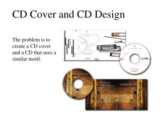
Enigmatic Woods: Psychedelic Melodies
Embrace the mystical connection between nature and music with animals and trees in surreal CD art. Vibrant purples, pinks, and trippy visuals invite viewers on a musical journey of wonder. Stand out with bold fonts amidst dreamy landscapes.


Enigmatic Woods: Psychedelic Melodies
E N D
Presentation Transcript
CD Cover research George Barr
CD COVER 1, THE CORAL There is a person with a bear head on in the background of the cover, the bear isn’t the main focus of the artwork, but it is clever as the reader has to look closely to spot it. I am going to use animals on my CD covers to show the link to the video. Trees also used in the CD cover, they stand out on the purple background, they’ve been used again to show the content of the music which is very strange and trippy, I want to incorporate my main image in trees also, because the video is set in the woods. The actual image itself looks as if it has been drawn, its been done to give the cartoon kind of finish to the cover. The Corals famous font seen on all album covers, white font used to stand out over the other colours. Pinks and purple colours used to portray the physcadelic content of the CD. I want to incorporate pinks and purples in my CD covers to show the strange content of the CD. And I also believe it will portray what kind of band they are. Font for the album title again in white to stand out over colours, but a different font is used, its a lot stranger and broken and all in capitals, I want to incorporate this idea into my CD covers.
From the image, we as the reader are able to tell what style of music they are from the way the images are blurred and the simplicity of it. CD COVER 2 THE HORRORS Band name in capitals, album name in lower case, this has been done to show which information is the most important in this case the bands name. Very plain font has been used again to keep the eyes on the image, and in white to stand out on the black box. Dark colours used around the outside of the cover, this has been done to keep the focus on the main image, I would like to edit my images and make them darker around the edges to create focus on my main image. Has been position to the bottom left, has been to to keep main focus on the image, I want to use the same idea on my CD covers because my images will be the most important part. A simple solid black box has been used to store the important information on, this has been done to make the text stand out, so that the readers can read clearly what it says. Main focus of the cover is the image, this image has been edited and blurred so we as the viewer are unsure to who it is these people are.
CD COVER 3 THE LA’S Font in capitals, stands out on the white border, easily read by consumer. Band name in a bold black font, has been positioned down the left and right side of the cover to keep the consumers attention on the main image to the centre of the CD cover. Left and right of the image is white, has been done to make the font stand out and act as a border to the image, I like this idea of having a border, I believe it again focus’ the attention on the image and text. Album name ‘Dirty’ to the bottom left of the cover. It has been done in a different font and colour so the consumer are still able to see it as well as everything else. Main image to the centre of the cover, this has been done as the the consumer would see the image first. I like how the image makes no sense I want to use this idea in my designs, I also like the size of the image as it draws the consumer in.