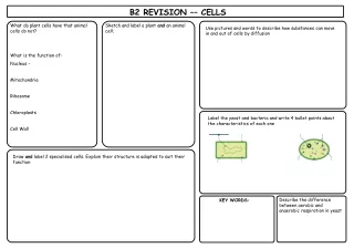
Graph Key Words
This guide explores various types of graphs and their uses in data visualization. Line graphs show trends over time, bar graphs compare quantities, and circle graphs illustrate percentages within a whole. Venn diagrams highlight relationships and overlaps between data sets. Additionally, we cover line plots and stem-and-leaf plots that effectively display data spread. Understanding these graphical representations aids in clearer data analysis and communication, making complex information more accessible and interpretable.
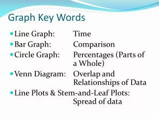

Graph Key Words
E N D
Presentation Transcript
Graph Key Words • Line Graph: Time • Bar Graph: Comparison • Circle Graph: Percentages (Parts of a Whole) • Venn Diagram: Overlap and Relationships of Data • Line Plots & Stem-and-Leaf Plots: Spread of data