C.R.A.P.
C.R.A.P. Color The contrast and intensity of the text and background. Good color creates a page that is aesthetically pleasing and that people will want to visit. Repetition Repeating formatting effects through out a web page.

C.R.A.P.
E N D
Presentation Transcript
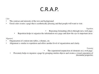
C.R.A.P. Color • The contrast and intensity of the text and background. • Good color creates a page that is aesthetically pleasing and that people will want to visit. Repetition • Repeating formatting effects through out a web page. • Repetition helps to organize the information on a page and draw the eye to important areas. Alignment • Organization of content into tables, columns, etc. • Alignment is similar to repetition and offers another level of organization and clarity. Proximity • The separation/conjunction of elements on a web page. • Proximity helps to organize a page by grouping similar objects and creates a visual separation of dissimilar properties
Nice slideshow that makes the reader gain interest in the items. Color Simple white background with and well organized info that makes the reader focus. Taylorguitars.com
Color Hot red background makes it hard to focus on the reading. A lot of empty space. Rzent.com
REPETITION Categories are well organized into columns. Space is given in between each column. Kpr.craigslist.org
REPETITION Background is to simple and bothers the reader’s eyes. Slideshow pulls the readers out of the main focus. Ebay.com
ALIGNMENT Class schedule is well organized in columns. ksd.org/schools/secondary/Southridge/Home
PROXIMITY Sufficient space in between each option. Yahoo.com
PROXIMITY Everything in this particular website was tried to be fit in one small space. Small text and its all condensed into a small area making it difficult to read. Historytravel.com
Bunch of words everywhere, and the font color disappears with background. Failure To C.R.A.P. Hard to read text and moving background Hosanna1.com
POLISHED C.R.A.P. Silver color on the vehicles makes them look great on the background. You’ll find info by selecting and clicking on the vehicles. www.Jeep.com