Huge Examples of C.R.A.P.
100 likes | 316 Vues
Huge Examples of C.R.A.P. By: Kyle Tinker & Spencer Crawford. What is C.R.A.P.?.

Huge Examples of C.R.A.P.
E N D
Presentation Transcript
Huge Examples of C.R.A.P. By: Kyle Tinker & Spencer Crawford
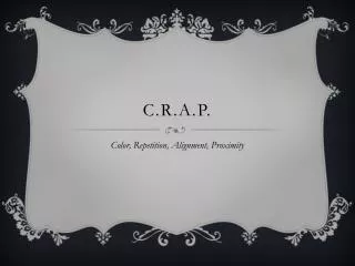
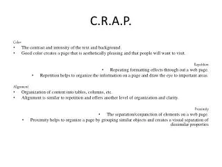
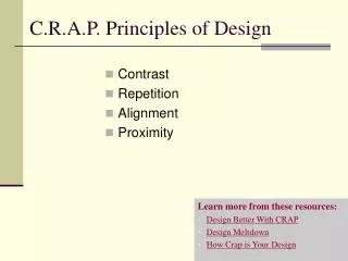
What is C.R.A.P.? C.R.A.P. is the basic of elements of web design. It is based around four things which are color, repetition, alignment, and proximity. Color in website should generally be corresponding with other colors on the website. For example, black and white. It also is used in websites to show where things separate by color variation. Repetition is used to make the website less choppy and look more thought out , professional, and clear. Alignment is used to make the website look less and choppy and more clear. Proximity is used to keep pages more organized as well as grouping all of one topic with the same topic.
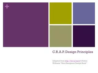
Good example of Color These colors contrast well. These colors are analogous on the color wheel.
Good Example of Repetition The color blue is repeated. All the titles are white.
Good Example Of Alignment Text is appropriately aligned.
Good Example Of Proximity Good spacing.
Bad Example Of Color These colors don’t go together on the color wheel.
Bad Example Of Repetition The text isn’t separated by titles. The background is distracting.
Bad Example Of Alignment No alignment.
Bad Example Of Proximity Very little space between sections. Everything looks cluttered.