Download
1 / 8
90 likes | 278 Vues
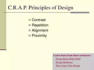
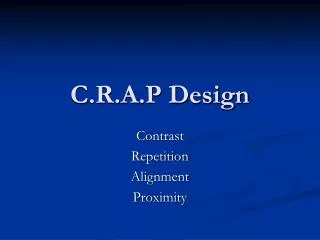
C.R.A.P. Andrew McNeill. What is C.R.A.P. C. R.A.P.- Color Color helps establish related and unrelated items on your web page . C. R. A.P-Repetition Repetition can lead the reader's eyes in the correct direction and give them hints as how to navigate. C.R. A. P.-Alignment

E N D
C.R.A.P. Andrew McNeill
What is C.R.A.P. C.R.A.P.- Color • Color helps establish related and unrelated items on your web page. C.R.A.P-Repetition • Repetition can lead the reader's eyes in the correct direction and give them hints as how to navigate. C.R.A.P.-Alignment • Alignment can show contrast to items not related. C.R.A.P.-Proximity • Like alignment, it helps the reader identify what is related and what is not.
COLOR Background colors are complimentary Titles and subtitles different font size Background is easy on the eyes http://teacherweb.com/
COLOR Font color and background color hard on the eyes Font color doesn’t help highlight what is important to read. Background color is one solid color and boring. http://www.bls.gov/k12/help01.htm
REPETITION Repeating color for titles Repeating color for subtitles Repeating graphics for organization http://bananarepublic.gap.com/
REPETITION Title font only slightly bigger then everything else Same color font although unrelated Shows bad repetition because very similar font size throughout http://www.hort.purdue.edu/newcrop/morton/banana.html
FAILURE TO C.R.A.P. Font hard to see Distracting background Links are confusing and cluttered Everything is cluttered in one spot http://www.schoolofvisualarts.edu/
POLISHED C.R.A.P. More important links aligned at the top Font colors are easy to read on the background Moving background looks professional All links in rows and columns http://www.pepsi.com/