Download
1 / 25
260 likes | 397 Vues
Explore the C.R.A.P. design principles of Contrast, Repetition, Alignment, and Proximity for effective visual communication. Understand the rules before breaking them to create compelling and organized designs. Learn to apply the principles to elevate your design skills.

E N D
C.R.A.P. (or C.A.R.P.) Formula The Non-Designer’s Design Book
Old Design Know the rules before you break the rules. W I S D O M ________________________________________
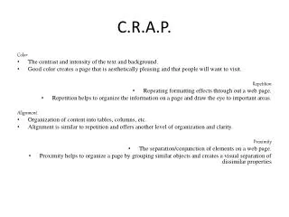
What does C.R.A.P. stand for? • Contrast • Repetition • Alignment • Proximity
What is the rule of Proximity?
Proximity • Group related items together. • Separate unrelated items. • Purpose: Creates organization
AVOID Type running together like this (hard for the eye to follow)
What is the rule of Alignment?
Alignment • Nothing should be placed on the page arbitrarily. • Every item should have a visual connection with something else on the page. • Purpose: Organize, unify, create visual connections.
AVOID • The “raggy” look
AVOID Center alignment because it creates a “raggy” look.
Make it exact. • If an element is “close” to being aligned with something else, make it exactly aligned. • Use a grid and/or rules to make sure it’s exact. • Turn to pg. 46 in your book. . . . (exercise)
What is the rule of Repetition?
Repetition • Repeat some aspect of the design throughout the entire piece. • But avoid too much repetition. • Purpose: Consistency, unity, visual interest
What is the rule of Contrast?
Contrast • Don’t be a wimp. • If two items are not the same, make them very different. • Purpose: visual interest, organization
AVOID • Type that’s all the same(or close to same) font, size, color, etc. • Scattered type • Outlined type • Reverse type on complex images • Full borders on flyers and full-page ads (usually). They can be distracting. “Bleeds” are usually stronger.
CRITIQUE Critique this flyer in terms of contrast, repetition, alignment, proximity. Is there a good type hierarchy? How could it be improved? What other type and layout issues do you see?