Color
Color. Dr. Yan Liu Department of Biomedical, Industrial and Human Factors Engineering Wright State University. Introduction. Evolutionary Advantages of Color Vision Helps to break camouflage, separating objects that differ only in their colors


Color
E N D
Presentation Transcript
Color Dr. Yan Liu Department of Biomedical, Industrial and Human Factors Engineering Wright State University
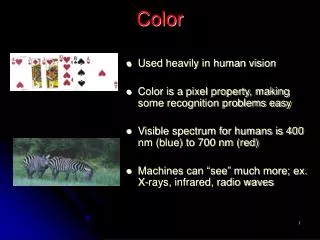
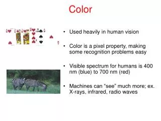
Introduction • Evolutionary Advantages of Color Vision • Helps to break camouflage, separating objects that differ only in their colors • Tells useful information about material properties of objects • e.g. whether a fruit is ripe or not, the composition of a stone • Color is an attribute of an object rather than its primary characteristic • Color is excellent for labeling and categorization but poor for displaying shape, space, or detail
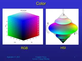
Trichromacy Theory • Trichromacy • We have three distinct color receptors (cones) in our retinas that are active at normal light levels • Color Space • An arrangement of colors in a three-dimensional space • Different purposes • Red, green, and blue for a computer monitor • Cyan, magenta, and yellow for color printing • Red, yellow, and blue for paint • Although only three different receptors are involved in color vision, it is possible to match a particular patch of colored light with a mixture of three colored lights (primaries)
Human cone sensitivity functions (how light of different wavelengths is absorbed by the different receptors) Trichromacy Theory (Cont.) • Long-wavelength L peaks at around 580 nm (yellow) • Middle-wavelength M peaks at around 540 nm (green) • Short-wavelength S peaks at around 450 nm (blue) and is much less sensitive
Color Blindness • About 10% of the male population and 1% of the female population have some form of color vision deficiency • Most common is an inability to distinguish between red and green The color space becomes two-dimensional in the case of color deficiency in one cone type Three-dimensional color space formed by the responses of three cone types
Color Measurement • Colorimetry • The science that describes colors in numbers or provides a physical color match using a variety of measurement instruments • Essential to specify colors precisely for reproduction C: the color to be matched R, G, B: the primary light sources to be used to create a match r, g, and b: the amounts of red, green, and blue lights, respectively ≡: denotes a perceptual match (the sample and the mixture of primaries look identical) C≡rR + gG + bB (Eq. 1) When the light from three projectors is combined, the results are as shown: a) Yellow is a mixture of red and green; b) Purple is a mixture of red and blue; c) Cyan is a mixture of blue and green; and d) White is a mixture of red, green, and blue A color-matching setup
Color Measurement (Cont.) Any color can be created by varying the amount of light produced by each of the primaries The three-dimensional space formed by three primary lights • If the three primaries are physically formed by the phosphor colors of a color monitor, this space defines the gamut of the monitor
C+rR≡gG + bB C≡ -rR + gG + bB Color Measurement (Cont.) • The primaries determine their gamut and thus the range of colors that can be reproduced • Primaries yellow, blue, and purple produce a smaller gamut than the RGB primaries • If the concept of negative light is allowed for primaries, then it is possible that any colored light can be matched by a weighted sum of any three distinct primaries C≡ -rR + gG + bB (Eq. 2) • The concept of negative light for a primary is made possible by adding part of the primary to the matched sample • e.g. If the light from the red projector is added to the sample, then
CIE System of Color Standards • Overview • The Commission Internationale de l’Eclairage (CIE) color space is by far the most widely used standard for measuring colored light • The CIE system uses abstract primaries (called tristimulus) values labeled as XYZ • The gray volume contained within the positive space defined by XYZ axes represents the colors that can be perceived • The pyramid-shaped volume within the RGB axes represents the colors that can be created by a set of red, green, and blue lights Color volume created by the XYZ tristimulus primaries of CIE system
CIE Chromaticity Diagram • Projection • Projecting the 3D color space onto the plane X+Y+Z=1 x= X/(X+Y+Z) y= Y/(X+Y+Z) z= Z/(X+Y+Z) = 1- x - y
If two colored lights are represented by two points in a chromaticity diagram, the color of a mixture of those two lights will always lie on a straight line between those two points • Any set of three lights specifies a triangle in the chromaticity diagram. Its corners are given by the chromaticity coordinates of the three lights. Any color within that triangle can be created with a suitable mixture of the three lights. In the diagram, red is at [0.64,0.33], green is at [0.3,0.6], and blue is at [0.15,0.06]. The white point is the D65 at [0.3127,0.329]. • The outer curved portion is the spectral (monochromatic) locus • The complementary wavelength of a color is produced by drawing a line between that color and white and extrapolating to the opposite spectrum locus. Adding a color and its complementary color produces white CIE chromaticity diagram
HSV and HSL Color Spaces • HSV(HSB) Color Space • Hue • Color in the spectrum, ranging from 0(red) to 360 degrees (but normalized to 0-1 in some applications) • Saturation • Purity of the color, ranging from 0(grayscale) to 100% (the purest) • Value (Brightness) • Brightness of the color, ranging from 0(black) to 1(the brightest) • Represented as a color wheel, cone, cylinder or hexcone • HSL Color Space • Hue • Saturation • Lightness or Luminance (from 0(pure black) to 1(pure white)) • Represented as a double color cone or hexcone • More natural than HSV for use by artists
The angular parameter corresponds to hue • Distance from the axis corresponds to saturation • Distance along the axis corresponds to value HSV Color Space (a cone) • The two apexes correspond to black and white • The angular parameter corresponds to hue • Distance from the axis corresponds to saturation • Distance along the black-white axis corresponds to lightness HSL Space (double cone)
Opponent Process Theory • Human visual system interprets information about color by processing signals from cones in an antagonistic manner • Six elementary colors that are opponent pairs perceptually • Black-white channel detects luminance and is based on inputs from all the cones • Red-green channel is based on the difference between long- and middle-wavelength cone signals • Yellow-blue channel is based on the difference between the short-wavelength cones and the sum of the other two Cone signals are transformed into black-white (luminance), red-green, and yellow-blue channels An illustration of color opponent process model
Opponent Process Theory (Cont.) • Cross-Cultural Naming • Primary color terms are remarkably consistent across cultures • The first two basic color words are black and white • The third color is always red • The fourth and fifth colors are either yellow and then green, or green and then yellow • The sixth color is always blue • Categorical Colors • Confusion between color codes is affected by color categories • Different colors that belong to the same category are more difficult to differentiate than those belonging to different categories • Only a very small number of colors can be used effectively as categorical labels • Red, green, yellow, orange, blue, purple, aqua, pink, and white
Properties of Color Channels • The most profound differences are between the two chromatic channels and the luminance channel • Displaying data on the luminance channel alone is relatively easy • With careful subject-dependent calibration, patterns can be constructed that vary only for the red-green or the yellow-blue channel, with the same luminance (isoluminant or equiluminous) • The red-green and yellow-blue chromatic channels are each only capable of carrying about 1/3 the amount of detail carried by the black-white channel. Therefore, purely chromatic differences are not suitable for displaying fine detail Yellow texts on a blue gradient. It is very difficult to read the texts that are isoluminant with the background color
Properties of Color Channels (Cont.) • Stereo space perception is based primarily on information from the luminance channel • It appears to be impossible, or at least very difficult, to see stereoscopic depth in stereo pairs that differ only in terms of the color channels • Motion perception appears to be primarily based on information from the luminance channel • A moving pattern that is equiluminous with its background appears to move much more slowly than a black-against-white pattern moving at the same speed • Perception of shape and form appears to be processed mainly through the luminance channel • Changing the shading of a surface shape from a luminance gradient to a purely chromatic gradient greatly reduces the effectiveness of the shape • Purely chromatic differences should never be used for displaying object shape, object motion, or detailed information such as text
Color Appearance • A most important role for color in visualization is coding information • Color is normally a surface attribute of an object • Depending on the surrounding colors in the environment and a whole host of spatial and temporal factors, the same physical color may look very different • In a monitor-based display, a large path of standardized reference white will help ensure that color appearance is preserved • When colors are reproduced on paper, viewing them under a standard lamp will help preserve their appearance
Color Contrast • Contrast-Causing Mechanism • Helps to see surface colors accurately by revealing differences between colored patches and background regions • Colors being perceived relative to their overall context can make the eye relatively insensitive to poor balance • e.g. When television sets are viewed side by side, the overall color of the pictures can differ strikingly, yet they may all look acceptable when viewed individually • Color contrast can also cause illusions The X pattern is identical in both sides, but it seems bluer on the red background and pinker on the blue background An illustration of color contrast illusion
Orange Brown Yellow Color Brown • Referred to dark yellow • Requires a reference white somewhere in the vicinity for it to be perceived • Appears qualitatively different from orange and yellow • If color sets are being devised for the purpose of color coding, brown may not be recognized as belonging to the set of yellows
Hue Smith’s transformation Saturation Color Specification Interfaces and Color Spaces • Color Space • The simplest color interface to implement on a computer • Gives users controls to adjust the amounts of red, green, and blue lights that combine to make a patch of color on a monitor • This method can be confusing for users who do not know the combination mechanism of colors • Smith’s (1978) HSV color space • a transformation from HSV coordinates to RGB monitor coordinates • Hue: an approximation to the visible spectrum from red to yellow to green to blue and back to red • Saturation: from monitor white to the purest hue possible given the limits of monitor phosphors
Design Color Space • In a computer interface for selecting colors, separate the luminance dimension from the chromatic dimensions • e.g. provide a single slide control for the luminous dimension and lay out the two opponent color dimensions on a chromatic plane • The best color selection interface is not resolved • Good feedbacks about the location of the color being adjusted in color space can help the process • A color circle with red, green, yellow and blue defining opposing axes • A color triangle with the monitor primaries – red, green, and blue – at the corners • A color square with the opponent color primaries – red, yellow, green, and blue – at the corners • A color hexagon with red, yellow, green, cyan, blue, and magenta at the corners (gives both the monitor and printer primaries) Four geometric color layouts of the chromatic plane
Color Naming • Choosing colors by name is not useful except for simple applications • National Color System (NCS) • Based on opponent color theory • Developed in Sweden and widely used in European countries • Colors are characterized by the amounts of redness, greenness, yellowness, blueness, blackness, and whiteness that they contain • e.g. the yellowish orange might be given Y70R30 which means 70 parts yellow and 30 parts red • Colors are also given independent values on a black-white axis by allocating a blackness value between 0 and 100 • Intensity describes the distance from the gray-scale axis • e.g. the color “spring nymph” becomes 0030-G80Y20, which expands to blackness 00, intensity 30, green 80, and yellow 20)
Red, green, yellow, and blue lie at the ends of two orthogonal axes • Intervening “pure” colors lie on the circle circumference, which are given numbers by sharing out 100 arbitrary units • Y70R30 is orange yellow; R50B50 is purple The NCS circle
Color Palette • Color Palette • Effective when the user wishes to use only a small set of standardized colors • Color selection palettes are often laid out in a regular order according to one of the color geometries (hue, saturation, brightness, or luminance) • Useful to provide a facility for the user to develop a personal palette which allows for consistency in color style across different visualization displays • A valuable addition to a color user interface is a method for showing a color sample on differently colored backgrounds • Understand how contrast effects can affect the appearance of particular color samples
Color for Labeling • Color can be extremely effective as a nominal code • A nominal code does not have to be orderable • Should be recognized • Distinctness • To rapidly distinguish a color from a set of other colors, the target color should lie outside of the convex hull of the surrounding colors in the CIE color space • A convex hull of a set of colors is defined as the area within a rubber band that is stretched around the colors when they are defined in CIE tristimulus space
(a) shows that gray is within the convex hull of red, green, yellow, and blue (b) shows that red is outside of the convex hull of green, blue, yellow, and gray (c) it is difficult to find the gray dot in a set of red, green, yellow, and blue dots (d) the red dot is easy to detect in a set of green, blue, yellow, and gray dots Illustration of color detection
Color for Labeling (Cont.) • Unique Hues • Red, green, yellow, blue, black, and white provide natural choices when a small set of color codes is required • No two colors should be chosen from the same category, even if they are relatively far apart in color space • e.g. Avoid using multiple shades of green as codes • Contrast with Background • Simultaneous contrast with background colors can dramatically alter color appearance, making one color look like another • Placing a thin white or black border around the color-coded object can help to reduce contrast effects • Never display codes using purely chromatic differences with the background • There should be a significance luminance difference in addition to the color difference
Color for Labeling (Cont.) • Color Deficiency • It may be desirable to use colors that can be distinguished even by people who are color deficient (especially in the red-green direction) • Almost everyone can distinguish colors that vary in the yellow-blue direction • Number • Only a small number of codes (between about 5 and 10) can be rapidly perceived • Convention • Color-coding conventions must sometimes be taken into account • e.g. red=hot, danger; blue=cold, green=life, go • Conventions can be cultural dependent • e.g. In china, red means life and good fortune, and green means death
Color for Labeling (Cont.) • Field Size • Color-coded objects should not be very small, at least with half a degree of visual angle • The larger the area that is color-coded, the more easily colors can be distinguished • Small objects that are color-coded should have strong, highly saturated colors for maximum discrimination • When large areas of color coding are used, the colors should be of low saturation and differ only slightly from one another. This enables small, vivid color-coded targets to be perceived against background regions • When colors are used to highlight regions of black text, they should be of low saturation to minimize interference with the text
Color Sequences for Data Maps • Pseudocoloring • The technique of representing continuously varying map values using a sequence of colors • Widely applied in astronomical radiation charts, medical imaging, and many other scientific applications • Selecting a pseudocoloring sequence can be based on the measurement scale of the coded object (nominal, ordinal, interval or ratio)
Color Sequences for Data Maps (Cont.) • Nominal Pseudocolor Sequence • Designed to enable rapid visual classification of regions where the values within the regions have no particular order • The considerations in selecting colors for nominal sequences are the same as for color labeling • Three colors – red, yellow, and green – are used to provide visual segmentation into three distinct regions with different slopes Pseudocolor sequence that demonstrates the physiographic features of the Arctic seafloor
Color Sequences for Data Maps (Cont.) • Ordinal Pseudocolor Sequence • The monotonic ordering of data values in different parts of the display can be perceived • It is important that the color sequence increases monotonically with respect to one or more of the color opponent channels • A black-white, red-green, or yellow-blue sequence • A saturation sequence or any relatively straight line through opponent color space • If it is important to show detail in the data, then it is essential to have a sequence that varies according to the luminance (black-white) channel
(c). A spectrum-approximation sequence (a). A black-white sequence • (a) is more effective than (b) in showing detail • (c) is not perceptual ordinal but effective in segmenting different regions in the map (b). A saturation sequence A map of ozone concentrations in the atmosphere
Color Sequences for Data Maps (Cont.) • Interval Pseudocolor Sequence • Each unit step of the sequence represents an equal change in magnitude of the characteristic being displayed across the whole range of the sequence • Use a uniform color space in which equal perceptual steps correspond to equal metric steps • Introduce steps deliberately in the color sequence (a banded color sequence) to produce clearly discernible intervals An economic forecast with estimate uncertainty
Color Sequences for Data Maps (Cont.) • Interval Pseudocolor Sequence (Cont.) • Contours can be usefully combined with pseudocoloring • A well-designed pseudocolor sequence or artificially shaded height map is usually much better for non-experts than an un-enhanced set of contours • It may also be better for experts when rapid decision making or data fusion is required A map containing contours and a pseudocolor sequence
Color Sequences for Data Maps (Cont.) • Ratio Pseudocolor Sequence • An interval sequence that has a true zero and all that this implies • Expressing a ratio sequence using a color sequence is hard to achieve • A sequence can be designed that effectively expresses a zero point and numbers above and below zero (called diverging sequences or bipolar sequences). • A neutral value on one or more opponent channels is usually used to represent zero, and diverging colors on one or more channels are used to represent positive and negative quantities • For a target detection task, a sequence on the red-green channel is more effective than that on the yellow-blue channel, which confirms the greater information-carrying capability of the red-green channel
Market capitalization is represented by area • Black represents zero • Increasing positive values are shown by increasing amounts of red • Increasing negative values are shown by increasing amounts of green An illustration of the treemap of a stock market
Color Sequences for Data Maps (Cont.) • Sequences for the Color Deficiency • Some color sequences will not be perceived by people who suffer from protanopia and deuteranopia, both causing an inability to discriminate red from green • Sequences that vary mainly on the black-white or yellow-blue channel are still clear to the people with protanopia and deuteranopia • Gray scale • Spectrum approximation • Red-green • Saturation • Yellow-blue • Green-blue • A sequence of colors in which each color is lighter than the previous one • Sequences a, e, and f can be perceived by people who suffer protanopia and deuteranopia Seven different color sequences
Color for Visual Data Exploration • Visual Data Exploration • Representing data graphically in order to search for useful patterns and information in masses of mostly meaningless numbers • In (a), there are two distinct clusters • In (b), there is a clear negative linear relationship between the two variables • In (c), there is a curvilinear, inverted U-shaped relationship • In (d), there is an abrupt discontinuity (b) (a) (d) (c) Illustration of four kinds of data relationship that are perceived in the graphs
Color for Visual Data Exploration (Cont.) • Color for Exploring Multidimensional Data • Color mapping can be used to extend the number of displayable dimensions to five or six in a single scatterplot • Using color to display dimensions is effective in perceiving clusters but not in in showing quantitative information
(b) Scatterplot matrix with color mapping (a) Scatterplot matrix without color mapping (the amounts of red, green, and blue are mapped to three different variables respectively) Visualization of five-dimensional data