Effective Data Presentation Techniques for Clear Communication
Learn how to present data using text, tables, and plots to communicate effectively. Understand the importance of clarity, simplicity, and proper formatting for data summaries. Discover best practices for creating understandable tables and graphs.


Effective Data Presentation Techniques for Clear Communication
E N D
Presentation Transcript
Communication • The goal of presenting data is to communicate ideas • Communication is not what you say but what your audience grasps • Know your audience • Be clear and precise • The simpler, the better • Eschew obfuscation
Including Numbers • Text, table, or graph? • Text = 3 – 4 numbers • Table = < 20 • Graph = > 10 • Whole numbers • 0 – 9 should be written as words • 10 and greater should be written as digits • Decimals should have proper number of significant figures
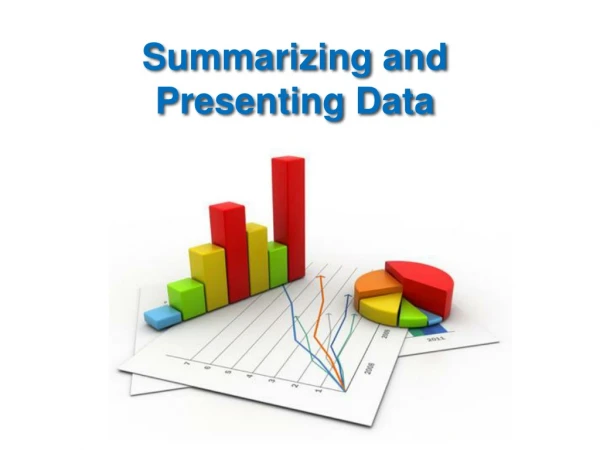
Data Summaries • Large amounts of data can be summarized using tables and plots • Focus on data • Tables and graphs should be self-explanatory • Text should mention key points • Final version should agree with text (and vice versa) • Tables • Best used when numerical details are important • Best used when there are few (< 20) values • Also used to show data that cannot be smoothly incorporated in the text or shown as a plot • Plots • Graphs and charts • Graphs have a continuous scale on the x-axis • Charts have a discrete or categorical scale on the x-axis • Used to show trends and relationships
Tables • Numerical data displayed in rows and columns • Patterns and exceptions should stand out • Clarity • Each column should have a clear and accurate heading • Reading down is easier than reading across • Make comparisons in columns • Widely spaced columns make comparisons difficult • CAREFUL use of lines, shading, fonts can enhance (or detract!) from readability
Tables • Simplicity • Large tables can be overwhelming • Break them up, if possible • Omit columns that can be easily calculated from others • Try to combine minor or less relevant categories into one larger category • Small fonts are nobody’s friend • Tips • Title or caption goes at the top of the table • Units of measurement in column headings • Within text, refer to table as (Table 1) not “See Table 1”
Plots • Many different types of plots • Scatter and bar plots most common (for us) • Avoid pie plots • Be aware that details are often lost with plots • Clear, thorough labeling • X-axis independent, Y-axis dependent • Horizontal labeling easiest to read • Keep it simple! • Avoid software/graphic gimmicks • Default values are not always best • Clarity is much more important than attractiveness • 3-D plots (especially bar plots) can be difficult to interpret
Plots • Tips • Each figure should have a number, title, and legend • Legend should have enough information so that reader does not have to go to text • Titles and legends go below the figure • Label each axis and provide units • X-axis does not have to start at 0, Y-axis does, unless negative values are included