Chapter 4 Displaying and Summarizing Quantitative Data
Chapter 4 Displaying and Summarizing Quantitative Data. CHAPTER OBJECTIVES At the conclusion of this chapter you should be able to: 1) Construct graphs that appropriately describe quantitative data 2) Calculate and interpret numerical summaries of quantitative data.


Chapter 4 Displaying and Summarizing Quantitative Data
E N D
Presentation Transcript
Chapter 4Displaying and Summarizing Quantitative Data CHAPTER OBJECTIVES At the conclusion of this chapter you should be able to: • 1) Construct graphs that appropriately describe quantitative data • 2) Calculate and interpret numerical summaries of quantitative data. • 3) Combine numerical methods with graphical methods to analyze a data set. • 4) Apply graphical methods of summarizing data to choose appropriate numerical summaries. • 5) Apply software and/or calculators to automate graphical and numerical summary procedures.
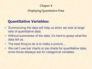
Displaying Quantitative Data Histograms Stem and Leaf Displays
Relative Frequency Histogram of Exam Grades .30 .25 .20 Relative frequency .15 .10 .05 0 40 50 60 70 80 90 100 Grade
Histograms A histogram shows three general types of information: • It provides visual indication of where the approximate center of the data is. • We can gain an understanding of the degree of spread, or variation, in the data. • We can observe the shape of the distribution.
Histograms Showing DifferentCenters(football head coach salaries)
Histograms - Same Center, Different Spread(football head coach salaries)
Grades on a statistics exam Data: 75 66 77 66 64 73 91 65 59 86 61 86 61 58 70 77 80 58 94 78 62 79 83 54 52 45 82 48 67 55
Frequency Distribution of Grades Class Limits Frequency 40 up to 50 50 up to 60 60 up to 70 70 up to 80 80 up to 90 90 up to 100 Total 2 6 8 7 5 2 30
Relative Frequency Distribution of Grades Class Limits Relative Frequency 40 up to 50 50 up to 60 60 up to 70 70 up to 80 80 up to 90 90 up to 100 2/30 = .067 6/30 = .200 8/30 = .267 7/30 = .233 5/30 = .167 2/30 = .067
Relative Frequency Histogram of Grades .30 .25 .20 Relative frequency .15 .10 .05 0 40 50 60 70 80 90 100 Grade
Based on the histo-gram, about what percent of the values are between 47.5 and 52.5? • 50% • 5% • 17% • 30% 10 Countdown
Stem and leaf displays • Have the following general appearance stem leaf 1 8 9 2 1 2 8 9 9 3 2 3 8 9 4 0 1 5 6 7 6 4
Stem and Leaf Displays • Partition each no. in data into a “stem” and “leaf” • Constructing stem and leaf display 1) deter. stem and leaf partition (5-20 stems) 2) write stems in column with smallest stem at top; include all stems in range of data 3) only 1 digit in leaves; drop digits or round off 4) record leaf for each no. in corresponding stem row; ordering the leaves in each row helps
Example: employee ages at a small company 18 21 22 19 32 33 40 41 56 57 64 28 29 29 38 39; stem: 10’s digit; leaf: 1’s digit • 18: stem=1; leaf=8; 18 = 1 | 8 stem leaf 1 8 9 2 1 2 8 9 9 3 2 3 8 9 4 0 1 5 6 7 6 4
Suppose a 95 yr. old is hired stem leaf 1 8 9 2 1 2 8 9 9 3 2 3 8 9 4 0 1 5 6 7 6 4 7 8 9 5
Number of TD passes by NFL teams: 2012-2013 season(stems are 10’s digit)
Advantages/Disadvantages of Stem-and-Leaf Displays • Advantages 1) each measurement displayed 2) ascending order in each stem row 3) relatively simple (data set not too large) • Disadvantages display becomes unwieldy for large data sets
Population of 185 US cities with between 100,000 and 500,000 • Multiply stems by 100,000
Back-to-back stem-and-leaf displays. TD passes by NFL teams: 1999-2000, 2012-13multiply stems by 10
Below is a stem-and-leaf display for the pulse rates of 24 women at a health clinic. How many pulses are between 67 and 77? Stems are 10’s digits • 4 • 6 • 8 • 10 • 12 10 Countdown
Symmetric distribution • A distribution is skewed to the rightif the right side of the histogram (side with larger values) extends much farther out than the left side. It is skewed to the leftif the left side of the histogram extends much farther out than the right side. Skewed distribution Complex, multimodal distribution • Not all distributions have a simple overall shape, especially when there are few observations. Interpreting Graphical Displays: Shape • A distribution is symmetricif the right and left sides of the histogram are approximately mirror images of each other.
Shape (cont.)Female heart attack patients in New York state Age: left-skewed Cost: right-skewed
Shape (cont.): Outliers An important kind of deviation is an outlier. Outliersare observations that lie outside the overall pattern of a distribution. Always look for outliers and try to explain them. The overall pattern is fairly symmetrical except for 2 states clearly not belonging to the main trend. Alaska and Florida have unusual representation of the elderly in their population. A large gap in the distribution is typically a sign of an outlier. Alaska Florida
Spread: fuel efficiency 4, 8 cylinders 4 cylinders: more spread 8 cylinders: less spread
Other Graphical Methods for Economic Data • Time plots plot observations in time order, with time on the horizontal axis and the vari-able on the vertical axis ** Time series measurements are taken at regular intervals (monthly unemployment, quarterly GDP, weather records, electricity demand, etc.)
Numerical Summaries of Quantitative Data Numerical and More Graphical Methods to Describe Univariate Data
2 characteristics of a data set to measure • center measures where the “middle” of the data is located • variability measures how “spread out” the data is
The median: a measure of center Given a set of n measurements arranged in order of magnitude, Median= middle value n odd mean of 2 middle values, n even • Ex. 2, 4, 6, 8, 10; n=5; median=6 • Ex. 2, 4, 6, 8; n=4; median=(4+6)/2=5
Student Pulse Rates (n=62) 38, 59, 60, 60, 62, 62, 63, 63, 64, 64, 65, 67, 68, 70, 70, 70, 70, 70, 70, 70, 71, 71, 72, 72, 73, 74, 74, 75, 75, 75, 75, 76, 77, 77, 77, 77, 78, 78, 79, 79, 80, 80, 80, 84, 84, 85, 85, 87, 90, 90, 91, 92, 93, 94, 94, 95, 96, 96, 96, 98, 98, 103 Median = (75+76)/2 = 75.5
Medians are used often • Year 2011 baseball salaries Median $1,450,000 (max=$32,000,000 Alex Rodriguez; min=$414,000) • Median fan age: MLB 45; NFL 43; NBA 41; NHL 39 • Median existing home sales price: May 2011 $166,500; May 2010 $174,600 • Median household income (2008 dollars) 2009 $50,221; 2008$52,029
Examples • Example: n = 7 17.5 2.8 3.2 13.9 14.1 25.3 45.8 • Example n = 7 (ordered): • 2.8 3.2 13.9 14.1 17.5 25.3 45.8 • Example: n = 8 17.5 2.8 3.2 13.9 14.1 25.3 35.7 45.8 • Example n =8 (ordered) 2.8 3.2 13.9 14.1 17.5 25.3 35.7 45.8 m = 14.1 m = (14.1+17.5)/2 = 15.8
Below are the annual tuition charges at 7 public universities. What is the median tuition? 4429 4960 4960 4971 5245 5546 7586 • 5245 • 4965.5 • 4960 • 4971 10 Countdown
Below are the annual tuition charges at 7 public universities. What is the median tuition? 4429 4960 5245 5546 4971 5587 7586 • 5245 • 4965.5 • 5546 • 4971 10 Countdown
Measures of Spread The range and interquartile range
Ways to measure variability range=largest-smallest • OK sometimes; in general, too crude; sensitive to one large or small data value • The range measures spread by examining the ends of the data • A better way to measure spread is to examine the middle portion of the data
Quartiles: Measuring spread by examining the middle The first quartile, Q1, is the value in the sample that has 25% of the data at or below it (Q1 is the median of the lower half of the sorted data). The third quartile, Q3, is the value in the sample that has 75% of the data at or below it (Q3 is the median of the upper half of the sorted data). Q1= first quartile = 2.3 m = median = 3.4 Q3= third quartile = 4.2
Quartiles and median divide data into 4 pieces 1/4 1/4 1/4 1/4 Q1 M Q3
Quartiles are common measures of spread • http://www2.acs.ncsu.edu/UPA/admissions/fresprof.htm • http://www2.acs.ncsu.edu/UPA/peers/current/ncsu_peers/sat.htm • University of Southern California