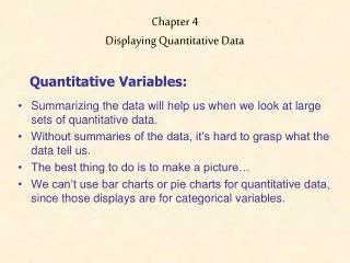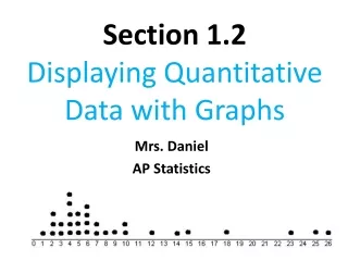
Displaying Quantitative Data
In this lesson on quantitative data, students are guided through the process of graphing a histogram (see p. 54) and interpreting its shape, center, and spread. Special attention is given to unusual features of distributions. The session also covers techniques for re-expressing skewed data, with detailed explanations on how to summarize right-skewed distributions using logarithms or square roots, and left-skewed distributions by squaring data values. Example graphs to illustrate these concepts can be found on page 58.


Displaying Quantitative Data
E N D
Presentation Transcript
Open your book to p. 54 • Follow the directions for graphing a histogram in the section TI Tips
Comparing Distributions • Look at the shape, center, spread. • Unusual features? • Interpret in CONTEXT!
Re-expressing Skewed Data • Skewed distributions are hard to summarize. • Example graph on page 58. • Data that is skewed to the right • Re-express using: • Logarithms • Square roots • Data that is skewed to the left • Re-express using: • Squaring data values