
Uploaded by
butch
0 SLIDES
237 VUES
10LIKES
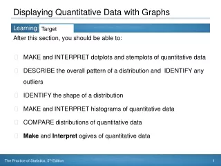
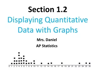
Displaying Quantitative Data
DESCRIPTION
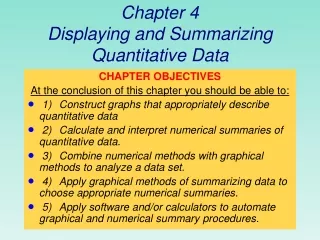
Displaying Quantitative Data. Chapter 4. Dealing With a Lot of Numbers…. Summarizing the data will help us when we look at large sets of quantitative data. Without summaries of the data, it’s hard to grasp what the data tell us. The best thing to do is to make a picture…
Download

1 / 0
Télécharger la présentation 
Displaying Quantitative Data
An Image/Link below is provided (as is) to download presentation
Download Policy: Content on the Website is provided to you AS IS for your information and personal use and may not be sold / licensed / shared on other websites without getting consent from its author.
Content is provided to you AS IS for your information and personal use only.
Download presentation by click this link.
While downloading, if for some reason you are not able to download a presentation, the publisher may have deleted the file from their server.
During download, if you can't get a presentation, the file might be deleted by the publisher.
E N D
Presentation Transcript
-
Displaying Quantitative Data
Chapter 4 - Dealing With a Lot of Numbers… Summarizing the data will help us when we look at large sets of quantitative data. Without summaries of the data, it’s hard to grasp what the data tell us. The best thing to do is to make a picture… We can’t use bar charts or pie charts for quantitative data, since those displays are for categorical variables.
- Histograms: Displaying the Distribution of Earthquake Magnitudes The chapter example discusses earthquake magnitudes. First, slice up the entire span of values covered by the quantitative variable into equal-width piles called bins. The bins and the counts in each bin give the distribution of the quantitative variable.
- A histogramplots the bin counts as the heights of bars (like a bar chart). It displays the distribution at a glance. Here is a histogram of earthquake magnitudes:
- A relative frequency histogram displays the percentage of cases in each bin instead of the count. In this way, relative frequency histograms are faithful to the area principle. Here is a relative frequency distribution histogram of earthquake magnitudes:
- When to use: Quantitative data . Works well with large data sets. How to construct: Draw a horizontal scale and mark the possible values of the variable. Draw a vertical scale and mark it with either frequency or relative frequency. Above each possible value, draw a rectanglecentered at that value (so that the rectangle for is centered at 1, the rectangle for 5 is centered at 5, and so on) The height of each rectangle is determined by the corresponding frequency or relative frequency. Often possible values are consecutive whole numbers, in which case the base width for each rectangle is 1
- Example Promiscuous Queen bees Queen bees mate shortly after they become adults. During the mating flight, the queen usually takes multiple partners. The authors of the paper “the Curious Promiscuity of Queen Honey Bees” (Annals of Zoology [2001]: 255-265) studied the behavior of 30 queen bees to learn about the length of the mating flights and the number of partners a queen takes during a mating flight. The data below is the number of partners generated by the queen bees in this study. Number of partners
- Create a relative frequency distribution to the number of partners. Round to three decimal places
- Create a frequency distribution histogram
- Create a Relative frequency distribution histogram
- Shape, Center, and Spread When describing a distribution, make sure to always tell about three things: shape, center, and spread… Shape: Does the histogram have a single, central hump or several separated humps? One main peak is called unimodal Two main peaks are called bimodal Three or more are called multimodal No peaks is called uniform
- A bimodal histogram has two apparent peaks:
- Uniform Histogram
- Where is the Center of the Distribution? If you had to pick a single number to describe all the data what would you pick? It’s easy to find the center when a histogram is unimodal and symmetric—it’s right in the middle. On the other hand, it’s not so easy to find the center of a skewed histogram or a histogram with more than one mode.
- What is the Shape of the Distribution? Is the histogram symmetric? Can you fold it in half vertically and have the edges match closely? The thinner (usually) ends of the distribution are called tails. If one tail stretches farther than the other, the histogram is skewed to the side of the longer tail. Do any unusual features stick out? Mention any outliers (an unusually small or large data value Are there gaps in the data? Gaps help us see multiple modes and encourage us to notice when data may come from different sources
- Is the histogram symmetric? If you can fold the histogram along a vertical line through the middle and have the edges match pretty closely, the histogram is symmetric.
- The (usually) thinner ends of a distribution are called the tails. If one tail stretches out farther than the other, the histogram is said to be skewed to the side of the longer tail. In the figure below, the histogram on the left is said to be skewed left, while the histogram on the right is said to be skewed right.
- The following histogram has outliers—there are three cities in the leftmost bar:
- Spread Since Statistics is about variation, spread is an important fundamental concept of Statistics. Are the values tightly clustered around the center or spread out? Because distributions that vary a lot around the center are harder to predict or model, we often prefer distributions with less variability. Think of the stock market as an example. Much more to come on spread….
- Now describe your histogram for queen bees
- Stem-and-Leaf Displays Stem-and-leaf displays show the distribution of a quantitative variable, like histograms do, while preserving the individual values. Stem-and-leaf displays contain all the information found in a histogram and, when carefully drawn, satisfy the area principle and show the distribution.
- Stem and Leaf Displays When to use: Numerical sets with a small to moderate number of observations How to construct: Select one or more of the leading digits for the stem values. The trailing digits (or sometimes just the first one of the trailing digits) become the leaves. Use the stems to label the bins. Use only one digit for each leaf—either round or truncate the data values to one decimal place after the stem. Indicate the units for stems and leaves somewhere in the display.
- Number of Automobile accidents per year for every 1000 people in 40 occupations Seem to Defy Data” (San Luis Obispo Tribune, June 19, 2004). Data includes number of automobile accidents per year for every thousand people in 38 occupations.
- Create a Stem and leaf plot for accidents
- Describe the data
- A dotplot is a simple display. It just places a dot along an axis for each case in the data. The dotplot to the right shows Kentucky Derby winning times, plotting each race as its own dot. You might see a dotplot displayed horizontally or vertically. Dotplots
- Think Before You Draw, Again Remember the “Make a picture” rule? Now that we have options for data displays, you need to Think carefully about which type of display to make. Before making a stem-and-leaf display, a histogram, or a dotplot, check the Quantitative Data Condition: The data are values of a quantitative variable whose units are known.
- What Can Go Wrong? Don’t make a histogram of a categorical variable—bar charts or pie charts should be used for categorical data. Don’t look for shape, center, and spread of a bar chart.
- Don’t use bars in every display—save them for histograms and bar charts. Below is a badly drawn plot and the proper histogram for the number of juvenile bald eagles sighted in a collection of weeks:
- Choose a bin width appropriate to the data. Changing the bin width changes the appearance of the histogram:


More Related