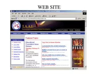
Web Site Readability
Web Site Readability . Mind the Use of Colors . Best for people with viewing problems Display on bad equipment Black text on a white background White text on a black background. 4 Second Rule.

Web Site Readability
E N D
Presentation Transcript
Mind the Use of Colors • Best for people with viewing problems • Display on bad equipment • Black text on a white background • White text on a black background
4 Second Rule • You should be able to look at the home page of any site and figure out what the site is about in less than four seconds. • If you can't, the site is a failure.
Poor Design • Frustrates visitors • even though that's not what you intended at all • Annoyed Visitors Likely to click off • Most common website mistakes easy to prevent or fix
Poor Contrast: Grey Text on White or light background can give a poor contrast.
Poor Contrast: Grey text on a Dark background can give a poor Contrast.
Mind Your Letter Spacing • Text with close letter spacing is difficult to read. • Text with extra letter spacing is easy to read. • Text with reduced letter spacing is difficult to read.
Mind Your Line Spacing Text with good line spacingis easy to read Text with reduced line spacing is difficult to read
Avoid the Fancy Fonts • This font is easy to read.... • While Seriffonts are best for the printed page, San Serif fonts are best for viewing on the computer. • This font is difficult to read.... • Cursive and fancy writing should only be used for the title or emphasis.
Italics and Boldfacing • Normal fonts are easy to read. • Italic fonts are not so easy to read. • Boldface and Italics font script should only be for emphasis. If all is italic and bold there is no difference and no extra emphasis
Avoid Sleazy Elements • Don't distract with: • blinking or scrolling text • Animated GIFs • Auto-loading sound • Slow Connections may create resentment by wasting time forcing them to load animations and sound files • Readers who are assaulted by blinking ads are more likely to leave the site immediately without clicking on anything, and are far less likely to bookmark the site, return to it, link to it, and recommend it.
Scrolling Text • Reader can't read it at own pace • Forced to read it at designed speed • Might have preferred to read those two sentences quickly and then move on • But because it's scrolling they're forced to sit there and wait for the text to slowly appear.
Always Keep Visitors' Interests In Mind • Scrolling text does nothing to serve the visitor. • If it's on a site it's because the site owner thought, "Let me show how cool I am." • Don't design the site for yourself, design it for the people who will actually use it.
No Text Over Image Backgrounds • Harder to Read • Load Time for Page Longer
DO Make it Easy to Find Stuff • Put some thought into organization • As important as what your pages look like, so actually spend some time on it. • If reader can’t easily find, they will leave
Navigation Should Be Easy to Find (Very Easy) • Web users are impatient, and they're not going to hang around a site very long if they can't find their way around. • Navigation should be a prominent element of your design. • Since it will often take up much less space than other elements, it should stand out enough so it doesn’t get lost amongst a sea of content.
Minimize Clicking! • More Clicking = More likely will leave • Home page simply "welcomes" visitors to site? = Delete Page • Give Visitors Information immediately • Group meaningful amounts of information on each page. • If a page doesn't have at least 400 words combine with another short page
Limit Size of Page • No more than two screenfuls of information • Articles are exceptions • Articles are longer by nature. • Very long articles (more than about 6-7 screenfuls) should usually be chunked into separate pages.
Home Button • Include a way to get back to the home page, on every page. • Lost users like to start over from square one. • Make sure to also include text "Home“ • Users might not be able to hit the "Back" button to go back to your home page • Might have entered the middle of your site after clicking a link to it from a search engine or from some other site.
Menu • Include a menu on every page. • On left or the top of each page. • Don't put navigation links only at the bottom of pages • Users will have to scroll down to the bottom to get to them
Capitalization • Don't type more than a few words in ALL CAPS • Used to draw attention to themselves • If everything is in all caps • Everything looks the same, so none of it looks important. • Try making headlinestand out • bold, bright color, maybe a little larger • Keep the text that follows it normal
Spelling Checker • Why should I trust your information when you aren’t educated enough or are not careful to spell right.
Links • Make links blue or underlined, or both • Don't underline words if they're not links • Don't open internal links in a new window • Test your links • Remove broken or incomplete links