Download
1 / 19
190 likes | 251 Vues
Learn how histograms display distribution of quantitative data & time series plots visualize changes over time. Understand bivariate & multivariate data visualization techniques.

E N D
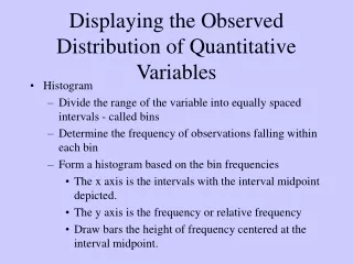
Displaying the Observed Distribution of Quantitative Variables • Histogram • Divide the range of the variable into equally spaced intervals - called bins • Determine the frequency of observations falling within each bin • Form a histogram based on the bin frequencies • The x axis is the intervals with the interval midpoint depicted. • The y axis is the frequency or relative frequency • Draw bars the height of frequency centered at the interval midpoint.
Example • Data frame giving the heights of singers in the New York Choral Society. Components are named height (inches) and voice.part. • Cleveland, William S. (1993). Visualizing Data. Hobart Press, Summit, New Jersey.
Example, cont. • Range 60 to 76 inches • Frequency distribution
What parameters affect the histogram? • Starting Point • Bin width • Let’s try the same example but altering these parameters.
Histogram • Graphical representation of the frequency distribution. • Graphical representation of the observed values of the variable of interest. • Provides a summary of the observed distribution. • Shape changes with the interval definitions (starting point and interval width)
Time Series Plots • If we observe a variable over consecutive time points. • X-axis is time • Y-axis is the value of the observed variable • Demonstrates the observed changes over time of the variable. • Major trends • Seasonal Variation
Example • Ozone • 11 to 22 measurement sites throughout the Houston area. • Hourly measurements (average of 5 minute observations for the given hour) • Focus on one site at 1pm for the year, 1997. • At what levels does ozone become a concern?
Bivariate/Multivariate Data? • Measuring more than one variable at a time. • How would you graphically describe the relationships between the variables? • Scatterplot • 2 dimensional histogram
Example • Measurements of daily ozone concentration (ppb), wind speed (mph), daily maximum temperature (degrees F), and solar radiation (langleys) on 111 days from May to September 1973 in New York. • Cleveland, William S. (1993). Visualizing Data. Hobart Press, Summit, New Jersey.
Numerical Summaries of Data • Measures of Central Tendency • Mean • Median • Mode • Measures of Variation • Standard Deviation • Interquartile Range • Range
5 Number Summary Minimum Q1 Q2 Q3 Maximum Boxplot Box Q1 Q2 Q3 Lines to last obs. within Lower extreme = median - 1.5 x IQR Upper extreme = median + 1.5 x IQR Individual points Observations beyond the extremes Many variations on Boxplots. 5 Statistic Summary