Download
1 / 23
240 likes | 1.01k Vues
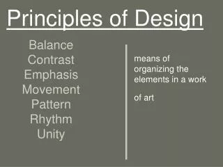
PRINCIPLES OF DESIGN. WHAT ARE THE PRINCIPLES OF DESIGN?. The principles of design are the RULES/LAWS used to create a work of art. The Principles of design can be thought of as what WE DO TO THE ELEMENTS of design.

E N D
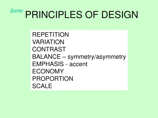
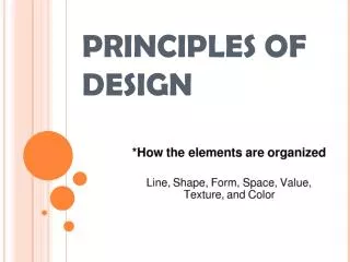
WHAT ARE THE PRINCIPLES OF DESIGN? • The principles of design are the RULES/LAWS used to create a work of art. • The Principles of design can be thought of as what WE DO TO THE ELEMENTS of design. • How we apply the Principles of design determines how successful we are in creating a work of art. • There is no specific “recipe” for their use.
SCALE AND PROPORTION • Proportion/Scale is the feeling of unity created when all parts (sizes, amounts, or number) relate well with each other. • When drawing the human figure, proportion can refer to the size of the head compared to the rest of the body. Proportion involves the relationship of size between objects. • Proportion is also relative sizes of surface areas of different colors. • Proportion also depends on functionality of object.
For example, one whole image can be broken down to two equal parts, which can be more into four equal quarters. • Think of it like a xerox copy. It’s the same image made smaller or larger. The image/ design NEVER changes
A good example is the map of New York. It is DRAWN to SCALE. For every few inches, a few miles have been represented.
BALANCE…. • Balance is the distribution of the visual weight of objects, colors, texture, and space. • If the design was a scale these elements should be balanced to make a design feel stable.
BALANCE…. • SYMMETRICAL: The elements used on one side of the design are similar to those on the other side.
ASYMMETRICAL: not exact but counterbalanced with contrasts such as dull and bright colors, dark with light values, geometric with organic shapes, active and inactive areas. In asymmetrical balance, the sides are different but still look balanced.
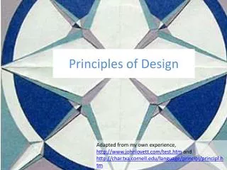
RADIAL: it “radiates” outward or inward like a spiral or burst-like effect.
ACTIVITY: You will need your Newsprint Pad and Colored pencils. Fold the paper into thirds. (Three EQUAL sections) On the top of EACH section, please write SYMMETRICAL, ASYMETRCIAL AND RADIAL. Then, create a DESIGN for EACH section based on the information we covered. Have a THEME for each section. For Example: Water. Towards the end of class, we will share what we have created.
UNITY…… • Unity is the feeling of harmony between all parts of the artwork creating a sense of completeness. • Unity can be achieved through the effective and consistent use of any of the elements, but pattern-- that is, underlying structure-- is the most fundamental element for a strong sense of unity. • Consistency of form and color are also powerful tools that can pull a composition together.
However, unity also exists in variety. • It is not necessary for all of the elements to be identical in form providing they have a common quality of meaning or style. • For example, fashions from a specific period share common features of silhouette, materials, and color that identify the style of the day, or the look of a particular designer. • Unity can also be a matter of concept. • The elements and principles can be selected to support the intended function of the designed object; the purpose of the object unifies the design.
VARIETY….. • Variety keeps life interesting. • Imagine if everything in your life was the same, day in and day out. Imagine the monotony! • Variety in art refers to the use of contrasting or different types of Elements in a work of art. • An artist knows that adding contrast to a work of art adds interest.
RHYTHM….. • Rhythm is created when one or more elements of design are used repeatedly to create a feeling of organized movement. • Variety is essential to keep rhythm exciting and active, and moving the viewer around the artwork. • Rhythm creates a mood like music or dancing.
CONTRAST….. • When defining it, art experts refer to the arrangement of opposite elements (light vs. dark colors, rough vs. smooth textures, large vs. small shapes, etc.) in a piece so as to create visual interest, excitement and drama. • The colors white and black provide the greatest degree of contrast. • Complementary colors also highly contrast with one another. • An artist can employ contrast as a tool, to direct the viewer's attention to a particular point of interest within the piece.
MOVEMENT (ALSO RHYTHM!) • Movement in a composition guides a viewer¹s eye through the work, usually to a FOCAL POINT. • An artist arranges parts of an image to create a sense of motion by using lines, shapes, forms, and textures, or by combining elements of art to produce the look of action.
EMPHASIS…… • Emphasis is the part of the design that catches the viewer’s attention. • Usually the artist will make one area stand out by contrasting it with other areas. • The area will be different in size, color, texture, shape, etc. • Emphasis is also referred to as point of focus, or interruption. • You are not required to use an emphasis! • If you want to capture the viewers attention, then an emphasis should be used.