PRINCIPLES OF DESIGN
660 likes | 841 Vues
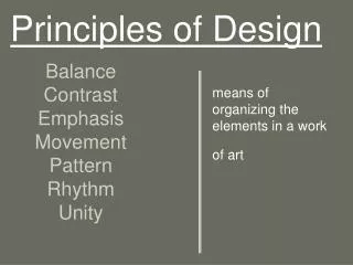
PRINCIPLES OF DESIGN. Directions or guidelines for using the elements of design. BALANCE. A sense of equilibrium. When establishing balance consider visual weight created by size, color, texture and number of objects. Visual Weight .

PRINCIPLES OF DESIGN
E N D
Presentation Transcript
PRINCIPLES OF DESIGN Directions or guidelines for using the elements of design
BALANCE • A sense of equilibrium. • When establishing balance consider visual weight created by size, color, texture and number of objects.
Visual Weight • Perception that an object weighs more or less that in really does. • 2 objects have the same dimensions, but because of thick lines, bold colors, large patterns or course textures on looks heavier.
SYMMETRICAL Achieved by placing identical objects on either side of a central point. ASYMMETRICAL Achieved by placing different objects of equal visual weight on either side of a central point. TYPES OF BALANCE
SYMMETRICAL BALANCE • Creates a quiet, restful feeling. • Suggests restraint, orderliness, formality, tradition. • Also called, FORMAL balance.
Asymmetrical Balance • Creates more interesting arrangements. • Suggests informality, relaxed. • Also referred to as INFORMAL balance.
BALANCE • Why? How? • Follow when arranging furniture. • Furnishings on each side of wall or on opposite walls should balance. • Accessories on display on a table or bookcase should balance.
Picture sort for points! • Each person in your group will be handed a picture. • You must decide if yours is symmetrical or asymmetrical balance. Share with your group. • Check your answers before calling me over to give you points.
Symmetrical Balance • Identical candle sticks, plates, sit on the mantle at each side of the wall mounted mirror.
Symmetrical Balance • Windows draped in identical fabrics, flank both sides of the grandfather clock.
Symmetrical Balance • Identical light sconces are placed on both sides of framed picture.
Asymmetrical Balance • Mirror is placed off center on the mantle. • Tray and bottles on either side of the mirror help to balance it out.
Asymmetrical Balance • Wall hangings of the same visual weight are hung on each side of the plant stand. • Chair balances out the fireplace on the other side of the room.
Asymmetrical Balance • Items on the mantle are arranged using Asymmetrical Balance. The picture is slightly off center with large plant on the left is balanced by a group of vases on the right.
RHYTHM • Leads the eye from one point to another, creates motion. • Results when element of design forms pattern.
TYPES OF RHYTHM • Rhythm by Repetition • Rhythm by Gradation • Rhythm by Radiation • Rhythm by Opposition • Rhythm by Transition
Rhythm By Repetition • Rhythm created by duplicating (repeating) shapes, colors, pattern, line, texture. • Beams in the ceiling are repeated. Window panes, repeat. Stripes on ottoman and chair are repeated.
Rhythm By Gradation • Rhythm created by a gradual change in size or color. • Paint on wall changes gradually in value.
Rhythm By Radiation • Rhythm created by identical objects coming from a central axis. • Tall Grasses “radiate” from the center of the vase on this bathroom vanity. • Examples: window, flowers
Rhythm By Opposition • Rhythm created by lines at right angles or contrasting colors. • Contrasting black and white tiles and the lines intersecting at right angles. • Window panes, frames, tables
Rhythm By Transition • Rhythm created by curved lines that carry your eye across a straight surface. • Window treatments that gently swag down, create a soft rhythm by transition.
What Type of Rhythm? • Repetition? • Gradation? • Radiation? • Opposition? • Transition?
SCALE & PROPORTION • Scale relates to the size of a design in relation to the height and width of the area in which it is placed. • Proportion relates to the parts of the object and how one part relates to another.
Relates to the actual and relative size and visual weight of the design and its components. Furniture and accessories must be in scale to the room Large room = large furniture = king bed Think about person using the room. SCALE
The Golden Mean – the division of a line or form so that the smaller portion has the same ratio to the larger as the larger has to the whole. Effective Ratios are 2:3, 3:5, 5:8, 4:7, etc. Square is the least pleasing shape. Rectangles are more pleasing, especially with a ratio of 2:3. PROPORTION
PROPORTION • The creative use of color, texture, pattern, and furniture arrangement can create illusions of properly proportioned space. • Important when selecting and positioning furniture/accessories • Lamp and lampshade, etc.
Text and PictureBreak! • Find the nine pictures in the group that are in the correct proportion and scale. • Bring me your pictures with a strip of paper with you group number.
SCALE & PROPORTIONToo Big, Too Small, Just Right • This chairs massive scale diminishes everything around it.
Too Small. • The chairs light palate accentuates its skinny scale.
Just Right. • This club chair matches the scale of the sofa.
Too Big. • Coffee table is over-scaled for the sofa.
Too Small. • Table not only looks out of proportion, it functions poorly as well.
Just Right. • The table is substantial enough to anchor the furniture grouping, yet it leaves room for traffic flow around both ends.
Too Tall. • Used as an end table, this wood pedestal towers over the sofa, making the sofa appear small and the pairing awkward.
Too Short. • The lamp would need to be fully stretched to offer good illumination from this low point.
Just Right. • The perfect pairing, visually and physically, is a tabletop that is a couple of inches shorter than the sofa arm.
Too Big. • The large-scale motif and strong colors of this floral wallpaper overpower the petite powder room as well as the fixtures and furniture in it.
Too Small. • The pattern is so small and pale that it almost disappears.
Just Right. • The narrow contrasting stripes provide the ideal balance for the clean-lined pedestal sink and oversize pine mirror.
Too Big. • This rug covers too much of the floor beyond the conversation area to define it as a discrete space.
Too Small. • Instead of creating intimacy, the rug only increases the appearance of isolation.
Just Right. • Choose an area rug that’s about as long and wide as the furnishings in the space.
Too Little. • Too much space between objects makes the candlesticks and the too-small frame look lonely, the bare wall yawning above.
Too Much. • There’s no time to pause to consider any single object, since they are all stepping on one another’s toes in a jostle for space.
Just Right. • The weight now shifted to the left side, fewer items are needed there for balance.
Too Big. • There’s no breathing room in this are-to-sofa match.
Too Little. • This picture is tall enough, roughly matching the height of the sofa. But it ends up looking leggy and lost because it’s too skinny in proportion to the sofa’s width.
Just Right. • To size a single picture, choose one that’s nearly the same height as the sofa and between half and two-thirds its width.