Principles of Design
410 likes | 1.48k Vues
Principles of Design. Fundamental guidelines to aesthetic design that govern the organization of the elements and materials in accordance with the laws of nature. Some primary principles of design are associated with related secondary principles of design. .

Principles of Design
E N D
Presentation Transcript
Principles of Design Fundamental guidelines to aesthetic design that govern the organization of the elements and materials in accordance with the laws of nature. Some primary principles of design are associated with related secondary principles of design.
The elements and principles of design are the building blocks of every successful floral design. • The principles are guidelines that tell us how to assemble the elements. • The Recipe • Taken together, the elements and principles of design provide the foundation upon which any successful design is created. Why follow the principles of design?
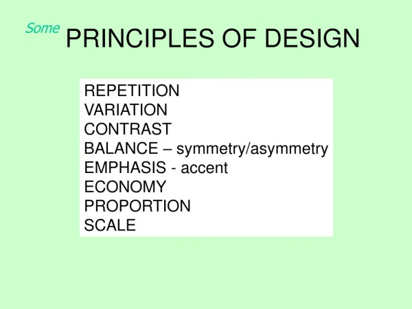
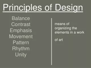
Balance • Dominance • Emphasis • Focal Area/Focal Point • Accent • Rhythm • Depth • Repetition • Transition • Proportion • Scale • Contrast • Opposition • Tension • Variation • Harmony • Unity Primary and secondary principles of design.
A state of equilibrium, actual or visual; a feeling of three-dimensional stability. • Every successful floral design conveys some sense of balance, or physical and visual stability. • A floral design is physically balanced if it does not fall over under it’s own weight. Balance
The feeling that the composition is stable in its placement. • Larger elements and darker colors tend to be used near the bottom or inner part of the design so as to avoid the appearance of being top heavy. Visual Balance
A feeling of stability created by all materials radiating of emerging from a common central point of convergence, such as the spokes of a wheel or the rays of the sun. Radial Balance
A state of visual equilibrium in which the two sides of an arrangement, relative to a central vertical axis, are nearly equal, suggesting mirror images and conveying a similar sense of visual weight. Symmetrical Balance
A state of visual equilibrium in which the two sides of an arrangement, relative to a central vertical axis, are different and unequal, yet convey a similar sense of visual weight. • Also referred to as informal balance or natural balance. • Often featured in contemporary design Asymmetrical Balance
An object in a floral arrangement may appear heavier if it is relatively larger in size, stronger in color, or coarser in texture than other objects. • Darker colors appear to be heavier Visual weight
The comparative relationship in size, quantity, and degree of emphasis among components within the composition; the relationship of one portion to another, or of one portion to the whole. • Good proportion describes the agreeable or harmonious relationship among parts of a whole, with respect to magnitude, number, or degree. Proportion
In order for a floral design to be in good proportion, the “flower” part of the arrangement should be one-and-a half to two times the height plus the weight of the container. Size relationships
The ideal standard of perfect proportion, defined as a line divided in such a way that the ratio of the smaller section to the greater is the same as that of the greater section to the whole. The mathematical value of this ratio is 1.618, expressed approximately in whole numbers as 3:5:8. • The flowers ought to be approximately 1.618 times the size of the container. But the principle of proportion applies to the relative amount of one color to another, the use of one texture against another, the preponderance of one kind of line as opposed to another, and so on. • It can be applied to virtually every one of the elements of design. The Golden Mean
A non-conventional use of proportion. • The floral materials are subordinate in size to the container. Reverse proportion
Features flowers that cascade down beyond the height of the container in opposition to the usual upright positioning seen in most floral designs. Inverse proportion
The relative ratio of size, or the relationship of the size of a composition to the surrounding area of environment. • Properly scaled design is appropriate for the size of its surrounding area. • This arrangement is in proper proportion for the hotel lobby, whereas a small bud vase would look out of place in this surrounding. Scale
For example: Large flowers may be out of scale for a small confined space. They may also be too large to appear comfortable in a small vase. Principle of scale applied to flowers
The visual organization within a design that emphasizes one or more aspects. When one element is emphasized, others are subordinate. • Dominance exists in the relationship between one element and another. • The effective use of dominance conveys a clear message to the viewer that one or another of the elements is the most important aspect of the design. Dominance
The special attention or importance given to one or more areas within a design. • The use of emphasis serves to direct the eye to visually important areas within the design. • Achieved through the use of relatively larger or darker materials. • Expressed through the repetition of one or more elements within a design. Emphasis
The area of greatest visual impact or weight; the center of interest to which the eye is most naturally drawn. • Center or gravity or balance within a composition. • Eye of the viewer is drawn to that area of the design. • Visual weight tends to be concentrated in this area. Focal area/Focal point
Detail added to a design to provide additional interest, affecting the total character of the composition. • Floral and plant materials can be used as accents if they are different from all the other flowers and foliages in the design. Accent
Emphasis by means of difference; strength through opposition. • The use of contrast in a floral design can strengthen the impact of an element. • For example; line, color, and repetition are often used in designs to contrast with the other elements in the design. Contrast
Contrast between elements which are counterpoint in relation to each other, bringing about a sense of tension in a design. • Materials used in opposition call attention to each other by their differences. • Black and white - Opposition
The dynamic, aesthetic quality achieved by the skillful use of opposition, implying or suggesting a sense of energy. • Implies contradiction • Tension creates interest in a flower arrangement by suggesting that some force of energy is present. Tension
Dissimilarity among attributes or characteristics. • Variety among the ingredients in an arrangement can create interest. • The blending of sizes, shapes, colors, and spacing Variation
Visual movement through a design, usually achieved through repetition or gradation. • The distance or space between the elements in a floral design generate rhythm throughout the arrangement. • Established by the placement of repeated elements within the design. Rhythm
The placement of materials at different levels within and around an arrangement. • Three-dimensional quality Depth
The recurrence of like elements within the composition. • A principle that leads to the appearance of unity in a design. Repetition
The ease of visual movement which results from gradual degrees of change among one or more of the elements. • Smaller flowers to larger ones • Lighter shades to darker shades Transition
Compatibility; a pleasing or congruent arrangement of parts. • Components of an arrangement seem to go together. • Must be considered in the relationship with its surroundings. Harmony
Oneness of purpose, thought, style, and spirit. • Organization of components into a harmonious whole. • Arrangement seen as a whole instead of in parts. Unity