QUALITY TOOLS
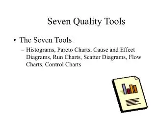
QUALITY TOOLS. Table of Contents. Quality techniques 7 Basic Quality techniques Histograms Pareto Charts Run Charts Scatter Diagrams Control Charts Flow Charts Cause and Effect Diagrams New techniques Other Tools. Introduction.


QUALITY TOOLS
E N D
Presentation Transcript
Table of Contents • Quality techniques • 7 Basic Quality techniques • Histograms • Pareto Charts • Run Charts • Scatter Diagrams • Control Charts • Flow Charts • Cause and Effect Diagrams • New techniques • Other Tools
Introduction • In the following we will Examine the Techniques and Tools that Support Quality Management within a company. There are for the 7 Basic Tools which we are going to define. Generally they can be subdivided into: • mathematical statistical Tools • logical tools
Histograms USL LSL What is it? • A Histogram is a bar graph • usually used to present frequency data How does it Work? • Define Categories for Data • Collect Data, sort them into the categories • Count the Data for each category • Draw the Diagram. each category finds its place on the x-Axis. • The bars will be as high as the value for the category What is its use? • Histograms provide an easy way to evaluate the distribution of Data over different categories
LSL USL Histograms Example: take the failure rate of a machine over a period of x weeks. Now Assign every week the number of failures that occurred. Draw the Histogram. Let the bar represent the weeks. The height of the Bar on the y-axis is the number of failures that occurred during that week.
X Type Pareto Charts What is it? • A Pareto Chart is a Histogram • + a cumulative line How does it Work? • Similar like a Histogram • First define categories, collect Data and sort them into the Categories. Count the occurrences for each category. • Now rank the categories starting with highest value. • Draw cumulative points above all the bars and connect them into a line. What is its use? • Pareto Charts are used to apply the 80/20 rule of Joseph Juran which states that 80% of the problems are the result of 20% of the problems. A Pareto Chart can be used to identify that 20% route causes of problem.
Pareto Charts Example: • A certain machine has different kinds of failures that occur. The Maintenance department identifies these types of failures and counts their occurrence over a period of 3 month. The Data is then added up. The Failures are ranked by their occurrence values starting with the most frequently occurring failure. • A histogram is drawn with bars representing the types of failures. Furthermore are cumulative values assigned to the failure types and drawn into the diagram. • Now determine the point were the cumulative line crosses the 80% mark. Concentrate of the failure types that lie left of this mark.
Pareto Charts 100% 50% Percentages of defects found Types of defects
Measurement Time Run Charts What is it? • Run Charts are representing change • in measurement over a sequence or time How does it Work? • Gather Data • Organize Data • Measurements (y) must be confronted with time or sequence of the events. • Chart Data • Interpreting Data What is its use? • Determining Cyclic Events and there average character
Measurement Time Run Charts Example • Oil consumption of a specific machine over a period of time.
Y X Scatter Diagrams What is it? • Statistical tool showing a trend in a series of values. How does it Work? • Gain values series • Draw graph with value points • Draw trend line: m*x+a • Calculate m value • Calculate a value • Calculate points for trend line. What is its use? • Demonstrating correlations between values and showing trends for value changes.
Y X Scatter Diagrams
Y Upper limit Average/Spec Lower limit X Control Charts What is it? • Statistical tool, showing whether • A process is in control or not How does it Work? • Define Upper limit, lower limit and medium value • Draw Chart. • Gather values and draw them into chart What is its use? • Taking samples of a process and detect possibility of process being out of control
Y Upper limit Average/Spec Lower limit X Control Charts
Within Spec? Process Output Input adjust Yes No Flow Charts What is it? • Way of representing a Procedure • using simple symbols and arrows • A Flowcharts shows the activities in a process and the relationships between them. Operations and Decisions can be represented How does it Work? • Determine what Process or Procedure you want to represent. • Start at a certain point and go then step by step using circles or rectangles for operations or other elements, diamonds for decisions, arrows show the flow and the direction. • Document the elements with titles. Let it close with an ending point. What is its use? • A Flow chart lets a process or procedure be understood easily it also demonstrate the relationships between the elements.
start Repair machine No Check machine OK? Yes end Within Spec? Process Yes Input Output No adjust Flow Charts Example: • You intend to repair a certain machine. • First you perform the repair thought to be necessary • Then You check it • If it does not work you continue with repairs • If it works you finish
Cause a Cause b effect Cause c Cause d Cause and Effect Diagrams What is it? • It’s a diagram that demonstrates • the relationship between Effects • and the categories of their causes • The Arrangement of the Diagram lets it look like a fishbone it is therefor also called fish-bone diagram How does it Work? • Determine the Effect or Problem you would like to examine • Categorize the possible causes • find subcategories • Describe the possible causes What is its use?
Cause and Effect Diagrams Machine Man effect Milieu Measurement Method
Seven New Management and Planning Tools
Need for New Tools • In 1976, the Union of Japanese Scientists and Engineers (JUSE) saw the need for tools to promote innovation, communicate information and successfully plan major projects
Affinity diagram (or) Affinity Chart (or) K-J method • It was created in the 1960s by Japanese anthropologist Jiro Kawakita. • organizes a large number of ideas into their natural relationships • This method taps a team’s creativity and intuition.
When to Use • When you are confronted with many facts or ideas in apparent chaos • When issues seem too large and complex to grasp • When group consensus is necessary
Typical situations Used • After a brainstorming exercise • When analyzing verbal data, such as survey results
Relations Diagram (or) Interrelationship Diagram(or)Digraph(or) Network Diagram • The relations diagram shows cause-and-effect relationships. • The process of creating a relations diagram helps a group analyze the natural links between different aspects of a complex situation.
When to Use • When trying to understand links between ideas or cause-and-effect relationships, such as when trying to identify an area of greatest impact for improvement. • When a complex issue and Solution is being analyzed & Implemented for causes. • After generating an affinity diagram, cause-and-effect diagram or tree diagram, to more completely explore the relations of ideas.
Example:-A computer support group is planning a major project: replacing the mainframe computer.
Tree Diagram (or) Systematic diagram (or) Tree analysis (or) Analytical tree (or) Hierarchy diagram Description • The tree diagram starts with one item that branches into two or more, each of which branch into two or more, and so on. • It looks like a tree, with trunk and multiple branches.
When to Use • When an issue is known or being addressed in broad generalities. • When developing actions to carry out a solution or other plan. • When analyzing processes in detail. • When probing for the root cause of a problem. • After an affinity diagram or relations diagram has uncovered key issues. • As a communication tool, to explain details to others
Example • The Pearl River, NY School District, a 2001 recipient of the Malcolm Baldrige National Quality Award, uses a tree diagram to communicate how district-wide goals are translated into sub-goals and individual projects
Matrix Diagram (or) Matrix chart Description • The matrix diagram shows the relationship between two, three or four groups of information. It also can give information about the relationship, such as its strength, the roles played by various individuals or measurements
When to Use each Shape An L-shaped matrix relates two groups of items to each other (or one group to itself). • A T-shaped matrix relates three groups of items: groups B and C are each related to A. Groups B and C are not related to each other. • A Y-shaped matrix relates three groups of items. Each group is related to the other two in a circular fashion.
When to Use each Shape A C-shaped matrix relates three groups of items all together simultaneously, in 3-D. An X-shaped matrix relates four groups of items. Each group is related to two others in a circular fashion. A roof-shaped matrix relates one group of items to itself. It is usually used along with an L- or T-shaped matrix.(Used in QFD)
Arrow Diagram (or) Activity Network Diagram (or) Network Diagram, Activity Chart (or) Node Diagram (or) CPM (critical path method) Chart Description • The arrow diagram shows the required order of tasks in a project or process, the best schedule for the entire project, and potential scheduling and resource problems and their solutions.
When to Use • When scheduling and monitoring tasks within a complex project or process with interrelated tasks and resources. • When you know the steps of the project or process, their sequence and how long each task. • When project schedule is critical, with serious consequences for completing the project late or significant advantage to completing the project early.
Process Decision Program Chart(or) PDPC • The process decision program chart systematically identifies what might go wrong in a plan under development. • Countermeasures are developed to prevent or offset those problems. • Using PDPC, you can either revise the plan to avoid the problems or be ready with the best response when a problem occurs.
When to Use • Before implementing a plan, especially when the plan is large and complex. • When the plan must be completed on schedule. • When the price of failure is high.
Example • A medical group is planning to improve the care of patients with chronic illnesses such as diabetes and asthma through a new Chronic illness management program (CIMP). They have defined four main elements and, for each of these elements, key components