Enhancing User Interface Through Typography and Reading Aesthetics
This document explores the significance of typography and reading aesthetics in user interface design, highlighting key elements such as legibility, readability, font choice, and the impact of physical factors like screen resolution and background contrast on user experience. It delves into the differences between serif and sans-serif fonts, the importance of text alignment and spacing, and how these elements facilitate active reading and comprehension. Additionally, it emphasizes the continuous nature of reading processes, whether on paper or screen, and the role of annotations in improving user engagement with text.

Enhancing User Interface Through Typography and Reading Aesthetics
E N D
Presentation Transcript
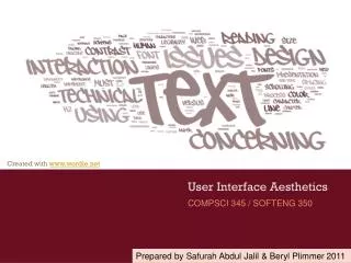
COMPSCI 345 / SOFTENG 350 User Interface Aesthetics Prepared by Safurah Abdul Jalil & Beryl Plimmer 2011
Human Issues • The Reading Purpose • Continuous process (reading a novel) • Scanning • Reading interface - screen or paper • Paper is more flexible than electronic media • We often rely on our spatial memory when we search for information Place holders
Human Issues • Active reading aids comprehension • Using your pen to follow lines • Annotating the text • I have done quite a lot of annotation research. Have a look here http://www.cs.auckland.ac.nz/research/hci/digital_ink/annotation_tools/index.shtml
Text in Interaction Design • Commentary/Instrumental • Commentary text is text that informs. • Instrumental text is text that works; e.g. hyperlinks, button labels (this will be covered in the lecture on forms & controls) • Legibility • Can the reader discern the words • Readability • Can the reader easily read the text • Physical Factors • What is the screen resolution, brightness
Remember the reading process? • We read lowercase more quickly than UPPERCASE • Lowercase presentation is more common • Except when people don’t want you to read it Do they want you to read the chocolate bar wrapper?
Typography craft and an art • Craft • Arranging glyphs (letters) • Dates from earliest printing presses • Its history is evident in the terms we use • Leading • Art Book of Kells (6th century)
Basic Anatomy of letterforms Image modified from http://26.media.tumblr.com/tumblr_kx1onhPpD61qajttoo1_500.gif
Fonts: serif & sans serif http://www.pixel77.com/typography-type-and-typefaces/ ‘Sans’ is “without”, therefore sans serif fonts are fonts without serifs • People still argue whether serif (Times New Roman) or san serif (Arial) is easier to read on a screen • Small serif fonts are less legibility on low res screens • Georgia, Verdana, and Trebuchet maintain legibility at small sizes and have been designed to facilitate reading on the Web
Fonts for title vs. body Decorative/Display fonts • Decorative fonts (sometimes called display fonts or title fonts) • suitable for titles and headings • strong personality: • grab people’s attention • reinforce the message of the word. • May not be installed on all machines – in which case you need to have a default! • Neutral looking fonts such Times or Arial are more suitable as body copy (easier to read)
Fonts: proportional & monospaced http://library.kiwix.org:4201/A/Typeface.html • A proportional font has variable-width: ioioioioio • A monospaced font has fixed-width ioioioioio • Example of courier page
Font Size • Factors that affect perceived font size: • Reading Distance—Greater distances require larger text. • Screen Resolution—Smaller text requires greater resolution to keep the characters clear and legible. • Text/Background Contrast—Positive contrast is optimal (black type on a white background). • Visual Acuity of User—Not all users have 20/20 vision. • Purpose —Text can be scanned, read word by word, or read character by character
Font Size • Fonts for body copy usually don't work well when set too large, they tend to become inelegant and clunky. Example • The opposite is the case when setting titling fonts too small – the title/heading will lose its dominance and the page looks bland. Example
Font Size • Fonts of the same size, say 11pt, will sometimes look different in size due to their different x-heights. http://www.pixel77.com/typography-type-and-typefaces/ • These fonts are all in the same size (36pt): a aaa Looks bigger Looks smaller • Example 1 & example 2 (Times New Roman & Book Antiqua - example 2 looks slightly smaller)
Weight & Style • Weight • Bold When two fonts differ in weight, they form a strong and vibrant visual contrast. e.g. between heading and body copy • Style • Italics - example • Underline • Underlines will be mistaken as a hyperlink • so don’t use except for links • Besides emphasizing points, creating contrast by varying weight and style can contribute to a dramatic and eye-catching look to an interface. It guarantees that your page will not look dull. • However, use with restraint and be consistent. • too many weight and styles on one screen gets confusing.
Spacing & Alignment Vertical line spacing • The spacing between lines of text (single spacing, double spacing, etc.) is called leading • Increasing spacing improves reading speed • But takes more screen space • Different languages need different amounts of leading • Korean needs lots more because letters are stacked • Examples: without | with | too much Alignment • Use left or justified • Right and centre are harder to read because can’t easily find beginning of the line • Examples: left | justified | centre
Spacing & Alignment Line length • Line length affects reading performance but not comprehension • Lines of greater length are read more quickly • Up to a limit • People prefer medium line lengths • Examples: too short | medium | too long Margin width • Shorter lines—4 inches—with large margins increased reading performance • Maximal use of white space • Examples: too little | medium | too much
To Summarize • Font • Serif, san serif • Proportional, mono space • Size • Bigger is dominant and easier to read – but takes more screen real estate • Weight • Bold emphasise and increases dominance • Style • Italics and underline (links only) bring focus • Spacing • Increased leading makes it easier to read – but takes more screen real estate • Alignment • Left or justified is easiest to read. • Small margins make it easier to read.
References • Tidwell, J. (2010) Designing Interfaces, Second Edition: Patterns for Effective Interaction Design . O'Reilly Media. Prepared by Safurah Abdul Jalil & Beryl Plimmer 2011