How to design a good poster?
170 likes | 349 Vues
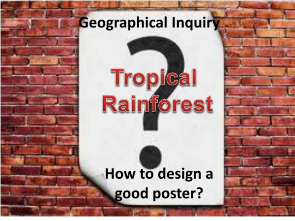
Tropical Rainforest. How to design a good poster?. Geographical Inquiry. What to do?. Design a poster to show the relationship between space and adaptation in the tropical rainforest.

How to design a good poster?
E N D
Presentation Transcript
Tropical Rainforest How to design a good poster? Geographical Inquiry
What to do? • Design a poster to show the relationship between space and adaptation in the tropical rainforest. • Use photographs (taken from your field investigation) & text to demonstrate your understanding of the above relationship. Minimise the use of text. • Size of poster: A2 ( we will print for you) Submit the soft copy. • Try this website for poster design: • http://www.postersessiononline.eu/diseno_powerpoint.asp
What is my message? • You are to showcase your understanding of the relationship between the 2 concepts : SPACE & ADAPTATION • E.g. relationship between Space & Diversity Where there is favourable growth conditions, the vegetation is the most diverse. • Content – show photographs taken of the rainforest supported by minimal text to show your understanding.
What should I have in my poster? • Tagline/Title – a phrase, statement or question • Message – understanding of the relationship between space and adaptation • Supported by photographs from the field • Names of members in the group
Who is my audience? • Effective communication starts with knowing who your audience is. ( In this case, your poster is displayed in the school for students, parents, teachers) • In their first 3 seconds your audience will determine whether to stay and explore your content or leave. • If they stay you have 30 seconds to secure their attention by conveying an overall understanding of your subject matter.
Deadline For Submission(Strictly NO Extension) 12 May (Tuesday) 13 May (Wednesday) ML 101 ML 102 ML 103 MN 101 MN 102 MN 103 • FN 101 • FN 102 • FN 103 • LE 101 • LE 102 • LE 103
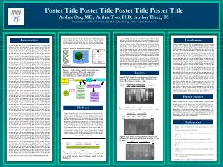
It should be understandableto the reader without verbal comment.
Use all the space but do not cram in the content - white space is an important part of the layout.
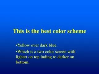
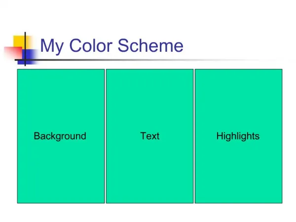
Use colour sparingly - limited use of a few colours is more striking than a 'rainbow' approach.
The title text should be readable from 6 metres away - at least 48-point text. The body text should be readable from 2 metres away - at least 24-point text
Choose a clear font with large inner space Good examples: Arial, Verdana, Georgia or Helvetica. Keep the word count as low as possible.
BAD POSTER DESIGN • too many words • too much text • no bullet format • organization of information is not broken down properly • can’t read it from a distance.
GOOD POSTER DESIGN • easy to read • eye-catching • good color combinations • interesting points.”