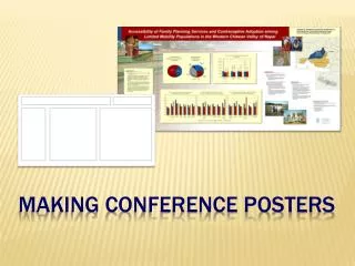
Making Posters
This guide provides essential tips for creating impactful scientific posters. It emphasizes the importance of poster size, recommending a 3x4 ft format for research reviews to maintain conciseness and clarity. Avoid using PowerPoint; instead, leverage software like Illustrator, Photoshop, or CorelDraw for better design capabilities. Ensure legibility with a minimum title height of 1 inch and body text at least 18 points. Focus on proper graphics usage to communicate data effectively, maintain open layout designs, and use a black text on white background for optimal readability.

Making Posters
E N D
Presentation Transcript
Making Posters Practical, Scientific and Artistic
How Big Should a Poster Be? • As small as it can • Cheaper • Faster (to make and to read) • Conciseness is a virtue: “if I had more time I would have written a shorter article” • 3 x 4 ft. for Research Review • Large enough • Use design to attract visitors
What software to Use? • 1.) NOT Powerpoint • 2.) Something to handle Vector Drawing and Raster Images as well as text (Canvas, Illustrator, CorelDraw, CAD, Photoshop, etc.) • 3.) NOT Powerpoint
What file format? • PDF • AI, CVX, DWX, CAD, etc. • Last Resort - TIFF • For PDF check in Acrobat 4 or 5 - mimics a printer.
Where to Print? • Geography 42” printer - $4/sq.ft. (email to posters@earth.uiuc.edu ) ~1/2 day turnaround • Beckman Institute 60” printer - ~$3.50/sq.ft. (see S. Hurst) 1/2 hour+ • Printing Services 60” printing - ~$6/sq.ft. (O&S web site) 2 days normal
Rules of Thumb • Title: min. 1 inch (72 points) high • San Serif Font (Helvetica, Arial, etc.) • Body Text: min. 18 points (24 better) • Serif Font typical for large areas (Times Roman, Palatino, etc.) • Left align, no justification • Picture Captions: min. 18 pt.
Rules of Thumb too! • Black text on white background is most readable (white text on black background least readable). • Open arrangement aids readability (white space is good!) • Bars and Boxes hurt readability and look ugly • Don’t use all Caps
Legibility Graphics reveal data. Indeed graphics can be more precise than conventional statistical computations. Excellence in statistical graphics consists of complex ideas communicated with clarity, precision, and efficiency. Edward Tufte, 1983
Legibility 2 Legibility 2 Graphics reveal data. Indeed graphics can be more precise than conventional statistical computations. Excellence in statistical graphics consists of complex ideas communicated with clarity, precision, and efficiency.
Legibility too Graphics reveal data. Indeed graphics can be more precise than conventional statistical computations. Excellence in statistical graphics consists of complex ideas communicated with clarity, precision, and efficiency.
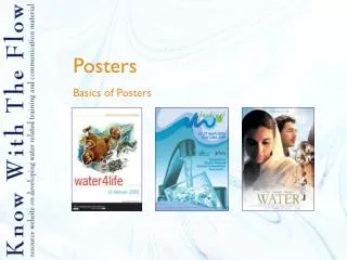
What about Graphics? • Graphical Displays should: • Show the data • Substance; not design, method, technology • Avoid distortion • Coherent • Encourage comparison • Show several levels of detail • Clear purpose • Integrated with description Tufte, 1983
Remove Redundancy 36.0 xx.x 36.0