
Posters
E N D
Presentation Transcript
Posters FfaenWalmsley
This poster advertises MINECRAFT POCKET EDITION. You see a man with a blue shirt, and dark blue trousers He is holding a (diamond) blue pickaxe this could connote a more masculine game. A pig and chicken are behind him. On a ridge you find a cow, under the ridge is a burning zombie. There are flowers on the floor. In the far background you see a blocky world, with two rectangular shapes to the far left (in mine craft, they are mine carts) On the bottom of the poster, you see a logo in red and the companies name, Mojang. This poster can connotes a free – for all game by the pickaxe in his hand, and the burning zombie, where you can choose how world is made. Some techniques that are used in the poster include the importance of colour, and this shows the user that the game is almost gender neutral, but does have a bias towards male gamers, which would be there target audience. As well as this the blue colour and light style also shows that the game isn’t a tough game, but more of a light hearted game which younger audiences could play. Another technique that has been used is the use of brand, which is shown at the top of the poster where it says “Minecraft” in larger letters then the pocket edition subtext.
In this poster you see a red sky, and the logo, MINECRAFT. Underneath you see a white, square object (ghast) about to attack, looking like its screaming. Then from front to back, you see, the same character, with the blue top, darker blue trousers and a pickaxe, a pig, a chicken, a green object, that looks like a human with no arms (creeper), a zombie, a skeleton, and a cross between a zombie and a pig. The floor is completely flat grass. This poster shows you the danger of Minecraft by you noticing the hostile status of the mobs in the poster, mainly the ghast in the background. This can also be connoted by the red sky. The style of the poster is light hearted, but also dangerous and this is shown by the simplistic nature of the poster and the red colour in the background. The direct mode of address is shown as it says Minecraft at the very top of the poster, which means that it isn’t hidden by anything.
This is a poster for the game DELVER. Behind the logo is a glowing black sword, and a black figure trying to grab it. You see a sweaty man, the protagonist in the centre holding a sword and a rod with a blue crystal on the top. He seems to be climbing a ladder. Trying to grab the rod, is a one eyed octopus, and on the opposite side you see a green slime. The floor looks to he a slimy wet blue colour. On the bottom you see the credits. “A game by CHAD CUDDIGAN ... Music by WHITEWOLF” The reason that this is displayed is because they are big names in the industry and people who are looking for games by these people would be interested and therefore would want to see it. This poster shows excitement and battle, and comedic elements are used. This posters style is quirky, fun and is aimed at a younger audience. This could be disagreed however, due to bats and skulls being connoted as scary, and this is backed up by the fear in the protagonists face. The sweat shown from the protagonists face can also show that the game is scary, but also could show that he is exhausted from climbing the ladders and running so far.
This poster is about Team Fortress 2, which you can see in the bottom left. The poster is about the engineer item, called a sentry. The poster consists of a red background with a red sentry, the sentry had a black tip and stand. In curly writing you see the word “Sentry” and in bold black you see the word “ Operating Manual” Towards the bottom of the poster you see the mythical companies logo, TF Industries. This poster connotes danger and violence. The type of game you could find from this is violent, and defiantly involves guns. You also see a retro vintage style in this poster, and shows the time this game could be set in 1990’s or a similar time. The indirect mode of address is shown because the title isn’t directly shown in the middle, unlike the Minecraft posters. Instead, this poster uses a more humorous approach and therefore doesn’t need the title of the game to attract the readers attention.
This poster is more on the advertising side, with a line on the very top in white saying “THIS SUMMER. MEET THE TEAM.” The imperative, telling you to meet the team directs the reader to do this and therefore shows the technique used that Valve uses to get the user to look at the game. You see a faded woman wearing red, appearing to have a cigar in her mouth. This shows mystery behind who this woman is, and therefore the reader thinks that this person will be important in the game.Below you see four quarter circles, in the shape of a circle with slits in between. Below that you see silhouette of all the main characters in team fortress 2. This silhouette connotes mystery so new players will be intrigued and will want to look at the poster, but old players will recognise the characters. Below that is white writing, saying “MISSION BEGINS JULY 17” “WWW.TF2MOVIE.COM” to the left, the Warner brothers logo, and on the right the VALVE logo. This poster connotes violence and mystery, not knowing who the “team” is. By using the capitals in the text it motivates you to want to download the game.
This poster is rather simple, only black and white. In the foreground you see the title, “GUILD WARS” In the background you see the number 2, however looking closer you see that the two is actually a dragon. Below that you see the text: “JUNE 28, 2012” “Pre-Order your Copy Today!” The pre-order text tells the reader to order their copy and therefore this makes the reader feel inclined to buy the product.“*Collector’s Edition only Available through Pre-Order until 5/30/12” This simple poster just gives you a sense of excitement found in guild wars. The style of poster is mysterious. This simple technique of the black on white and the graphic design of the ‘2’shows what the game is about, and the type of game. The direct address of the poster shows the reader exactly the information they need to pre-order a copy of the game.
This poster is for the game “ASSASSIN’S CREED III.” In the poster you see a man with a white shirt and hood with brown leather gloves holding and axe about to kill a man with a red coat, with a white hat on. The man in white is choking the other man with his spare hand. In the background you see a flag, and a battle. In the bottom right corner you see the UBISOFT logo. This shows you the extreme violence in the assassins creed series. The style of the poster is violent, in order to show viewers about how ‘hardcore’ the series is. There is a lot of white in the scene as it shows that this is a cold scene, which contrasts with cold blood. We also see the American flag in the background as well as a battle, so we are able to tell that this could be during a US civil war. We also see the axe swing of the protagonist, which shows that the game is not for young children, and this is reinforced with the dirt and grit and dark colours at the bottom of the poster.
This simple poster is about a game called portal 2. On the poster you see the quote in bold letters: “I THINK WE CAN BOTH PUT OUR DIFFERENCES BEHIND US FOR SCIENCE YOU MONSTER” The text size is important, for example the text ‘I think’ is big, and this gets the audiences attention, the next line ‘we can both’ tells the reader that there are more people then the one shown below, the text line ‘put our differences behind us’ is a purposely small font which shows the depth of the game, and the last two lines ‘for science’ and ‘you monster’ which shows the underlying themes of the game. Underneath that you see a person with a gun and some sort of boot. Too the left you see the game name, PORTAL 2, and to the right you see the release date, 4.19.11. This poster connotes simplicity and payback, and can give you a very simple idea of the story, and tells you that you should solve these puzzles without violence. The style of the poster is again, simple but complex at the same time. The effect of the poster is vital. The size on the fonts show emphasis on different areas. The black and white style is meant to be simplistic.
Like the previous poster, this is a simplistic black and white poster with a big, black, 2 in the centre. Below, you see a machine like object... This leads to mystery of who or what that object is. Again, the same two pieces of text, “PORTAL 2” and “4.19.11” Again, the poster is simple, but is great for puzzle fans, like the portal franchise. Also, this poster uses the same black and white colours to emphasise that the game can be simplistic and complex at the same time. The colour scheme that is used (black on white) gets the readers attention, and allows the reader to see the merger of the 2 and the character shown below, which also should be an iconic character for anyone returning to the franchise, which means that fans of said franchise will recognise the poster and the ‘2’ will make them excited for a sequel.
This poster is a rather simple poster about Batman Arkham City. The poster is intriguing to the viewer as most of the background is white due to smoke which connotes mystery. The red in the females top could connotes mystery as new players would not know who that person is and so would wonder who that woman is, making the person buy that game. She also has our back to us, which shows the reader that this person might not be nice, or follows her own rules. The protagonist (batman) is also looking down at her which could show the reader that he looks down to her, almost like she is less important. The poster is mainly black and white, again to connote mystery. We also see the male gaze effect in this poster, as the female in the poster is standing in a provocative manner. She also is holding her fingers to batman, which could show her disrespect to him. The use of an upward shot shows that both characters show power, and this allows the reader to see the game is about power and crime.
ALL Posters contained had the title of the game. All posters are for games.
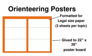
Posters contain the release date and background information. Some provide spoilers into the story. For example the portal posters give quotes and silhouettes. Some posters contain the main character. For example one of the portal posters contain a silhouette of the main character while the other does not. Some posters are advertising posters, some are teaser posters and some are fan-made posters. SOME
FEW Posters contain intriguing colours and hectic scenes, for example the portal poster contains a very simple scene, while the delver poster contains a very hectic scene, maybe to reflect the game itself. Also, few posters actually have in game pictures, for example the second Minecraft poster has been taken in game, while all the other posters have not. Few posters a portrait, while some are landscape or a custom size.