Crafting Effective Conference Posters: A Comprehensive Guide
230 likes | 363 Vues
This guide highlights the essential characteristics and effective strategies for creating impactful conference posters. The poster serves as a visual representation of your research, condensing complex information into an engaging format. Key components include a compelling title, clear sections for background, objectives, methods, results, and conclusions, as well as visual elements like graphs and illustrations. It emphasizes the importance of legible text, color contrast, and a clean layout to enhance comprehension and capture attention. Use this guide to effectively showcase your findings and connect with your audience.

Crafting Effective Conference Posters: A Comprehensive Guide
E N D
Presentation Transcript
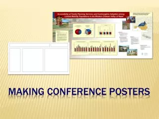
Characteristics of Conference Poster It tells a story of your research in an outline form. It is visually stimulating. It is easily assimilated.
Generating Content for Poster Condense text and graphics to 3-4 typed pages Focus on central ideas Highlight key results using illustrations Say why work is important Use organizing scheme BANNER: Title; authors and affiliations; unit logo INTRODUCTION: Background, objectives METHODS: Data, measures, instruments, analyses RESULTS: Key findings, illustrated CONCLUSIONS: Implications and importance ACKNOWLEDGEMENTS / REFERENCES
Generating Title for Poster Compose title that covers topic succinctly while generating interest Union Formation Implications of Race and Gender Gaps in Educational Attainment: The Case of Latin America over the Past Two Decades More concise: Transitions in Assortative Mating Patterns in Latin America, 1980-2000 Highlight the methodology Nontraditional Approach to Measuring Maternal Mortality …. Cross-Temporal Analysis with U.S. Health Survey Data …. Ask a question or begin with a phrase How Stable Are U.S. Careers? Employment Histories, 1967-2005 Beyond Educational Attainment: Influence of Parental High School Experiences on Children’s Test Performance
Design Applications PowerPoint Pros: Readily available, familiar, abundant templates Cons: Not print design tool, limited slide size, screen-to-print issues Adobe Creative Suites: InDesign Pros: Powerful, intended for print design Cons: Not easy to master for beginners, few templates Adobe Creative Suites: Illustrator Pros: Powerful, huge range in design possibilities, U-M templates Cons: Not easy to master for beginners, intended for made images MS Publisher Pros: Intended for print design, intuitive for Microsoft users Cons: Few templates
Design Applications: Using the Grid Format: 42 x 72 inchs, 4 column
Design Applications: Using the Grid Add text, adjust size of type and graphics
Formatting Guidelines A horizontal or vertical grid format can be divided into columns with banner space above. Plan for 1.5 inches around edges of poster and 1 inch between columns. Text-only columns are optimal at about 10-12 words per line, and about 10-20 lines per text block. Use bullet points whenever possible. Remember, your poster should be driven by graphical elements.
Sans serif type - Arial Sans serif type - Verdana Serif type - Times Roman Serif type - Book Antiqua Hybrid serif type – Baker Signet Hybrid serif type – Korinna Decorative type – Don’t Decorative type – Don’t Type Guidelines All type should be legible 3 to 6 feet from poster. Serif type is often used for body text, sans serif type, for headings. Type in ALL CAPS is more difficult to read, even in a headline, than title case. Banner title: 1 to 1.5 inches tall or 85 to 100 points, bold face Headings: 35 to 45 points, bold face Body text: 22 to 28 points Title Headings Body text
Note on Reverse Type Use high contrast type to background. Use for title or headings. Use sparingly for body text.
Printing in Chunks Print option in Microsoft Publisher: Check legibility of type/images
Elements of Design: Visual Interest Graphics and headings in large type should create initial interest Too much information reduces impact of story
Elements of Design: Colors & Composition Type, colors and composition should mesh well Avoid highly saturated backgrounds in multiple colors
Elements of Design: Visual Hierarchy A clear hierarchy improves information cogency and assimilation
Use of Limited Color Palette Using one color scheme for similar graphs and charts allows ready comparisons
Graphics: Accounting for Color Perception Ishihara Test for Color Blindness Perception of two-color contrasts among typical color blind shows problem with green-red distinction
Poster Graphics: Image Resolution Web graphics are generally much too low in resolution for poster printing Map at 72 ppi Map at 250 ppi
Data Presentation Even in the case of few data or statistics, a chart may have more impact and be easier to assimilate than a table
Logos and Wordmarks Download official U-M logos: https://www.logos.umich.edu/toolkit/downloads.html Download PSC logo (right click and Save Image As): http://www.psc.isr.umich.edu/img/PSC-logo.jpg
Before You Print Poster Print out full-size pieces to gauge legibility of type and graphics. Convert file to a high-quality pdf at full size. At FedExKinko’s, you can ask for small-size proof to judge colors. Local poster printing is available at: Digital Media Commons, Duderstadt Center FedEx Kinko’s, Liberty and Thompson (UM discount)
