Download
1 / 39
420 likes | 578 Vues
Elements and Principles of Art. visual elements. ELEMENTS. colour. Visual elements. Primary Colours. The Three primary colours are Red Blue and Yellow. They cannot be made by mixing other colours. Secondary Colours. Secondary colours can be made by mixing 2 primary colours.

E N D
visual elements ELEMENTS
colour Visual elements
Primary Colours The Three primary colours are Red Blue and Yellow. They cannot be made by mixing other colours.
Secondary Colours Secondary colours can be made by mixing 2 primary colours
Secondary Colours BLUE + YELLOW =GREEN RED + YELLOW = ORANGE RED + BLUE= PURPLE
COMPLIMENTARY COLOURS Complimentary colours are opposite each other on the colour wheel. They create a contrasting effect when placed together.
COOL COLOURS Generally cool colours are blues,greens and some purple and greys. Blue colours tend to recede in an image and make things look like the are going back into the distance.
WARM COLOURS Some examples of warm colours are Red, Orange,Yellow, and some purples and greys.Warm colours tend to come forward in an image.
What is happening in this picture? How has the artist created a feeling of space between the figures and the sky ? The warm reds bring the figures in the image forward, while the cool blues in the sky pulls the sky back into the distance.
Is this woman standing in the wind on a cool or sunny day? Its hard to tell without colour. Colour in an image influences how we feel in more ways than one.
One image makes us feel like the woman is standing in a cold and icy wind, the other a hot summers day.
TEXTURE is the surface quality of a shape - rough, smooth, soft hard glossy etc. Texture can be physical (tactile) or visual. Texture is an obvious and important element in a painting. To save confusion it can be broken into two parts. Physical Texture is the texture you can actually feel with your hand . The build up of paint, slipperiness of soft pastel, layering of collage - all the things that change the nature of the papers surface.Visual Texture is the illusion of physical texture, created with the materials you use. Paint can be manipulated to give the impression of texture, while the paper surface remains smooth and flat.Traditional transparent watercolour makes little use of physical texture other than the roughness of the paper. Mixed media allows advantage to be taken of physical as well as visual texture. Understanding the difference between physical and visual texture helps us take full advantage of this element. Things to consider. Texture is often something that finds its way into a painting in an accidental sort of way, particularly with mixed media. Lumps, bumps and scratches pop up all over the place, often bearing no relationship to the painting. Make it a habit to question whether these marks help the work or just add unnecessary confusion.Texture can have more impact through variation and relief - contrasting rough, course areas with orderly patterned areas and providing smooth areas of relief will make a painting far more interesting than an even, unrelieved texture running from edge to edge
Making and Creating: Using textured surfaces in portraiture. Observation has shown that we can define objects by representing surfaces as different textures. These examples were produced after students had investigated the artwork and in particular the portraits of Van Gogh. Repetition Repetition of brush strokes, with variation is interesting, without variation repetition can become monotonous
SHAPE A shape is a self contained defined area of geometric or organic form. A positive shape in a painting automatically creates a negative shape. POSITIVE/NEGATIVE SHAPE AND CONTOUR Increasing our understanding of spatial relationships require the ability to see the shape of where things are and the shape of where things arent. Admittedly, this terminology is cumbersome but the visual experience we will share will gradually clarify this wonderful dualism. The sensitivity to Positive/Negative relationship is critical to the perceptual skills we are seeking to develop. It is also a fundamental element in the understanding of effective pictorial composition.Our concern for shape naturally leads us to a concern for the delicate variations we find when looking at the outside edges, the contour, of form. SIZE is simply the relationship of the area occupied by one shape to that of another.
PRINCIPLES DIRECTION PROPORTION CONTRAST DOMINANCE/ EMPHASIS UNITY BALANCE REPETITION DEPTH IMAGES FROM ART DESIGN AND VISUAL THINKING http://char.txa.cornell.edu/first.htm
direction The element of direction can have a powerful influence on the mood of a painting. It is something often overlooked, but making a conscience decision about the dominant direction in a painting can have a noticeable effect on the atmosphere of the work. Sometimes the subject will dictate the dominant direction. Sometimes the subject will allow you to impose a direction on it. In the paintings below the subject dictates the direction. The strong horizontal lines of the water, boats and buildings in the first example give a feeling of stillness and calm. In the second example, the diagonal lines of the shoreline and the rocks reinforce the feeling of movement. The third example has a dominant vertical direction which adds a static orderly influence to what might be a random chaotic painting.
Contrast Contrast is the juxtaposition of opposing elements eg. opposite colours on the colour wheel - red / green, blue / orange etc. Contrast in tone or value - light / dark. Contrast in direction - horizontal / vertical. The major contrast in a painting should be located at the center of interest. Too much contrast scattered throughout a painting can destroy unity and make a work difficult to look at. Unless a feeling of chaos and confusion are what you are seeking, it is a good idea to carefully consider where to place your areas of maximum contrast. Harmony Harmony in painting is the visually satisfying effect of combining similar, related elements. eg.adjacent colours on the colour wheel, similar shapes etc
DOMINANCE Dominance gives a painting interest, counteracting confusion and monotony. Dominance can be applied to one or more of the elements to give emphasis
visual principles Emphaisis: Can be created by contrast, position, size, dominance or colour. Visually, it is the most important message that the designer wants to get across to the audience. Some artists’ place the centre of interest slightly off center and balance it with some minor themes to maintain our interest. Some artists avoid emphasis on purpose. They want all parts of the work to be equally interesting. What do you think was the artists intent in this picture story book illustration?
UNITY Relating the design elements to the the idea being expressed in a painting reinforces the principal of unity.eg. a painting with an active aggressive subject would work better with a dominant oblique direction, course, rough texture, angular lines etc. whereas a quiet passive subject would benefit from horizontal lines, soft texture and less tonal contrast. Unity in a painting also refers to the visual linking of various elements of the work.
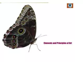
Balance There are two types of balance: symmetrical and asymmetrical. In symmetrical balance, one side of the design is like the other side. This is sometimes called formal balance. Asymmetrical balance is achieved when different elements are distributed on the design surface but the whole still appears to be unified or balanced. Balance in design: a large shape close to the center can be balanced by a small shape close to the edge. A large light toned shape will be balanced by a small dark toned shape (the darker the shape the heavier it appears to be). The butterfly is essentially symmetrical. Both sides are similar in visual weight and almost mirrored. Because symmetrical balance often looks more stiff and formal, sometimes it is called formal balance. Asymmetrical balance is more interesting. Both sides are similar in visual weight but not mirrored. It is more casual, dynamic, and relaxed feeling so it is often called informal balance.
Repetition Repetition in the visual arts can be thought of as a recurring shape, color, object, motif, or other element within a work of art. Visual repetition is one of the devices that artists sometimes use in order to move a viewer's eye across the surface of a canvas. Repetition can be used on all of the Visual Elements. If things are repeated without any change they can quickly get boring. However, repetition with variation can be both interesting and comfortably familiar. Repetition can be used for design of architectural features, such as the interiors of buildings. http://www.moe.gov.sg/edsoftware/ir/files/artrepetition/what_is_repetition_repetition_example_1.html This artwork that shows repetition being used to give a sense of movement. The yellow and red arrows show the directions of the sense of movement.
Depth effects of depth, space, projection toward the viewer add interest. Linear perspective in the real world makes things look smaller in the distance. Some artists try to avoid depth by making large things duller and small things brighter, and so on, to make the objects contradict realism. Many artists don't believe in realism even though they could do it if they wanted to. It seems too boring to them. Realism wouldn't be art for some artists. Here the same butterfly is shown twice. Which one appears closer? Note how size relationships create depth or space in a composition.
effects of depth and space. Linear perspective in the real world makes things look smaller in the distance. color intensity or brightness can also give a feeling of depth and space. Which of these butterflies are farther away? overlapping is often used by artists to create depth.
surfaces These paintings show how surfaces can be used in a drawing or painting. On the picture plane you can work with colour and shape. Planes cannot exist on their own, they occur together with colour and shapeand use line tone and colour. The number and variety of surfaces in a painting or drawing determines to a certain extent how interesting the art work will be.
light and shadow For something to be seen, there must be some kind of light source. Light and the contrast between light, dark and shadow, makes the shapes we see clearer. Different types of light includes natural light, and artificial light but whatever the light source a shadow is created. All objects have their own shadows as well as a cast shadow. Because an object must be lit in some way for us to be able to see it, light and shadow, or chiaroscuro, it is an important technique in art especially when we are trying to depict things realistically. The contrast between light and dark (chiaroscuro) is used by many artists such as Rembrandt and Dobell as the chief element in their paintings. Chiaroscuro, is a way of making objects look three dimensional. For example, if you draw a circle and shade in half of it, the circle will look like a sphere, The contrast between light and shadow is vital in the depiction of volume and space. In a still life, drawn with lines only and no shading, the objects appear to be directly next to each other. However, if the objects are depicted as having both their own and cast shadows, then the composition will develop a feeling of depth and space.
Texture making using line and pattern Diagonal lines using varying pressure Series of parallel diagonal lines in different directions Repetition of curving contour lines Combining lines of different types . Using simple overlapping patterns Repeating and varying patterns
USING LINE, TONE AND PATTERN TO CREATE TEXTURE Using a variety of pencils from 2B to 6B, experiment with the following techniques: Create a graduation of tone: shade from dark to light, and light to dark, varying the pressure on your pencil. Practice techniques of hatching and cross-hatching. Cover an area of the page with graphite, then remove parts with an eraser. Draw simple geometric shapes and solids (circles, spheres and cubes). Add shading and shadows to create the illusion of depth and solidity. . Student Activity: In the classroom examine the work of Jeannie Baker and discuss the techniques she uses to represent a rainforest environment. Explore the use of tonal gradation and mark making to create an illusion of surface texture.
Create the Illusion of space using overlapping, tone,shadows and size Objects in the distance appear smaller than objects in the foreground. Shapes appear brighter and darker in the foreground and lighter and greyer in the distance. Overlapping shapes also create a feeling of depth. Textures appear to become smoother in the background . Graduated tone creates an illusion of a 3-dimensional object. Pattern and texture
Exercise: Linear shading with markers Linear shading is a way to show shadow and depth with line. Linear shading gives art texture and movement too. There are three basic kinds of linear shading: stippling, hatching and cross-hatching. Artists use these techniques with a variety of media including pencils, pens and markers. Glossary Term: Value is the lightness or darkness of a color. You can get different values of a color by mixing its shades and tints. http://www.sanford-artedventures.com/create/try_this_3d.html
Linear Shading Stippling Stippling consists of a number of small dots. Firstly practice making dots of different sizes with a pen or marker. Make dots pressing lightly, Try some pressing firmly, Press quickly. Experiment to see how many different dots your marker or pen can make.Practice making many dots close together to make dark areas. Then make dots lighter and less dense as you move toward light Stippling: transform shapes to form Draw a circle with your pencil or marker. Circles appear flat. Make it look like a 3D sphere by stippling with your pen or marker from darkest to lightest. You might want to use a ball and shine a light on it and observe how the light falls on a sphere. Try squinting your eyes- it helps to see the 3D form emerge as you stipple.Try making other forms using shapes such as cubes, cylinders or irregular shapes
Linear shading Hatching Hatching consists of many little lines. Practice making many lines of different widths and lengths with your pen or marker. Experiment with different pressures and placing marks close together for darker tones and lighter pressure and greater spaces between lines for lighter tones. Cross Hatching Is lots of little lines that cross. It is very similar to hatching except the lines cross. Practice making cross hatching lines of different sizes with your markers. Make some lines drawing lightly. Try drawing firmly. Draw some quickly and then draw slowly. Experiment and see how many different cross hatching lines your marker can make. Practice making many cross hatching lines close together to make dark areas. Then make lighter, less dense cross hatching lines as you move towards light.
Hatching: Transform draw a can or cylinder shaped object and shine a directional light on it. Try rendering other shapes as well. shapes to forms,draw a cylinder. To make the shape have the appearance of a 3dimensional form use a hatching technique . Following the contour of the cylinder draw hatching lines from darkest to lightest bending around the form. Cross hatching transform shapes to forms. Draw a cube. Make it look more 3D by cross hatching from the darkest area to lightest. It helps to have the cross hatching lines bend around the form or stay straight in flat areas. You may want to find a cube form and shine a light on it to see how the light and shadows look
Now make a drawing using linear shading: stippling hatching or cross hatching.
Putting it together Exploring the elements and principles of art using: LINE COLOUR TEXTURE TONE SHAPE SPACE PATTERN REPETITION DIRECTION DEPTH CONTRAST BALANCE EXAMPLE FROM MALAYSIAN STUDENT
EXAMPLE STUDENT EXERCISE MALAYSIA
EXAMPLE STUDENT EXERCISE MALAYSIA