Chapter 5: Compositional Effects of Color
730 likes | 766 Vues
Explore how color, hue, chroma, and value influence the perception of 2D and 3D spaces. Learn techniques like value massing, bracketing, high key, and low key to create impactful compositions. Study Milton Glaser's design and balance warm & cool colors for emphasis. Understand open, limited, and structured palettes for effective color schemes.

Chapter 5: Compositional Effects of Color
E N D
Presentation Transcript
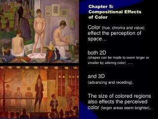
Chapter 5: Compositional Effects of Color Color (hue, chroma and value) effect the perception of space… both 2D (shapes can be made to seem larger or smaller by altering color) … and 3D (advancing and receding). The size of colored regions also effects the perceived color (larger areas seem brighter).
Value Massing • Group or ‘cluster’ values so that large regions or ‘masses’ have a very similar value. • The result is a composition with a simplified underlying structure — an arrangement of basic shapes that can, in practice, be made of many details, textures, colors and patterns.
Value Bracketing • Reduce the values used in a composition to only a few values. • These bracketed or limited values enable clear distinctions of shape to contrast well with each other, generally simplifying the gestalt of the image into well-defined forms, thus tending to unify the image.
High key • “High value” - a composition DOMINATED by high (or lighter) values. • Also, a surface or color that is high in value. • The French Impressionists typically worked in high key compositions. (Degas was an exception) Claude Monet Eugene Boudin Berthe Morisot
Low key • “Low value” - a composition DOMINATED by low (or darker) values. • Also, a surface or color that is low in value. • Carravaggio and Rembrandt typically worked in low key compositions with brilliantly contrasting, high-key focal regions.
All values are in a very dark range -- except accent areas. Image dominated by dark values, so high values have strong impact.
Glaser’s Aretha: anomaly trumps high chroma • Note that Milton Glaser’s Arethadesign is dominated by colors of similar chroma and value, except where he wants special attention – the face is distinctive because of a region of lighter value and of lower chroma than elsewhere. • Normally we expect brilliant chroma to command our attention – to draw the viewer’s eye. But when high chroma dominates, low chroma offers distinctive and eye-catching contrast. Also, the value contrast provides the only modeled form – all other forms are quite flat.
Milton Glaser • Aretha Franklin Poster • Lower Chroma and simple color modeling of face offer distinctive traits within this composition — and so draw the viewer’s eye from bold flat color elsewhere.
Milton Glaser • Aretha Franklin Poster • NOTE: the usual “rule” — high chroma attracts. • Here: • a) dominant chroma is high • B) low chroma is rare, • C) Therefore, lower chroma areas stand out--low chroma has graphic impact.
What happens when chroma is raised in the focal region (face)?
Balance: warms vs. cools • The text states that some color theorists believe that compositions can be pleasingly balanced by making sure that warm colors fill roughly the same area as cool colors. • Other theorists (of the Triadic Color System – John Goodwin), recommend a balance between warm sunlight hues (yellow and red) and cool “shadow” hues (blues) in proportions of roughly 3:5:8 ratio. • handy formulas, maybe – but not generally reliable.
Emphasis by contrast • Emphasis, generally, is created by distinctive contrast – any part of the design that is distinctly different than the rest of the design, stands out. • The designer selectively emphasizes some areas, while subduing others. • Contrast, however, cannot be established unless there is a dominant condition to contrast with. • There are many strategies by which contrast can be established.
The graphic impact of a particular color depends more on figure-ground contrast, than the color itself.
Open Palettes vs. Limited Palettes • Hue schemes can be generally divided into open palettes and Limited palettes. • Open palettes allow any hue to be present — either randomly selected hues or expressive/intuitively selected hues are used. • Limited Palettes confine the hues used to some pre-planned strategy. Structured hue schemes (e.g. analogous, complementary, triadic, etc.) are hue-plans that confine colors to only a few, selective hues.
Open Palette- vs.- Limited Palette vs. Structured Palette • Limited Palette concept simply acknowledges that only a small selection of colors are used. Typically, but not always, involving a structured palette. • Structured Palette concept refers to the usual “color schemes” — that is, a “structure” of monochromatic, or of Complementary, or split complementary hue selections. The hues that are used in the palette are selected according to some scheme, plan or structure. • Open Palette is an un-structured palette. Hues may be selected from any region of the color wheel. No structure is intentionally planned or imposed. Colors are most often applied intuitively, rather than analytically.
Open Palette • (p. 53) A color scheme that uses hues from all over the color wheel. • Potentially chaotic, but visually dynamic. • When an open palette is daringly used, some other characteristics of the design must provide unity – to hold it all together. [see Matisse and the Fauves]
Open Palette • Henri Matisse • Woman with a Green Stripe (Portrait of Mme Matisse) • Fauve (wild beast) • Though hues are clustered in generally complementary groups, the range is beyond that of a tight, structured complementary scheme.
Expressionism FrenchAcademicism ImpressionismMonet, Manet, Degas… Analytic Post-ImpressionismSeurat, Cezanne Expressionist Post-ImpressionismVan Gogh, Gauguin Cubism Picasso, Braque Matisse, Derain, Fauves, Expressionism • Henri Matisse • Expressionist color —colors selected for emotional impact, not for representational illusion.
ExpressionismFauvism Expressionists Fauves German Expressionists • Expressionist color —colors selected for emotional impact, not for representational illusion. • While Picasso and Braque explored the logic of analytic Cubism, Matisse & Derain & friends explored unrestrained, emotion-driven color — thereby creating the expressionist/romantic branch of early Modernism.
Henri Matisse • Fauve
Open Palette • Henri Matisse • Andre Derain • Fauve
Open Palette • Henri Matisse • Fauve
Open Palette • Henri Matisse • Fauve • Dishes and Fruit • 1901
Open Palette • Henri Matisse • Fauve • Note value structure — massed values and carefully placed contrasts organize the composition.
Open Palette • Henri Matisse • Fauve • Dishes and Fruit • 1901 • Henri Matisse • Fauve • Note value structure — massed values and carefully placed contrasts organize the composition.
Open Palette • Henri Matisse • Fauve
Open Palette • If a well-established hue-structure is NOT unifying this, then what is? • Explore the value structure. • Henri Matisse • Fauve
Open Palette • Explore the value structure. • Two value ranges-- • dominant value 3, • subordinant value 7
Open Palette • Henri Matisse • Fauve
Open Palette • Henri Matisse • Fauve
Open Palette • Andre Derain, Fauve
Open Palette • Andre Derain, Fauve
Open Palette • Andre Derain, Fauve
Open Palette • Andre Derain, Fauve
Open Palette • Andre Derain, Fauve
Open Palette • Raoul Dufy, Fauve
Open Palette • Raoul Dufy • Fauve
Note how few values are present — the major, massed values are quite limited, bracketed into two narrow ranges, plus some dark and light accents. This simplifies the visual busyness that varied hues offer. Massed and Limited Values • Raoul Dufy, Fauve
Open Palette • Raoul Dufy • Fauve • Coronation of King George
Open Palette • Raoul Dufy • Fauve • Coronation of King George
Open Palette • Raoul Dufy • Fauve • Coronation of King George
Open Palette • Raoul Dufy • Fauve • Le Moulin (1943)
Open Palette • Raoul Dufy • Fauve • Le Moulin (1943)
Janet Fish Contemporary Realist, watercolors and oil paintings • American, b. 1938 • Fish received her BA from Smith College, Northampton, Massachusetts and her MFA from Yale University School of Art & Architecture, New Haven, Connecticut. She is well known for her brilliantly hued, light filled still lifes and landscapes with figures, and an exciting body of prints in a variety of media. • Her work is in the collections of the Metropolitan Museum of Art, New York; the Whitney Museum of American Art, New York; the Dallas Museum of Art, Texas; The Art Institute of Chicago, Illinois; Powers Institute, Sydney, Australia; and others. • Fish is represented by D. C. Moore Gallery, 724 5th Avenue, New York, NY 10019. • http://wwol.inre.asu.edu/fish.html • Janet Fish
Open Palette • Janet Fish • Contemporary Realist, watercolors and oil paintings
Open Palette • Janet Fish • Contemporary Realist, watercolors and oil paintings