Download
1 / 8
80 likes | 229 Vues
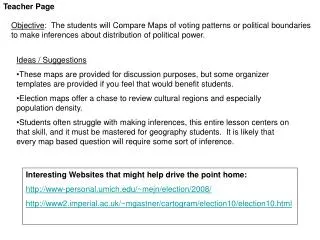
Teacher Page. Objective : The students will Compare Maps of voting patterns or political boundaries to make inferences about distribution of political power. Ideas / Suggestions

E N D
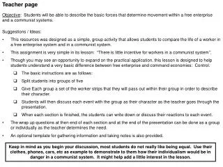
Teacher Page Objective: The students will Compare Maps of voting patterns or political boundaries to make inferences about distribution of political power. • Ideas / Suggestions • These maps are provided for discussion purposes, but some organizer templates are provided if you feel that would benefit students. • Election maps offer a chase to review cultural regions and especially population density. • Students often struggle with making inferences, this entire lesson centers on that skill, and it must be mastered for geography students. It is likely that every map based question will require some sort of inference. Interesting Websites that might help drive the point home: http://www-personal.umich.edu/~mejn/election/2008/ http://www2.imperial.ac.uk/~mgastner/cartogram/election10/election10.html
Election Maps Directions: Follow all directions to complete the organizer below. Describe the map, what do you see? # Answer any questions on the slide here. 1. 2. 3. 4. 5.
Are you familiar with this kind of map, what do the colors mean? What time of year do you seem to start seeing these?
This map indicates the average margin of victory in the last five elections. Therefore, if you were running for president as a democrat or a republican, which states, specifically, would you campaign in the most?
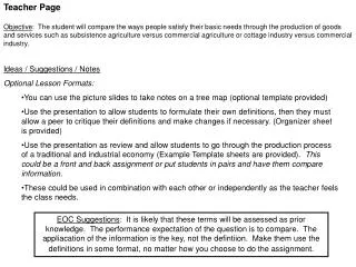
This map indicates to what political party the senators from each state belong. However, there is no key, what do you think the colors would mean? Remember each state has two senators. Blue means both are Democrats The stripes indicate at least one is an independent with no party Click Each for Answers Purple means one is from each party Red means both are Republican To Next Slide Thegreyanomaly. Creative Commons 2.5, January 2011.
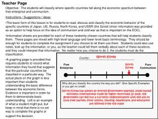
No states on this one. What are we looking at here? (Hint, this is an presidential election map) To clean this up, lets just see the majority results How is this different than the last map? Mark Newman. Creative Commons 3.0. December 2, 2008.
Explain this weird looking map. What do you call these things?