Conference presentations
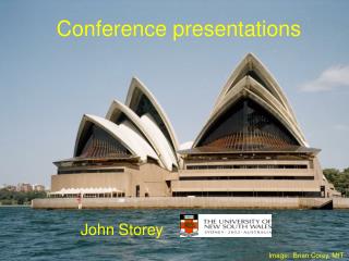
Conference presentations. John Storey. Image: Brian Corey, MIT. Keep the message simple. Your audience will remember at most three points from your talk. A simple message might be: Respect your audience Respect your colleagues Respect yourself. Image: Patrik Kaufmann.

Conference presentations
E N D
Presentation Transcript
Conference presentations John Storey Image: Brian Corey, MIT
Keep the message simple Your audience will remember at most three points from your talk. • A simple message might be: • Respect your audience • Respect your colleagues • Respect yourself Image: Patrik Kaufmann
Respect your audience • Ask yourself: “Why have these people come to listen to me?” • Set the context • Explain what is new • Explain why it is interesting • Learn from your mistakes (and those of others) Image: Guillaume Dargaud
Respect your audience • Talk to them, not the screen • Make eye contact with the full room • Aim to inform, not to impress • Don’t patronise or “talk down” to them • Don’t keep saying “I don’t have enough time to cover this...” Image: Guillaume Dargaud
Death by Powerpoint Be economical with the number of different • Colours • Fonts • Sizes • Transitions • Entrances • Gimmicks • Backgrounds
Powerpoint Be economical with the number of different • Colours • Fonts • Sizes • Transitions • Entrances • Gimmicks • Backgrounds
Readability • Use very high contrast (but not too high!) • Remember that some folk are colour blind • Use a large font size (>24 pt) This is 24 pt • Use “clean” fonts, eg Arial or Optima • This is Arial. This is Helvetica.This is unreadable. • If overlaying an image, use “transparency” to improve contrast • Leave a margin for projector misalignment
Images • Keep the original aspect ratio, but don’t be afraid to crop ruthlessly • Make sure the image adds to, rather than detracting from, the message • Images can be absorbed fast – watch the TV news and you will find that each image appears for an average of 5 seconds • Compress the file when finished
Jokes • Can help connect with the audience, but • Can also dilute your message • Can easily cause unintentional offence • Steer clear of sex, religion, politics and most other things that are funny • Very few physicists make good stand-up comics, but you never know...
NO SIGNAL Searching for input on RGB1...
Keep the message simple Your audience will remember at most three points from your talk. A simple message might be: • Respect your audience • Respect your colleagues • Respect yourself
NO SIGNAL Searching for input on RGB1...
NO CREDIBILITY Searching for speaker who knows what they’re doing...
Technicalities I • Check setup beforehand • Talk to auditorium staff about lighting and sound • Check the projector focus • Stand at the podium to see how it feels • Find (and test!) the laser pointer • Keep a backup on USB memory • If you plan to use a different computer: • Fonts, movies etc may not work on different computer
Technicalities II • If you plan to use your own laptop: • Ensure “Sleep mode”/screensaver is off (ie, switch to “Always on” or “Presentation”) • Switch off WiFi searching, Skype, reminders and virus updates • Run off mains power • No risk of batteries going flat • Computer will run faster • Take a careful look at your desktop…
Respect your colleagues • Properly acknowledge all images • Properly acknowledge your collaborators and co-workers • Give credit to prior work • Clearly distinguish your contribution from that of others • Thank your sponsors
Atmospheric transmission, summer time, Dome C Walden et al, PASP, 2005
Raw image of March 29th 2006 40sec exposure Milky way LMC SMC Satellite trail Image: A. Moore & Gattini Team
Just because you found something on the web, that doesn’t mean you can use it without acknowledgement (or indeed permission). Image: www.dandennis.com
In other words: “Do unto others...” Image: Colin Bonner
Respect yourself • Dress appropriately • Be confident • Or at least pretend to be confident • Avoid: • picking your nose • sniffling or scratching • fondling yourself
Credit your own slides Image: John Storey
The voice-over • Talk slowly and clearly • Not everyone in the audience is necessarily fluent in English • Explain technical terms, but avoid being patronising • Avoid jargon and TLAs (Three-Letter Acronyms) • Modulate the pace and the intensity • particularly with long presentations • No reading! Learn the first few sentences and closing remarks
The audience from hell will be… • Talking (maybe in other languages), • Texting their mates, • Allowing their mobile phones to ring, • Listening to MP3 players, • Emailing and web-surfing, • Typing noisily on their laptops, • Allowing their computers to make noises, • Snoring… Smile – and try harder to engage them!
The auditorium from hell… • Is noisy, hot and stuffy • Has the sun shining on the screen • Has an out-of-focus, misaligned projector with bad ghosting and keystone • Has a miserable sound system that constantly breaks into feedback... • ...and prevents you from relating to the audience
Timing • Never go over time... ...Ever • Talk to session chair beforehand about timing cues • Use a crib sheet or “hidden” symbols on your slides • Practice; then expect real talk to take 20% longer
Nerves • Everybody is nervous before a talk • If you are not nervous, it is time to retire... • Remember to breathe • Find a friendly face in the audience • Make fear your friend • Don’t forget to visit the “little astronomer’s room” before your talk... ...and before you put on the cordless mike!
Conclusion • You may wish to summarise the main points: • Respect your audience • Respect your colleagues • Respect yourself Image: John Storey

