Download
1 / 11
110 likes | 260 Vues
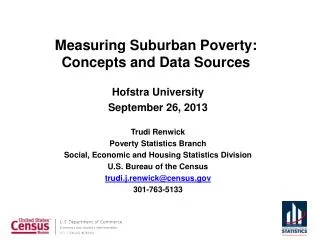
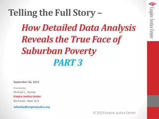
Telling the Full Story – . How Detailed Data Analysis Reveals the True Face of Suburban Poverty PART 3. September 26, 2013 Presented by: Michael L. Hanley Empire Justice Center Rochester, New York mhanley@empirejustice.org. The Problem With Zip Codes:. They are really just postal routes!

E N D
Telling the Full Story – How Detailed Data Analysis Reveals the True Face of Suburban PovertyPART 3 September 26, 2013 Presented by: Michael L. Hanley Empire Justice Center Rochester, New York mhanley@empirejustice.org
The Problem With Zip Codes: • They are really just postal routes! • They vary tremendously by size • They don’t have any consistent characteristics (number or type of housing or households); • They change frequently (10% of them each year). BUT – • They may be the only data you have; • They can give a helpful overview (better than “county” level); • People understand where they are (generally); • They can sometimes be correlated with other data, especially by using maps
The Foreclosure Example: One recent manifestation of increasing poverty has been an increase in foreclosures, particularly in suburban areas. These 3 zip codes were each identified as problem areas, and cross into suburban areas, but when we add the actual address data, we can get a clearer picture that the problem is even worse in the urban neighborhoods. You are likely to see the same thing if you compare TRACT level to Zip Code level poverty data. Looking at Zip Code data can me misleading or obscure the areas that are hardest hit.
Zip Code data is helpful, but would actually obscure the true extent to which foreclosures are impacting minority neighborhoods. Unlike most poverty issues, however, we can compare actual foreclosure addresses to the census data for minority homeowners at the block level: A mix of Black and Latino Homeowners The heaviest concentration of Black homeowners On this map African American homeowners are shown in reddish-brown, Latino homeowners are in an orange-tan, and Asian homeowners are shown with bright yellow dots.
When we add the foreclosure addresses from 2009 to August 2012 (blue dots) we can see the overlap to areas with the highest concentrations of Black and Latino homeowners (brown and orange dots, respectively).. This area of Black and Latino homeowners is also one of the highest areas for foreclosures This area has both the heaviest concentration both of Black homeowners and of foreclosures
We might expect foreclosures to be in the same patterns as where most of the housing is located. So, let’s compare the foreclosure addresses to the census block level data for White, non-Latino households: Here we see just the location of the actual Lis Pendens, shown in Blue Dots.
These butter colored areas are actually dots, dispersed by census block. They show the location of all of the White, non-Latino homeowners.
Compare the addresses of foreclosures (blue dots) to the locations of White, non-Latino households (the butter colored dots). Although non-minorities do live in areas impacted by foreclosures . . . . . . most White, non-Latino homeowners live in areas less impacted by foreclosures. Here you can also see that the numberand density of foreclosures are more likely to impact the central city tax base than those of the 19 surrounding towns. The two areas do not experience the impact of the poverty that led to the foreclosures in the same way.
The Problem With Zip Codes: A tablelisting the numbers of foreclosures in a county by zip code can be very misleading. Zip Code totals alone would suggest some of the suburban zip codes are in similar foreclosure distress situations to the most impacted Zip Codes within the city. They might even have similar number of housing units. But in one example, a suburban zip code with a similar number of foreclosures was nearly 30 times the size of the urban zip code. Accordingly, the impact on the housing market in the suburban zip code was far less. The density of foreclosures in the urban zip code and their proximity to other impacted neighborhoods is typically significantly greater in urban areas, and thus creates a far greater impact on abandonment and property values. In both cases, the homeowners need help, but in the urban area the damage is greater and impacts more “bystanders.” Beware of similar issues when looking at poverty data!
Comparing the total numbers of families in poverty in the suburbs to those in urban areas can mask the serious additional issues created by concentrations of poverty in urban areas. The bottom line? Both “suburban” and “urban” poverty numbers raise important issues that need to be understood and addressed -- but they are likely to be different!
Contact Information: Michael L. Hanley Empire Justice Center Rochester, New York mhanley@empirejustice.org