Descriptive vs. Inferential Statistics
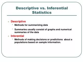
Descriptive vs. Inferential Statistics. Descriptive Methods for summarizing data Summaries usually consist of graphs and numerical summaries of the data Inferential Methods of making decisions or predictions about a populations based on sample information. Data Vocabulary.

Descriptive vs. Inferential Statistics
E N D
Presentation Transcript
Descriptive vs. Inferential Statistics • Descriptive • Methods for summarizing data • Summaries usually consist of graphs and numerical summaries of the data • Inferential • Methods of making decisions or predictions about a populations based on sample information.
Data Vocabulary • We will refer to Data as plural and data set as a particular collection of data as a whole. • Observation – each data value. • Subject(or individual) – an item for study (e.g., an employee in your company). • Variable – a characteristic about the subject or individual (e.g., employee’s income).
Data Vocabulary Consider the multivariate data set with 5 variables 8 subjects 5 x 8 = 40 observations
Types of Data Attribute(qualitative) Numerical(quantitative) Verbal LabelX = economics(your major) CodedX = 3(i.e., economics) DiscreteX = 2(your siblings) ContinuousX = 3.15(your GPA) Data Vocabulary – Data Types • A data set may have a mixture of data types.
Data Vocabulary – Attribute Data • Also called categorical, nominal or qualitative data. • Values are described by words rather than numbers. • For example, • Automobile style (e.g., X = full, midsize, compact, subcompact).
Data Vocabulary – Data Coding • Coding refers to using numbers to represent categories to facilitate statistical analysis. • Coding an attribute as a number does not make the data numerical. • For example, 1 = Bachelor’s, 2 = Master’s, 3 = Doctorate 1 = Liberal, 2 = Moderate, 3 = Conservative
Data Vocabulary – Binary Data • A binary variable has only two values, 1 = presence, 0 = absence of a characteristic of interest (codes themselves are arbitrary). • For example, 1 = employed, 0 = not employed 1 = married, 0 = not married 1 = male, 0 = female 1 = female, 0 = male • The coding itself has no numerical value so binary variables are attribute data.
Data Vocabulary – Numerical Data • Numerical or quantitative data arise from counting or some kind of mathematical operation. • For example, - Number of auto insurance claims filed in March (e.g., X = 114 claims).- Ratio of profit to sales for last quarter (e.g., X = 0.0447). • Can be broken down into two types – discrete or continuous data.
Data Vocabulary – Discrete Data • A numerical variable with a countable number of values that can be represented by an integer (no fractional values). • For example, - Number of Medicaid patients (e.g., X = 2).- Number of takeoffs at O’Hare (e.g., X = 37)
Data Vocabulary – Continuous Data • A numerical variable that can have any value within an interval (e.g., length, weight, time, sales, price/earnings ratios). • Any continuous interval contains infinitely many possible values (e.g., 426 < X < 428).
Data Vocabulary - Rounding • Ambiguity is introduced when continuous data are rounded to whole numbers. • Underlying measurement scale is continuous. • Precision of measurement depends on instrument. • Sometimes discrete data are treated as continuous when the range is very large (e.g., SAT scores) and small differences (e.g., 604 or 605) aren’t of much importance.
Nominal Level of Measurement • Nominal data merely identify a category. • Nominal data are qualitative, attribute, categorical or classification data (e.g., Apple, Compaq, Dell, HP). • Nominal data are usually coded numerically, codes are arbitrary (e.g., 1 = Apple, 2 = Compaq, 3 = Dell, 4 = HP). • Only mathematical operations are counting (e.g., frequencies) and simple statistics.
Ordinal Level of Measurement • Ordinal data codes can be ranked(e.g., 1 = Frequently, 2 = Sometimes, 3 = Rarely, 4 = Never). • Distance between codes is not meaningful (e.g., distance between 1 and 2, or between 2 and 3, or between 3 and 4 lacks meaning).Many useful statistical tests exist for ordinal data. Especially useful in social science, marketing and human resource research.
Interval Level of Measurement • Data can not only be ranked, but also have meaningful intervals between scale points. (e.g., difference between 60F and 70F is same as difference between 20F and 30F). • Since intervals between numbers represent distances, mathematical operations can be performed (e.g., average). • Zero point of interval scales is arbitrary, so ratios are not meaningful (e.g., 60F is not twice as warm as 30F).
Level of Measurement – Likert Scales • A special case of interval data frequently used in survey research. • The coarseness of a Likert scale refers to the number of scale points (typically 5 or 7).
Likert Scales • Careful choice of verbal anchors results in measurable intervals (e.g., the distance from 1 to 2 is “the same” as the interval, say, from 3 to 4). • Ratios are not meaningful (e.g., here 4 is not twice 2). • Many statistical calculations can be performed (e.g., averages, correlations, etc.).
Time Series vs. Cross-sectional Data – Time Series • Each observation in the sample represents a different equally spaced point in time (e.g., years, months, days). • Periodicity may be annual, quarterly, monthly, weekly, daily, hourly, etc. • We are interested in trends and patterns over time (e.g., annual growth in consumer debit card use from 1999 to 2008).
Time Series vs. Cross-sectional Data – Cross-sectional • Each observation represents a different individual unit (e.g., person) at the same point in time (e.g., monthly VISA balances). • We are interested in - variation among observations or in - relationships. • We can combine the two data types to get pooled cross-sectional and time series data.
Population and Sample • Population: All subjects of interest • Sample: Subset of the population for whom we have data
Sample Populations and Samples Population
Example: The Sample and the Population for an Exit Poll • In California in 2003, a special election was held to consider whether Governor Gray Davis should be recalled from office. • An exit poll sampled 3160 of the 8 million people who voted.
Example: The Sample and the Population for an Exit Poll Example: The Sample and the Population for an Exit Poll • What’s the sample and the population for this exit poll? • The population was the 8 million people who voted in the election. • The sample was the 3160 voters who were interviewed in the exit poll.
Parameter and Statistic • A parameteris a numerical summary of the population • A statistic is a numerical summary of a sample taken from the population
=RANDBETWEEN(1,48) Simple Random Sample • Every item in the population of N items has the same chance of being chosen in the sample of n items. • We rely on random numbersto select a name.
Graphical Summaries • Describe the main features of a variable • For Quantitative variables: key features are center (Where are the data values concentrated? What seem to be typical or middle data values?) spread (How much variation is there in the data? How spread out are the data values? Are there unusual values?) and shape (Are the data values distributed symmetrically? Skewed? Sharply peaked? Flat? Bimodal? • For Categorical variables: key feature is the percentage in each of the categories
Frequency Table • A method of organizing data • Lists all possible values for a variable along with the number of observations for each value • Natural categories exist for qualitative variables • For quantitative variables artificial “bins” are created
Example: Shark Attacks Example: Shark Attacks • What is the variable? • Is it categorical or quantitative? • How is the proportion for Florida calculated? • How is the % for Florida calculated?
Example: Shark Attacks • Insights – what the data tells us about shark attacks
Graphs for Categorical Data • Pie Chart: A circle having a “slice of pie” for each category. Center angle of slice represents relative frequency/percentage. • Bar Graph: A graph that displays a vertical bar for each category. Length of bars represents frequency.
Pie Chart • A pie chart can only convey a general idea of the data. • Pie charts should be used to portray data which sum to a total (e.g., percent market shares). • A pie chart should only have a few (i.e., 3 to 5) slices. • Each slice should be labeled with data values or percents.
2-D Pie Chart Bar Chart Pie Charts Are Often Abused • Consider the following charts used to illustrate an article from the Wall Street Journal. Which type is better? Why?
Exploded 3-D Pie Chart Exploded Pie Chart ILL-Advised Pie Charts Options • Exploded and 3-D pie charts add strong visual impact but slices are hard to assess.
Summarizing Quantitative Data • Example: Price/Earnings Ratios • P/E ratios are current stock price divided by earnings per share in the last 12 months. For example:
Graphs for Quantitative Data • Dot Plot: shows a dot for each observation • Histogram: uses bars to portray the data Which is Best? • Dot-plot • More useful for small data sets • Data values are retained • Histogram • More useful for large data sets • Most compact display • More flexibility in defining intervals
Dot Plot • A dot plot is the simplest graphical display of n individual values of numerical data. - Easy to understand - Not good for large samples (e.g., > 5,000). • Make a scale that covers the data range • Mark the axes and label them • Plot each data value as a dot above the scale at its approximate location • If more than one data value lies at about the same axis location, the dots are piled up vertically.
Dot Plot • Range of data shows dispersion. • Clustering shows central tendency. • Dot plots do not tell much of shape of distribution. • Can add annotations (text boxes) to call attention to specific features.
Frequency Distributions and Histograms • A frequency distribution is a table formed by classifying n data values into k classes (bins). • Bin limits define the values to be included in each bin. Widths must all be the same. • Frequencies are the number of observations within each bin. • Expressas relative frequencies (frequency divided by the total) or percentages (relative frequency times 100).
Constructing a Frequency Distribution • Sort data in ascending order (e.g., P/E ratios) • Choose the number of bins (k) • - k should be much smaller than n. • Too many bins results in sparsely populated bins, too few and dissimilar data values are lumped together.
Bin width Bin width Constructing a Frequency Distribution Set the bin limits according to k from Sturges’ Rule: For example, for k = 7 bins, the approximate bin width is: To obtain “nice” limits, round the width to 10 and start the first bin at 0 to yield: 0, 10, 20, 30, 40, 50, 60, 70
Constructing a Frequency Distribution • Put the data values in the appropriate bin • In general, the lower limit is included in the bin while • the upper limit is excluded. • Create the table: you can include • Frequencies – counts for each bin • Relative frequencies – absolute frequency divided by • total number of data values. • Cumulative frequencies – accumulated relative • frequency values as bin limits increase.
3A-49 Bin Limits for the P/E Ratio Data
3A-50 Frequency Distributions and Histograms • A histogram is a graphical representation of a frequency distribution. • Y-axis shows frequency within each bin. • A histogram is a bar chart with no gaps between bars • X-axis ticks shows end points of each bin.