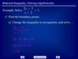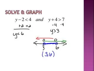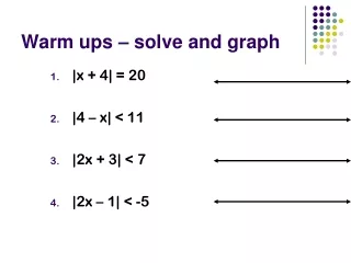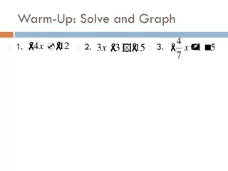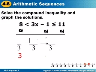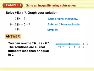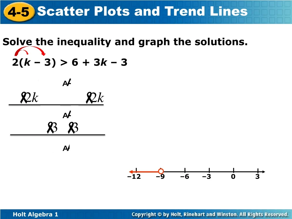
Solve the inequality and graph the solutions.
190 likes | 209 Vues
Learn to create & interpret scatter plots, use trend lines for predictions, and identify correlations between data sets. Practice graphing data and making predictions based on trends. Solve inequalities and graph solutions.

Solve the inequality and graph the solutions.
E N D
Presentation Transcript
–12 –9 –6 –3 0 3 Solve the inequality and graph the solutions. 2(k – 3) > 6 + 3k – 3
Objectives Create and interpret scatter plots. Use trend lines to make predictions.
A scatter plot is a graph with points plotted to show a possible relationship between two sets of data.
The table shows the number of cookies in a jar from the time since they were baked. Graph a scatter plot using the given data.
The table shows the number of points scored by a high school football team in the first four games of a season. Graph a scatter plot using the given data.
A correlation describes a relationship between two data sets. A graph may show the correlation between data.
Describe the correlation illustrated by the scatter plot. Positive Correlation
Describe the correlation illustrated by the scatter plot. Positive Correlation
Identify the correlation you would expect to see between the pair of data sets. Explain. the average temperature in a city and the number of speeding tickets given in the city NO CORRELATION!The number of speeding tickets has nothing to do with the temperature.
the number of people in an audience and ticket sales POSITIVE CORRELATION! As ticket sales increase, the number of people in the audience increases.
a runner’s time and the distance to the finish line NEGATIVE CORRELATION!As a runner’s time increases, the distance to the finish line decreases.
the temperature in Houston and the number of cars sold in Boston NO CORRELATION!The temperature in Houston has nothing to do with the number of cars sold in Boston.
the number of members in a family and the size of the family’s grocery bill POSITIVE CORRELATION! As the number of members in a family increases, the size of the grocery bill increases.
the number of times you sharpen your pencil and the length of your pencil NEGATIVE CORRELATION! As the number of times you sharpen your pencil increases, the length of your pencil decreases.
Choose the scatter plot that best represents the relationship between the age of a car and the amount of money spent each year on repairs. Explain. Graph A Graph C Graph B Graph A shows negative values, so it is incorrect. Graph C shows negative correlation, so it is incorrect. Graph B is the correct scatter plot.
Choose the scatter plot that best represents the relationship between the number of minutes since a pie has been taken out of the oven and the temperature of the pie. Explain. Graph B Graph C Graph A Graph B shows the pie cooling while it is in the oven, so it is incorrect. Graph C shows the temperature of the pie increasing, so it is incorrect. Graph A is the correct answer.
You can graph a function on a scatter plot to help show a relationship in the data. Sometimes the function is a straight line. This line, called a trend line, helps show the correlation between data sets more clearly. It can also be helpful when making predictions based on the data.
The scatter plot shows a relationship between the total amount of money collected at the concession stand and the total number of tickets sold at a movie theater. Based on this relationship, predict how much money will be collected at the concession stand when 150 tickets have been sold. A trend line is used to make a prediction. Based on the data, $750 is a reasonable prediction of how much money will be collected when 150 tickets have been sold.
Based on the trend line, predict how many wrapping paper rolls need to be sold to raise $500. HW pp. 267-269/14-32 even,34-41 Based on the data, about 75 wrapping paper rolls is a reasonable prediction of how many rolls need to be sold to raise $500.