Human Memory
Human Memory. By Chris Gardner 10155520. The Different Types of Memory. Short Term Memory. Types of Long Term Memory. Types of Long Term Memory. Procedural Long Term Memory is, essentially, remembering skills like playing a guitar or riding a bike.

Human Memory
E N D
Presentation Transcript
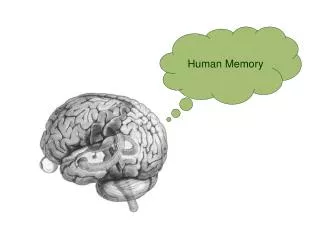
Human Memory By Chris Gardner 10155520
Types of Long Term Memory • Procedural Long Term Memory is, essentially, remembering skills like playing a guitar or riding a bike. • Declarative Long Term Memory has two subsets, Semantic and Episodic. • Semantic memory is related towards words and word meaning, like remembering names or having a large vocabulary. • Episodic memory relates to events, like remembering one’s last birthday.
The Answer is... No!
Memory Retrieval • People have very subjective memories: They may be good at remembering some things but terrible at others • When you “forget” something, it is usually because you didn’t effectively encode the information into long term memory, and as such have trouble retrieving it • Distractions make it harder to encode something into long term memory, so you are less likely to “remember” something if you experienced it in a distracting environment
Design Rationale • Creating an effective slideshow or presentation is considerably different from creating a text document. There is considerably more emphasis on flow, rhythm and colour than on text and information, and as such sometimes information must be sacrificed for a more visually engaging, dynamic design. • In order to appear more ordered and coherent, the principle of unity is used very strongly. The consistent colour scheme and slide background serve to keep everything under the “umbrella”, if you will, of the human memory theme. Since “the viewer needs to be able to understand what he or she is seeing” (Evans & Thomas, p. 3), the consistency and unity of the colour scheme, font and background graphics help create an atmosphere that is very welcoming, making it seem like one overarching idea as opposed to many disparate ones. There is also a degree of variety used, in order to keep the viewer engaged and interested. The text heavy slides (2, 3, 5 and 7) are broken up by slides demonstrating a concept or idea simply and graphically, making it easier, more digestible and more aesthetically pleasing. • To maintain a logical progression of information, the slides have been set up with a very prominent, easy to read heading. As such, the headings are the “dominant” elements; the elements that have been “given the most visual weight, the element of primary emphasis that advances to the foreground in the composition” (McClurg-Genevese, p. 1). The text and background serve as the sub-dominant and subordinate elements, respectively, and establish an hierarchy of heading, text and background, establishing the main point and then expanding upon it.
Design Rationale • The text is , proportionally, the most important element. The graphics, tables and flowcharts serve more as organisers than eye catching elements. Slides like 2 and 3 were structured particularly meticulously, creating a “proportional harmony” that makes the whole presentation seem very smooth, flowing and logical. • Slides 4, 6 and 8 have a very strong sense of rhythm, guiding the readers eye through a concept or idea in a logical fashion. This gives these particular slides “shape to the movement in a composition” (Evans & Thomas, p. 13) and makes it a more logical read. Slides like 3, on the other hand, don’t have any logical rhythm to speak of, but since the information can be read in any order, it acts more as a quality than a detriment. • The use of the blue colour scheme is mostly to avoid an overly dynamic vibe to the slide show. The colour is muted, yet visually engaging, and connotes a very relaxed, calm atmosphere. The use of a consistent colour theme throughout avoids an overly confusing, visually unpleasant atmosphere and aids the flow, rhythm and coherent unity of the entire slide show.
References • Evans, P. & Thomas, M. (2008). Exploring the elements of design. 5 Maxwell drive, Clifton Park, New York: Thomson Delmar learning • McClurg-Genevese, J. (2005). The principles of design. Retrieved 17/09/2009.http://www.digital-web.com/articles/principles_of_design/‘ • Human Memory. (2009). Retrieved 26/08/09. http://www.cc.gatech.edu/classes/cs6751_97_winter/Topics/human-cap/memory.html • Mohs, R. (2009). How human memory works. Retrieved 26/08/09.http://health.howstuffworks.com/human-memory.htm


![[Human Memory] 10.Knowledge](https://cdn1.slideserve.com/2691475/human-memory-10-knowledge-dt.jpg)