Download
1 / 11
110 likes | 243 Vues
Discover essential tips for web design with a focus on color schemes and font usage. This guide outlines best practices for using backgrounds, layouts, and typography to create an engaging website. Learn why certain colors, like red and black, can detract from readability, and understand how to choose effective palettes that enhance visual appeal. We'll discuss the importance of contrast, font size, and maintaining a consistent style. Whether you're designing a personal site or a professional project, these tips will help you avoid common pitfalls and elevate your design.

E N D
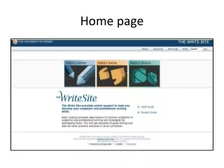
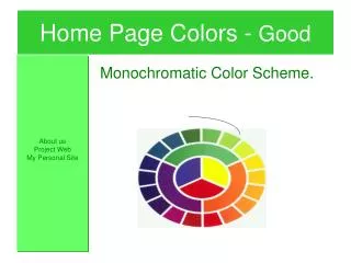
HomePage Colors - Good About us Project Web My Personal Site Monochromatic Color Scheme.
Web Design The Good, the Bad, and the Ugly!
Web Design Topics • Background Page Colors • Layouts • Color Schemes • Fonts
Home Page Colors -Ugly My home Page Stay away from base colors like red. They are hard to read!
HomePage Colors –More Uglier • Never, never use black as a base.
Home Page Colors - Bad • Using soft a soft color palette for background color. • Using different colored fonts ie: yellow • Using fonts in general.
HomePage Colors - Good About us Project Web My Personal Site • Stick to white/light colored backgrounds. • Use color for titles and toolbars. • Try using a color wheel for a decorators touch
HomePage Colors - Good About us Project Web My Personal Site Monochromatic Color Scheme.
Home Page Colors - Good About us Project Web My Personal Site Contrasting Color Scheme.
Font Usage – Ugly to Bad • Donot mixdifferentcolorsinsentences! • Do notmix fontsin a sentence. • Do Not make Fonts to small. (10 pt)
Font Usage - Good • Use a different font for heading and paragraphs. • Acceptable Paragraph type sizes are: Example of 14pt Example of 16 pt