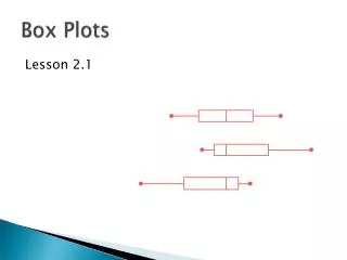
Understanding Box Plots: Comparing Class Test Scores
This guide explains how to visualize the distribution of test scores between two classes using box plots (also known as box-and-whisker plots). It details the steps to calculate key statistical measures: the minimum mark, maximum mark, lower quartile, median, and upper quartile. With this information, you can create a box plot representing each class's data spread. The rectangular box illustrates the interquartile range, while whiskers indicate the range from minimum to maximum values, offering a clear comparative view of student performance.

Understanding Box Plots: Comparing Class Test Scores
E N D
Presentation Transcript
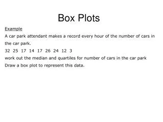
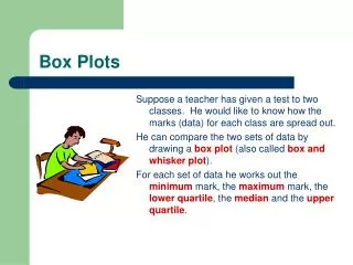
Box Plots Suppose a teacher has given a test to two classes. He would like to know how the marks (data) for each class are spread out. He can compare the two sets of data by drawing a box plot(also called box and whisker plot). For each set of data he works out the minimummark, the maximum mark, the lower quartile, the medianand the upper quartile.
0 50 100 Box Plots He is now ready to illustrate, above an appropriate number line, the way each set of data is spread out by drawing the box plot for each class. He draws a rectangular box stretching from the lower quartile to the upper quartile. Across this box he draws a line to indicate the location of the median. From the ends of the box he draws straight lines (whiskers) parallel to the number line as far as the minimum mark and the maximum mark.
0 50 100 Box plots Lower Quartile Upper Quartile Minimum Value Maximum Value Median