Graphing Linear Relationships
Graphing Linear Relationships. What are the objectives of Unit 3?. To learn how to critically analyze data using graphs. To learn how to use graphing techniques to arrive at mathematical equations that describes the relationship between two variables.

Graphing Linear Relationships
E N D
Presentation Transcript
What are the objectives of Unit 3? • To learn how to critically analyze data using graphs. • To learn how to use graphing techniques to arrive at mathematical equations that describes the relationship between two variables. • To learn to connect the mathematical slope of a line to a physical property
Graphs compensate for shortcomings of data tables. • Difficult to determine relationship between variables. • Impractical to find equation
The most important purposes of a graph are • Quick and efficient organization of large amounts of data. • Demonstration of relationship between independent and dependent variables. • Calculation of a mathematical equation that describes the relationship in the data.
Scientists who used graphs to make important discoveries. • Galileo’s falling body experiments showed all objects, no matter what they weigh fall at the same rate. • Schwabe’s sunspot data showed that sunspots are at a maximum every 11 years.
Dependent Axis and Independent Axis • In any graph there are at least 2 axes • Vertical axis is called the y-axis • Plot the dependent variable on the y-axis. • May refer to it as y.
Horizontal axis is called the x-axis. • Plot the independent variable here except when time is a variable • Always plot time on the x-axis • May refer to the variable as x
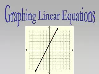
(x,y) is the pair of data. Plotting this point allows you tosee the relationship between the variables. • Linear Data – data points form a straight line.
Best Fit Line Approximates the linear trend of the data. • The line passes in between the data points. • The line does not have to pass through all of the points. • Points should be relatively close to one another. • Random error causes about ½ the points to be above the line and ½ to be below the line. Use a straight edge to approximate. • Can be computed by mathematical equation or computer program like Excel.
Best Fit Curve • Used when data points form a curve. • Should pass between points but must remain smooth.
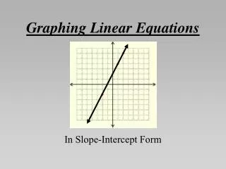
Types of Linear Relationships Direct Linear Relationships • As the independent variable increases, the dependent variable increases. • As the independent variable decreases, the dependent variable decreases. • Example of both is ice cream cone - Melting vs. Temperature: Both variables move in the same direction. • Have positive slopes and appear to go uphill. • Equation is y=mx+b
Direct Linear Proportion • A direct linear relationship that passes through the origin (0,0). • y-intercept is 0. • Equation is y = mx.
Indirect Linear Relationships • Indirect means as one variable increases, the other decreases. • Have negative slopes and look like downhill lines. • Indirect linear proportions are extremely unusual in the physical sciences since science deals with real situations.
Indirect Linear Proportion • Data starts at (0,0) and decreases into the negative region of the graph.
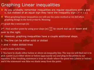
Horizontal Line • 1. Indicates there is no measurable relationship between the variables. • 2. The independent variable is an irrelevant variable. • Mass and Arc Size in the pendulum lab
Let’s think a minute • What would a vertical line tell you? • The values of the replicates are changing. • A variable has not been controlled. • You’ve made a mistake in your procedure.
Calculating the Equation of a Plotted Line • In Algebra the general equation for a line is y =mx + b • x is the independent variable • y is the dependent variable • m is the slope • b is the y-intercept • We will determine a specific equation for a specific set of data where x and y will be replaced with more descriptive variables.
Calculating the Slope • The slope of a line describes how quickly the dependent variable changes with respect to the independent variable. • Large positive slopes - steep uphill • Small positive slopes – gradual uphill • Large negative slopes – steep downhill • Small negative slopes – gradual downhill
To calculate slope • Pick two points on the line (not data points) • Pick points where the line perfectly crosses a corner of the grid. Move from left to right. • Choose points as far apart as possible • Use
Significant Figures in Graphing • The significant figures should be determined by the accuracy of the data. • Use the place value of the independent (x) and dependent variables (y) in the data table when selecting points off the graph
Calculating the y- intercept • The y-intercept is the value of the dependent variable at the point where the best fit line crosses the y-axis. • Estimate this value from the graph. • Express with units of the dependent variable. • If the y-intercept is not shown on the graph, plug in values of a point and solve for b in the equation for the line.
Putting it all Together • Change the variables from x and y to more appropriate variable. • 2. Example pressure = P, temperature = T • a. clarity • b. real situation • If there is not a standard variable, define a variable
Using the Equation • Why use the equation? • So we do not have to redo the experiment each time we need a new data point.
P 66 continued • Select data points (2.0°C, 5.00atm) and (68.0°C,16.00atm) • Calculating Slope: • Slope = 0.167atm/°C • Equation of the line is: • y = (0.167atm/°C )x + b
Now we need b • y = (0.167 atm/ºC) x + b • 5.00 atm = (0.167 atm/ºC) 2.0ºC + b • 5.00 atm = 0.34 atm + b • b = 5.00 atm – 0.34 atm = • 4.66 atm = 4.66 atm • Plugging in the value of the y-intercept, the equation of the best-fit line becomes: • y = (0.167 atm/ºC) x + 4.66 atm
Now change the variables • P = (0.167atm/˚C)T + 4.66 atm
PWYR p69 • 1. Which variable is being changed by the experimenter? • Mass • Explain why you chose this variable? • It is the independent variable and is plotted on the x axis. • 2. Find the equation of the best-fit line in the graph. • (0g,0Kj) and (84g,250Kj) E = energy E = (3.0Kj/g) M
P 69 continued • 3. How many kilojoules (kJ) of energy would be released if 4,129 grams of ammonium dichromate decomposed? • E = (3.0Kj/g) M • E = (3.0 Kj/g) 4,129g = 12,387Kj = 12,000Kj • 4. If researchers needed to limit the energy released in the chemical reaction to 975 kJ, what is the maximum mass of ammonium dichromate they can use? • 975Kj = (3.0 Kj/g) M • M=975Kj/3.0 Kj/g = 325 g = 320 g
Derived and Empirical Equations • Derived Equations can be found by graphing data or can be formulated by combining 2 or more already known equations. • C=∏d • d=2r where r = radius • Substitute 2r for d in the first equation • C=2∏r
Empirical Equations • Empirical Equations can be formulated by observing patterns in nature and creating an equation. • Johanne Kepler observed the patterns of the planets orbiting the sun and concluded they had something in common. • If the periods of their revolutions were squared and divided by their average distances from the sun cubed, the result for all the planets was a constant.
Extrapolation • The extension of a best fit line beyond the plotted points. • Allows you to make predictions. • Use it cautiously and make sure the following conditions are met. • The plotted data is accurate. • The data points were plotted correctly. • The relationship between the 2 variables continues. • Small error can result in huge error over large distances.
Interpolation • To go between data points. • Can have a great deal of confidence that the interpolated data is as good as the experimental data.