FRONT COVER DRAFTS
This overview showcases the evolution of my music magazine cover design from the first to the final draft. Initially, I focused on a harmonious color scheme inspired by the model's blouse. In the second draft, I introduced a striking green banner to highlight the limited edition feature and incorporated relevant coverlines. The final draft embraced a color splash effect, enhancing the model's outfit and emphasizing a major story. Each draft highlights areas for improvement, leading to a more polished and compelling cover that resonates with readers.

FRONT COVER DRAFTS
E N D
Presentation Transcript
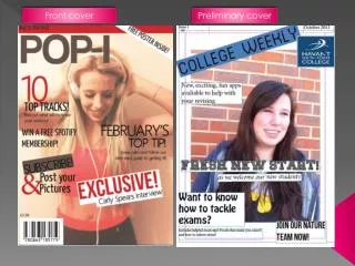
Draft 1 This is my first front cover draft. I have used the colour scheme of her blouse with the "Beats" and coverlines and other various parts to make it more attractive and organised, and i have used white because it stands out and attracts your eyes. I got my model to pose in a way that was plain and looking forward so it is as though she is addressing the reader directly. Areas of improvement - I could get my model to look more like she is directly addressing the reader - Maybe use more than two colours so that certain bits of the page jump out -Make a better barcode and place it in a better place
Draft 2 This is my second draft and I used a green banner to standout on the page so that the reader can see its limited edition which I have incorporated as “Print” which ties in with the magazine name “PritnedBeats” I have also used the same idea with the coverlines which states there are other “Prints” in the magazine, I have used big names in the music industry. For my main image I had cropped my models image so that only half her body was showing and changed the colour of her blouse to purple instead of blue because it stands out more and catches the readers eye. I have used a white masthead with the words “ the music magazine “ going through it to make it look more offical and I really liked this idea Improvement -Make the font smaller -Place barcode somewhere else - Add more pictures
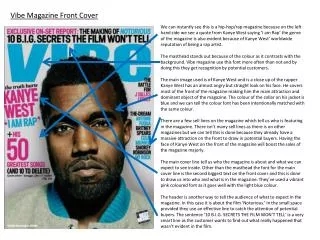
Draft 3 This is my final draft and I have done something completely different with this cover. I have used the idea of colour splash to make the models clothes stand out which game me the opportunity to used their clothes as a good guide to the colour scheme which we can see in the skyline. I have also used the same idea of putting “ the music magazine” through my masthead which I have seen is common in some official magazines. In this front cover it is very plain and only displaying one article which suggests to the reader that it’s a major story and worth the read which is what I was aiming for. I did a survey and found out that 60% of people thought this too.; IMPROVEMENT -add more text/better font -add more pictures -add a coverline