The Front Cover
In what ways does your media product use, develop or challenge forms and conventions of real media products?. The Front Cover .

The Front Cover
E N D
Presentation Transcript
In what ways does your media product use, develop or challenge forms and conventions of real media products?
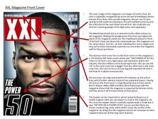
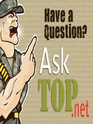
The Front Cover The name of my magazine is Crash, I chose the name of Crash for my magazine as it is onomatopoeia of a cymbal and is also a very common sound in this genre of music this follows forms and conventions as some magazines follow this way of creating their magazine name e.g. Kerrang. Also the word crash is associated with relaxing so then this is implying that the readers can sit and relax whilst they read the magazine. I also chose a short word because it would fit fairly big across the top of the magazine. The title ‘Crash’ has been done in black in order to stand out n the magazine against the light background. The font that Crash is written in is Franklin Gothic Demi and I have then used the liquify tool in order to give it the sharp points; I did this as it gave a more rock and metal theme to the magazine cover. On my magazine front cover, and throughout the whole magazine, I have followed a colour scheme of red, black, white and grey. I chose these colours as they fit in well with the rock theme. I used images to help brighten up the magazine against these quite dark colours. I have only used one image on my front cover. On the cover I have taken a long shot of an ‘up-and-coming artist’ as this is what the issue is going to be primarily about. On the picture I have taken, I have got the models against a dirty brick wall to show that the music is still quite dark even though in the picture they are both smiling, this gives the picture a more friendly touch. The picture on my double page spread is of the band members with their instruments. In this image the band members are depicted with a sense of attitude which shows the roughness that this genre persuades. With this I have gone against the forms and conventions of most rock magazines as I only have one image instead of several. Franklin Gothic Demi has been used as the only font used on my front cover. With my cell lines I have used varying sizes to get different pieces of information across better than others.
Contents Page I have followed forms and conventions in many places on my contents page. When writing the articles and the page numbers I followed the forms and conventions of other magazines, I looked at how they present this information and replicated it. I wrote out the main article in capitals with a snippet of information in lower case underneath, I also made the page number big and noticeable in comparison to the article information. The headings on my page of the article sections are in black boxes to help slit up the page a bit and set different sections of the page and of the magazine. All my font sizes on the page are relevant to how important each piece of information is and the titles attract the reader to a certain are of the page so they can find the information they are mainly interested in easily. On this page the colour scheme of the magazine is obviously continued through showing brand image.
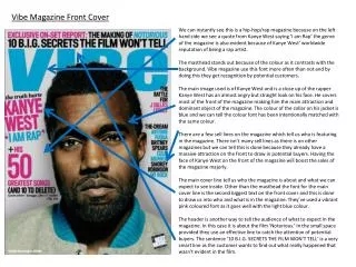
Double Page Spread The Love Divide title is written in Franklin Gothic Demi and I have then used the liquify tool in order to give it the sharp points, the same as the title of the magazine, continuing the brand image. Franklin Gothic Demi is the main font that features throughout the entire magazine with an appearance of Courier New on the double page spread to create a bit more diversity. I have followed the forms and conventions of real media products in the way my page is laid out. I have separated my page and have the main picture of my page on one side and have the information on the other side. The main image on my page follows similar forms to that of other rock magazines such as Kerrang as it shows the band members clearly and the way they are stood is very similar to that of other magazines. The background of the page has a gradient from black to white to create a sense of the pages flowing in to each other and also to make the pages more interesting. The article is an interview which follows the forms and conventions as most articles about bands tend to be an interview with them and this is what I have done.