Exploring Character Conventions in Romantic Drama: Conformity and Challenge in Media Misrepresentation
This media project examines how our film both adheres to and subverts typical conventions seen in romantic dramas. The lead character embodies the emotional and irrational traits often associated with mentally ill individuals, highlighting existing stereotypes. In contrast, our psychiatrist character challenges norms by being young and unprofessional. Through poignant music, emotional imagery, and familiar settings, we blend romantic and dramatic elements while also critiquing typical portrayals in films. Our project strives to navigate the fine line between exploration and reinforcement of these media conventions.

Exploring Character Conventions in Romantic Drama: Conformity and Challenge in Media Misrepresentation
E N D
Presentation Transcript
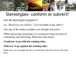
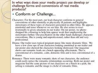
In what ways does your media project use develop or challenge forms and conventions of real media products? • Conform or Challenge... Characters: For the most part, our lead character conforms to general conventions of other mentally or physically ill patients and highlights stereotypes of these types of characters presented in other films. He appears emotional and tense whenever we see him. He also seems to react irrationally to given situations in our trailer. On our poster, we photo-shopped his colouring to help him appear weak thus emphasising the stereotypes further. Our psychiatrist on the other hand challenges character conventions. She is young and unprofessional, rather than old and very professional. Drama: Our trailer uses typical poignant music like many dramatic films. We have a few close ups of our characters looking emotional in our trailer and our poster also showed the characters looking distressed. Our magazine shows our romantic leads on a bench appearing affectionate. This is conventional of a romantic, calm, domestic film and is less conventional of a drama. Romance: There were many romantic shots of our characters, the audience could easily notice the romantic relationships occurring. Both our poster and magazine had the same picture of our characters on a bench in a park, the setting is romantic and the image is cliché of romantic films.
Poster Finding Neverland: The title is more stylistic than ours. The picture is surrounded by autumn trees in a natural setting like ours however the colours have been photo-shopped to look more romantic and camp with a more abstract style. The two lead characters take up most of the space on the poster, which is very typical of a romantic drama and is a technique our group chose to exploit. Good Will Hunting: The two lead characters are sat on a bench; this is similar to some of the photos we took and ended up using on our magazine front cover. The poster is themed with neutral colours as ours is to create a natural realistic feel. The style and font of the title is simple and only white, this is fairly similar to our title and is often done only with realistic types of films like ours. The Help: Again the photo shows the characters sitting on a public bench, however in this film it is to present the status of the characters represented. The bright colours, for me, detracts from the dramatic tone and presents the film as more abstract and thus our group decided on weaker colours.
When advertising on magazines, dramatic films tend to use a photo of only one protagonist, usually a male, in a dramatic scene, where as we decided to use a photograph of two of our romantic leads in a calm moment. Like other film magazines, we chose a shot that would be used in the film and the trailer to create a theme throughout. Empire tends to use close ups of the actors while Film magazine for example uses long shots perhaps Empire focuses on the actors more than the films. Although we created a cover for Empire, we decided to use a long shot showing the scenery as well. Our film is also more feminine, with lighter colours rather than blue and a more stylistic font of our title. • Magazine However, when romantic films are on magazines, they use both romantic leads as we have. Both characters appear intimate and it is obvious of a romantic relationship. In this way our magazine front cover challenges the conventions of other drama films on magazines, but conforms to romantic films. Although our theme is more feminine that Empire’s usual theme
Trailer Revolutionary Road: The opening shot shown the scene of New York city at night. This creates a romantic dramatic atmosphere and is regrettably a shot our group could not use. The trailer used many cross cutting scenes so the audience can return to a scene that had been built up since the beginning of the trailer. Likewise our group decided to use cross cutting between the two relationships the psychiatrist has. Most of the trailer is shot using high key or natural lighting similar to ours, to create a calm domestic environment. The characters also appear distressed telling exaggerating the intensity of the film. Our group portrayed our lead character as emotional and distressed, therefore emphasising the stereotype of terminally ill patients.