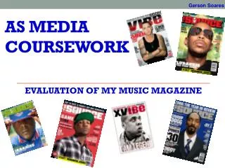
COURSEWORK PLANNING- MUNIRAH ISLAM MEDIA
170 likes | 287 Vues
This proposal outlines my vision for a unique pop magazine aimed at teenagers, ages 13-18. Unlike existing pop genres, my publication will feature a natural and relatable aesthetic rather than overly polished images. The content will entertain and resonate, incorporating current trends, popular artists, and fresh faces while maintaining an edgy and daring approach. With a focus on raw imagery and striking typography, this magazine aims to reflect the real-world experiences of today's youth while avoiding clichés commonly found in teen magazines.

COURSEWORK PLANNING- MUNIRAH ISLAM MEDIA
E N D
Presentation Transcript
PROPOSAL My magazine will be a ‘pop’ genre aimed towards a target audience of 13-18 year olds. In other words, teenagers consisting of both boys and girls. However, i aim to make my magazine distinct from other pop genres currently on market. Rather then creating a polished, over-photo shopped style, i aim to make mine more natural and realistic. I believe in order for the target audience to relate to the magazine, the approach needs to be somewhat reflective of teenagers in the real world, so it would have a more ‘personal’ feel. However, i will take into consideration that a pop magazine aimed towards teenagers will need to include content which would entertain and appeal, including the current trends, popular artists and upcoming fresh faces. I do however want to get away from making my magazine cheesy and a replicate of what is already on offer to teens. My magazine will not purely be ‘pop’ but ‘pop with a edge’, i will aim to achieve this by being slightly more daring on what i include. For example, i would like my front image to be unique, even controversial as opposed to the typical and common pose which we are so used to seeing glamorized in shop shelves. EXAMPLE- EDGY POP MAGAZINES
DRAFT LAYOUT- FRONT PAGE This is how I intend the general layout of my front cover to be. I aim to create a edgy style, hence why I have used the colour range of red, black and white, it is also not gender biased. In addition, I believe that the direct glare of Lady Gaga immediately makes her the focus on the front cover, this is pivotal in order to attract the audience to the magazine. In my own front image, one of my main focuses will be to create a direct, intense eye contact. Front images are also generally face shots or close up- another factor which I hope I can adapt on my final cover. I hope to give a ‘raw’ feeling to my magazine, hence why the fonts such as the title looks eroded , almost like it is disintegrating away. For e.g.- the magazine ‘kerrang’ is named by the sound of a guitar cord. Moreover, I will include all the basic features which is essential to all magazines- tag line, articles, logo, price etc. A example of my logo can be seen- ‘approved’- once again trying to reflect a edgy style, this makes it look almost ‘military/army’ style.
DRAFT LAYOUT- CONTENTS PAGE I think it is important to maintain the same font, colour codes and general layout to each aspect of the magazine as it re-enforces the idea of consistency, hence why I have repeated the fonts. In general, i aim for my contents page to be a taster of the main bulk of my magazine, giving a preview of what the main context is. The contents page will have a combination of images and text- a title heading for each page, then a small sentence (a line or two) to elaborate. However, iwill change the images as some of them such as the piano does not reflect my genre of music. The images which i intend to include will be mainly close ups of of face shots, each with a different expression. I may edit them in a certain way, such as a ‘pop art’ effect. In addition, the layout of my writing may be slightly more organised, to make it more clear and readable to my readers. Overall, i don’t intend to make my contents page complex, but rather sweet and simple, yet effective.
DRAFT LAYOUT- DOUBLE PAGE SPREAD This is how i imagined my general layout to look like, once again iam re-enforcing the colour code of red, black and white. In addition, the master head also has a red background. As mentioned previously, i wanted the title to look as if it is disintegrating away, moreover it relates to the slightly rebellious context. My article consists of a two page spread, which i hope to fill with columns, images and quotes relating back to the context. The quotes which i will be using will reflect a small part of the article, perhaps a line which would catch the interest of the reader. Although the main body is the article, there will be a small section towards the side consisting of musical reviews, reviewing the latest releases and hits of the week. The idea of columns makes it clear to the readers and distict.
FONTS- TITLE I like this style as it looks like calligraphy, however this does not necessarily reflect ‘edgy’ pop as it looks too sophisticated This font is very clear and distinct, and eye catching, and almost looks ‘showbiz’ with the stars. However, once again I want a hint of rebelliousness, and a slightly more ‘raw’ font This is the kind of style which i am aiming for, the imperfections make it edgy, almost a eroding away look. It’s the flaws that make it intriguing and reflect my genre of music. I particularly like this font out of the previous one, as it is a enhanced version. It is also more clear, yet still maintaining the disintegrating look. It is also a good choice to reflect edgy pop, and the word ‘rhythm’. This is the font which i will use.
Photo manipulation This is the image which i will use for my front page. I like the direct eye-contact and the pose. However, i would like my image to be smaller, and brighter. I was able to do this in paint shop pro where i cropped the image, and enhanced the brightness, and increased the contrast. By making the face brighter, it eliminates flaws and also gives a spotlight effect. In addition, i selected the suit and increased the saturation resulting in a darker shade of black.
Photo manipulation These are the images which I intend to use in my contents page, by using a tripod, I was able to capture a constant position for all the shots. I then used a range of facial expressions, and then edited them by making it look like a portrait with a photo frame on the edges. In addition, i increased the brightness, making the face look brighter. Moreover, as the facial shot was the main focus, i cropped the images so they where all the same size and re-positioned them.
Photo manipulation I quite like this image as it gives the ‘air guitar’ pose, i edited this by cropping out the windows, enlarging the picture, increasing the saturation and softening it. It now has more focus on the entire figure, as opposed to the backgreound.
Research on similar artists- Lady Gaga ‘With the record industry suffering from the combined effects of an internet revolution and global recession, there's a sense that Gaga is the goose that laid the golden egg. Apparently it's not enough that she has reached number one in 20 countries with her single "Poker Face", or been nominated for a Grammy for the song "Just Dance", or sold 1.9 million copies of her debut album, The Fame. The more impressive the statistics, it seems, the more intense the schedule. But if it's hard work being an über-cool, multi-million-selling post-modern pop icon, Gaga isn't going to be caught grumbling. I spend a good 10 minutes trying to get her to admit that the interviews, the television appearances, the costume changes, the rictus smiles, are beginning to wear her down. After all, nobody spends years trying to make it as an artist in order to be quizzed about a teacup on breakfast telly, do they? "You know, I have such an appreciation for where I am in my life because I've struggled and because I couldn't get signed, and because I couldn't get played on the radio," she says serenely. "There are times when it can be a lot to deal with but always when I get up in the morning I try to find that very joyful place that reminds me that I would die if someone took it all away. If someone did that I wouldn't be a person anymore." Gaga is 23, though with her white hair, radioactive tan and pale-pink frosted lipstick, she appears oddly ageless, as if she's been cryogenically frozen and is still in the process of defrosting. Today she is wearing a white shoulder-padded jacket, black leggings, vertiginous platform sandals and a huge harlequin-style hat. And let's not forget her trademark: the false eyelashes, so heavy-duty that her eyes don't seem to open properly.’ I find this intriguing, as Lady GaGa is clearly one of the most influential and successful women of the decade. Perhaps what was needed to save the pop industry was a new approach, an attempt to break conventional styles and she has almost introduced a whole new genre into music. She is distinct in her style, reflecting a certain edginess, and provoking controversy. Her eccentric and bizarre attitude to both her style of music and fashion sense has opened eyes, and brought about a new interest to people. It proves that attempting to be different and daring can have a turn for the best.
Research on similar artists- Paramore "Decode" is a song by Paramore released as a single from the soundtrack to the film Twilight.[4] It is also included as a bonus track on the international version of Paramore's third studio album, Brand New Eyes.[5] An acoustic version of this song was released as a part of the special CD/DVD of the Twilight soundtrack. The song was certified Platinum in the U.S on February 16, 2010, selling over 1,000,000 copies.[6] It is also nominated for a Grammy Award in 2010 for Best Song Written for a Movie What intrigues me about this extract is that it clearly shows how the success of a single can be heightened by relating it to other areas of the media industry. Paramore is a renowned band, so whilst it still would’ve been successful without the need of a movie, inputting it into one of the most popular films in modern day has obviously done the sales a advantage. By doing this, it can bring about new interest to a more diverse audience, and also provide a platform to a variety of audiences. This would not only promote interest in them, but also encourage new audiences to buy the single. The success is evident by the number of sales and the Grammy awards it has won.
Research on similar artists- ‘coldplay’ Shares in music giant EMI closed more than 16% lower after the firm issued a profit warning following disappointing sales and delays to two album releases. EMI said music sales for the year to March will fall 8-9% from the year before, with profits set to be 18% lower than analysts had expected. It blamed poor sales since Christmas and delays to the releases of new albums by Coldplay and Gorillaz. Shares in EMI ended the day down 46.25p at 235 pence. 'Disappointing' performance EMI said two major albums scheduled for release before the end of the financial year in March - one by Coldplay and one by Gorillaz - have now had their release dates put back.