Shuffler Magazine: Challenging Conventional Dance Music Media
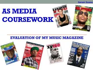
In my magazine, Shuffler, I employ traditional conventions seen in professional music magazines while also introducing unique elements that challenge norms in dance music media. The bold masthead, logo, and engaging slogan attract the target audience. The mysterious imagery of the featured artist piques curiosity. I’ve added a personal touch with an editor's message and structured the contents for easy navigation. By focusing on vibrant colors, modern fonts, and strategic layout, I've crafted a professional yet welcoming magazine that resonates with dance music enthusiasts.

Shuffler Magazine: Challenging Conventional Dance Music Media
E N D
Presentation Transcript
QUESTION 1 - In what ways does your media product use, develop or challenge forms and conventions of real media products? In my magazine I have used a number of conventions from professional magazines particularly in the music category. Firstly, for my magazine front cover I have the mast head. This is the magazine name and its identity. The name, Shuffler is using a unique, bold font to make it appeal to its target audience with the dancing man logo beside it. The logo is my brand identity and it is featured in other pages of the magazine including the content page. This is something that the audience can use to identity Shuffler. Below my mast head I have used a slogan which is “The World’s Biggest Dance Music and Clubbing Magazine” This is used because it appeals to its target audience; it is also the selling line of the magazine which adds to the magazine’s purpose and content.
For my main image I have my featured artist with his back facing the reader. This creates a mysterious side to my artist and the text anchoring the main image fits well since the main cover line is “Who is J-Beatz” Which asks the reader a question that they might want the answer to. I have added a very popular artist to the front cover because this is a popular tactic used by rivalling magazine companies. They add a popular music artist to attract their fans to buy the magazine. This is a key convention used in all the music magazines I have seen and it is very successful. Also, price, issue number, promos, and use of secondary images are visible on my magazine as this is nothing out of the ordinary, these are just key conventions and that is why I included them!
One feature that stands out from other dance music magazines and previous issues of Shuffler is the background. The background choice for this issue is mysterious. This was done purposely to create an unusual approach to dance music which I believe fits perfectly with the main subject of this issue. When editing the images for the magazine this was a challenge for my since I have taken an image, removed the background, changed the brightness, the saturation to make it fit with the background. This was completed with a number of applications in the Microsoft suite. What the Microsoft suite didn’t have though was a huge variety of professional looking fonts. So for this I had to look around on the web for some interesting dance themed fonts. For the front cover, the font used for my mast head was found online. I think by challenging myself and doing this I have improved the overall quality of the front cover, making it look more like a professional music magazine.
When creating the contents page for this issue I took into mind how, again, my brand identity is important and that is why, besides “contents” – which is actually written in the Shuffler font, you will see the dancing man logo. Besides this reappearing feature I have copied a few other things that I have seen when researching other magazines in the same genre. The layout of my images is positioned to the right side of the page. This is done simply because when looking at other magazines, I have found that this gives them structure and it gives the page very high quality feel overall. Also, it allows me to have the contents in an easy to follow column so users can find the page they want to go to.
The images all have page numbers on them too and captions anchoring them giving the images meaning. The background I chose for this issues content page has very vibrant shades of orange; this has been done specifically to connote dance music. Dance music is very colourful, especially when at a live gig you will see bright, vibrant lights flashing and I have tried to give the content page that feel to it. Something which I haven’t seen many other magazines do is have a message from the editor, well for Shuffler and wanted to include this because it personalises the magazine and makes it less formal. I want it to come across as a professional magazine but I wanted to make it seem friendly and welcoming to new viewers.
For my DPS, one noticeable media conventions is the headline, “THE DJ IS NOT FOR TURNING!” this is actually a famous quote but changed slightly (adding DJ instead of lady) it means not to do a U-turn and I wanted to have this because the questions asked in the DPS interview were “Would you ever reveal your secret identity” and the artist is not planning on doing this anytime soon, he is happy with keeping it how it is, for now anyway. I have also added some key conventions often used in other magazines such as page number, stand first, page number etc because these are typical in the average music magazine DPS.
Question 2 - How does your media product represent particular social groups? Being of a dance genre, my magazine must appeal to fans of dance music. The social group typically known to read dance magazines are people who regularly go to clubs and nights out. To represent this in my magazine I have added appealing headings such as ‘Britain's best dance clubs’ which will attract social groups looking for good clubs to go to for a night out. The logo beside my masthead is someone shuffling. This is a dance move which is commonly seen in clubs. The name of my magazine is also based off the dance seen in clubs
Question 2 - How does your media product represent particular social groups? For my artist, J-Beatz appears with his back to the camera in all of his shots. This appears as if the DJ is unfriendly and it might seem to represent fans of dance music to be unfriendly or antisocial. This isn’t actually the case and wasn’t the effect I wanted to give off with the photos. I made J-Beatz secretive because with dance music, is more focused on the music itself, rather than the looks of the artists. That’s why some of them rarely appear in photos. Instead, we see there logo for mask etc. My interview explains this where J-Beats believes that your appearance shouldn't matter. I believe this is typical of dance music although there are lots of shots of DJ’s doing live performances. In my contents page and double page spread I showed a picture of J-Beatz preforming live at a concert. The hoodie remains the same on all three pictures but there isn’t meant to be any thought about that. Dance music fans don’t have a specific clothing taste. The hoodie could represent the younger audience – teenagers because this is a typical clothing linked with teenagers.
Question 2 - How does your media product represent particular social groups? I suppose my pictures would be unconventional to other magazines in the same genre but the reason I did this was to break out from the typical rules of my genre which would at the same time separate my magazine from others that are of the same genre. This is always a risky tactic but I needed to make my magazine a slightly different style from it’s competition because otherwise there wouldn’t be any point in buying my magazine from others. Comparing my magazine we can see the obvious differences of representation. Even the background adds to the mysteriousness of my DJ and looking away from the camera gives off a different effect to David Guetta instead being closed off in the corner of the page. This is an issue from mixmag. The DJ has is hands open inviting the audience in. Representing fans of dance music to be open and outgoing. His top also is referencing dance / electric music
Question 3 - What kind of media institution might distribute your media product and why? I think that Development Hell Limited would be interested in publishing Shuffler. My reason being that Shuffler is a dance magazine and Development Hell publish the markets leading international music mag, Mixmag which is a similar style to Shuffler. Development Hell Limited know from Mixmag that good money can be made with dance magazines – so it isn't too risky for them to release another onto the market. Development Hell Limited might also feel that if Shuffler was to get published by another company, Mixmag might lose sales and money. My magazine will be sold at all the leading super markets that sell all other music magazines. The idea is to sell it at as many as possible to increase the possible sales. Development Hell Limited also own Don’t Stay In who organise and promote club nights. Since Development Hell Limited are already experienced with other companies in the same genre it would be a perfect media institution to distribute Shuffler.
Question 4 -Who would be the audience for your media product? I can narrow down the audience for Shuffler from researching and looking at the audience for other dance mags. Research suggests my magazine would appeal to those in their 20s (mostly male). Obviously not every young male adult though, fans of the music and the artist featured in my magazine would want to buy a magazine to keep up to date in then latest news for their artists they enjoy listening to. Research shows that readers of another common music magazine ‘mixmag’ enjoy socialising and clubbing with their friends. They are known to be trend setters. My target audience are people who are looking for the next big gig or club, people looking for a night out, people looking to share great clubs with others. Easy-going, social groups. The sort of music featured though appeals to a younger audience as they are the ones known to regularly go on nights out. The language used by my viewers is generally informal and consists of a lot of slang and taboo. Audience for Shuffler would need the latest news on live tours, latest tracks, coolest clubs. The group I’m aiming for tend to be the trend setters so they need all the latest news on dance music fast. That’s why I also feature articles showcasing the top clubs picked by readers of the magazine. Audience for my magazine, looking for good nights out, love partying and dancing.
Question 5 - How did you attract/address your audience? With Shuffler, my front cover contained a very popular artist which draws in the fans. By using big name artist for the front cover automatically draws in fans because they will want to know the latest information about them. For the writing I used informal language to address my audience as this is the best way to grab their attention. The writing imitates talking so audience can understand it better and it feels more like a conversation, getting them more involved with the magazine.
Question 5 - How did you attract/address your audience? My mast head is unique which is important when trying to attract an audience because it gives your magazine an identity that they can remember. For my logo there is a dancing man, this logo is of a man doing the shuffle dance which is a popular dance move used in clubs. Also, the text below my masthead is giving away a fact ‘The Worlds biggest dance and clubbing magazine!’ Which draws in the audience. The contents page features information which attracts the audience. I discovered what the audience wanted when doing my research. I have chosen to give away a free mix CD with lots of fantastic well known tracks played at Ibiza. People reading magazines are always going to be interested in free giveaways so giving a CD full of songs known in clubs is perfect and is relevant to the CD and the audience
Question 6 - What have you learnt about technologies from the process of constructing this product? Throughout the research and production of my coursework, I have used a variety of different applications and technology. Some of which I hadn’t used before. When collecting information, I found a new way to get people to give me the information that I needed. I created an online survey using survey monkey, an online website which allows you to create free surveys and email it to others to complete. I could also post the link to social media sites for my friends to complete. The results are automatically calculated on the site and I was abled to quickly collect the data I needed to make my magazine.
Question 6 - What have you learnt about technologies from the process of constructing this product? Using the DSLR cameras to take professional looking pictures for my magazine was something I learnt in the process of constructing my magazine. I found though that taking pictures with the DSLR cameras improved the overall quality of my magazine because it looked a lot clearer than HD pictures from other cameras I used. To improve the quality of my pictures and to remove the background. I found out that PowerPoint has some fantastic hidden features that I had not noticed until I started constructing my product. The picture of the Nikon DSLR camera has had the colours enhanced to make it look less blurry. The background for this image has also been removed. Removing the background is essential for images in a music magazine so I needed to learn how to do it. The cropped image below shows all the tools you can use on PowerPoint many of them I used before copying my picture back over to Publisher.
Question 6 - What have you learnt about technologies from the process of constructing this product? Another process of making my magazine which I have learnt was using the green screens. The were many things need to create my final pictures. I had to stand facing a green screen then using the windows suite I removed the background and added in other pictures to make up the background. Also with some of my images I decided it was best to add a filter to improve the look of the picture. I did this by using picture tools in publisher. There were many different ways in which I could change my picture.
Question 6 - What have you learnt about technologies from the process of constructing this product? Also with some of my images I decided it was best to add a filter to improve the look of the picture. I did this by using picture tools in publisher. There were many different ways in which I could change my picture.
Question 7 - Looking back at your preliminary task, what do you feel you have learnt in the progression from it to the full product? Looking back, at my preliminary task, which was to create a front cover, contents page and double page spread for a college magazine I definitely believe my skills in media have improved. I think looking at my college magazine design it does look a little bland. When comparing it to my music magazine. The difference in quality is very noticeable. When comparing the two side by side, there are a few similarities such as the selling line / slogan. The date and time are also kept at the top because after researching other music magazines and other magazines in general I have noticed that the issue number and date are almost always at the top of the magazine. My college magazine has a lot of empty space on the front cover which I found, gives off an impression that the magazine doesn't have a lot of content inside. So I kept that in mind when creating the front cover to my music mag
Question 7 - Looking back at your preliminary task, what do you feel you have learnt in the progression from it to the full product? Another thing I looked at when making the front cover to Shuffler magazine is the fonts. Looking back at my preliminary task I can see that the fonts look very boring. When making a magazine you need a font that people actually want to look at, and by using a standard font type, fonts which people see all the time, it makes them not want to look at it and therefore not want to read it. BORING!!
Question 7 - Looking back at your preliminary task, what do you feel you have learnt in the progression from it to the full product? The contents page I think on both of my magazines I created looks very similar. Clearly there are some differences such as the improved font on Shufflers contents page and also the editors notes. I kept them similar because I found that this works well and readers can easily navigate. One thing that I needed to add in my music magazine was the page numbers and anchorage to the images in the contents page because without this the pictures don’t have meaning. Also, after searching through other music magazines in my genre I found that most of them used vibrant colours for the contents page. My background is meant to imitate the lights at a concert or a club.
Question 7 - Looking back at your preliminary task, what do you feel you have learnt in the progression from it to the full product? Overall, looking back I can see things that I have learnt throughout completing the coursework. The key difference with my music magazine is that I have copied features and layouts from other dance and clubbing mags. Even the pictures in the magazine are of a similar style to ones I have seen already.

