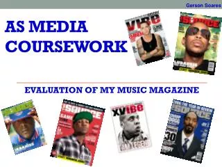
Media Coursework Evaluation
Contains my evaluation of my music magazine project.


Media Coursework Evaluation
E N D
Presentation Transcript
Who would be the audience for your media product? As said in my treatment sheet, the audience of Undisclosed would be young people, around the age of 18-21, of no specific gender, that enjoy ‘alternative’ music, and want to hear about new bands in that genre. They could get involved with what features in the magazines, so they could specialise it to their own tastes. Music magazines are common now, so I had to make my magazine stand out from the shelf, and I had to completely specialise it to this type of person.
How does your media product represent particular social groups? I think that by using a simple colour and font scheme, the magazine is clean and adult, but still having an element of fun, which is key to draw in readers. It is written in quite an informal style, so that it doesn’t seem too adult, but there is quite a bit of text, meaning that there is more content for your money. I have used pictures of young people in normal settings, or in band sort of settings, so that people can relate to them, and the magazines seem more relevant to that age group. Blocks of colour are used to highlight parts of the page which are important, and stops the magazine getting boring. In the audience feedback, the front cover was referred to as being ‘cool’, and the colour scheme was ‘suitable’ for my target audience.
How did you attract/address your audience? • My magazines content is specifically designed to meet the needs of my audience. It contains advice for new bands, gig reviews, and new albums, all of which should be things that my audience look for in a music magazine. • I made my front cover stand out by using the teal in conjunction with black and white. The cover lines and strap lines should stand out to my target audience as things that would interest them. Also, if they were interested in any of the bands at the bottom, then that would catch their eye and see what was featured about them. • My magazine uses quite informal language, of the kind that young people would actually use, particularly in the editors section to make it seem more accessible for young people. In the audience feedback, people referred to the magazine as ‘cool’, meaning that it must be attractive to the audience.
In what ways does your media product use, develop or challenge forms and conventions of real media products? • The key ingredients of music magazines are cover stories (as with many magazines), reviews, gigs, and new releases. I tried to incorporate this elements into my magazine, and still give it a sense of being different as it focuses on new bands. • The front cover is possibly the most important part of a magazine, because it has to grab the attention of the buyer, and must include things such as cover lines, strap lines and exclusives to make the magazine more attractive than others. I feel that I have included these things, and they stand out from the page, making it an aesthetically pleasing front cover.
My contents page is separated into sections, like magazines often are, and contain pictures relating to the stories. It also has a section from the editor, another common element of music magazines. • My double page spread is conventional in the sense that it has about 50:50 ratio of image to text, and the text is made up of an interview. It has a typically informal introduction, making it more accessible. • I think that including these commonly found features help it to seem more like a music magazine, as well as appealing to the audience (see audience feedback video 2), whilst having a different focus than most others.
What kind of media institution might distribute your media product and why? There are many publishers of music magazines, such as Bauer Media Group, IPC Media and Future Publishing. Bauer publish quite a few music magazines, and so they may be interested in this one. It is the only magazine which is completely focused on new bands, and has a different feel to the other ones that they produce. I think that it would be a good marketing opportunity for the company, as I think that Undisclosed has the potential to be a big magazine. The audience feedback is positive overall, meaning that it would probably sell quite well.
What have you learnt about technologies from the process of constructing this product? • For this project I have used: - Photoshop Elements - Publisher - MS Paint - Digital Camera - Blogger (to record my progress) - Dafont.com (for my masthead and contents heading) - Polls • I have learnt more techniques on Photoshop, as it took a long time to get my front cover picture suitable for use. I used the video function for the first time on my camera, meaning that I also learnt about that. Apart from that, I knew of all the other things, so it was mostly about using techniques that I used from the preliminary task.
Looking back at your preliminary task, what do you feel you have learnt in the progression from it to the full product? • In the preliminary task, I don’t think that my student magazine looked professional enough. I tried to improve this in my music magazine by using simpler font and colour scheme, and listening to what people want, making it suited to their needs. • I also tried to produce photographs that are more suited to their purpose, and that had a more professional and grown up feel. I used a better camera this time, which created clearer and better images, again adding to the professional feel of the magazine.
I also used other technologies that I didn’t use in the preliminary task. For example, I have used videos to record the opinions of my audience in the audience feedback, and I used Photo Shop to tweak photographs to perfection. • However, this of course was not easy, and I think that I have learnt a lot about the magazine industry, and how difficult it is to produce an appealing magazine, with all the components it needs.