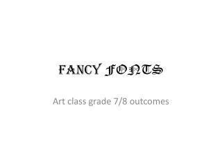
A few good fonts
A few good fonts. COM 365 Newspaper Layout & Design.

A few good fonts
E N D
Presentation Transcript
A few good fonts COM 365 Newspaper Layout & Design
Baskerville is a transitional serif typeface designed by the English gentleman printer John Baskerville in 1757. Baskerville had also mastered the craft of engraving headstones, a knowledge that influenced his design process. His letters are sharply detailed with a vivid contrast between thick and thin elements. During his lifetime, Baskerville's letters were denounced as extremist, but today we think of Baskerville as a classic, elegant, and easy to read font. Baskerville's lifestyle was also regarded with suspicion: he was a professed agnostic living out of wedlock (see Mrs Eaves). Bodoni , created by Giambattista Bodoni in the 1790s, is known as a modern typeface. It has nearly flat, unbracketed serifs, an extreme contrast between thick and thin strokes, and an overall vertical stress. Compared to Garamond, which is based on handwriting, Bodoni is severe, glamorous, and dehumanized. Similar typefaces were also designed in the late eighteenth century by François Ambroise Didot and Justus Erich Walbaum.
Caslon is named for the British typographer William Caslon, whose typefaces were an eighteenth-century staple and a personal favorite of Benjamin Franklin (who also enjoyed the racier innovations of John Baskerville). The U.S. Declaration of Independence and the Constitution were first printed in Caslon's types. Classified as transitional, Caslon has strong vertical elements and crisp serifs. Adobe Caslon, designed by Carol Twombly in 1990, transports Caslon's solid Anglo pedigree into the digital age. Century Expanded was created in 1900 by Morris Fuller Benton, who was trained as a mechanic and engineer and became a leading designer during the early years of the American Type Foundry. The Century family is so called because it was initiated by Morris's father, Linn Boyd Benton, for Century magazine. Classified as Egyptian owing to its slab serifs, Century Expanded maintains its substance and openness at small sizes. It is often used in children's books.
Clarendon, named for The Clarendon Press that commissioned its design in 1845, is classified as an Egyptian typeface. It has heavy, slab serifs and ball terminals on the arms of some letters. This stocky, functional, Victorian face can be seen in early advertisements as well as in dictionary entries. HTF Didot was created by Jonathan Hoefler in 1992, inspired by the late eighteenth-century designs of Francois Ambroise Didot. It has an overall vertical stress, extreme contrast from thick to thin, and unbracketed serifs. Hoefler created different styles for use at different sizes, enabling the typeface to maintain its distinctive character across wildly divergent scales, from enormous letters on the side of a bus to tiny text on the pages of a magazine. Each font is represented by a number that lets the user know the smallest point size at which it should be used.
Franklin Gothic, designed in 1902 by Morris Fuller Benton for the American Type Founders , is one of the most popular sans-serif types ever produced. Named after Benjamin Franklin, it is a weighty sans-serif font often used for headlines. ATF later gave ITC permission to create additional weights for the Franklin Gothic family. Matthew Carter created a refined version of Franklin Gothic for use in the graphic identity of the Museum of Modern Art, New York. Futura was designed by the German typographer Paul Renner in 1927. This geometric sans-serif font embodies Bauhaus ideals in a practical, commercially viable typeface. Futura has round O's and a capital M, N, and W with sharply pointed peaks and valleys. Renner, who viewed Futura as an appropriate typeface for the machine age, streamlined the alphabet by eliminating the tail from lowercase t and j.
Georgia, designed by Matthew Carter in 1996, is the serif companion to his sans serif font Verdana. Commissioned by Microsoft and created specifically for on-screen reading, it maintains clarity at small sizes and at low screen resolutions. It has a more vibrant character and open quality than Times, another common default face for Web designers. Gill Sans was created by the English designer Eric Gill in 1928. Its forms are more humanistic, less geometric, than its German contemporary Futura. Note how the lowercase a relates to the a in Garamond (in contrast to the circular a of Futura). Additionally, Gill Sans is recognized by its flared capital R and the closed descender of the lowercase g. Gills Sans has been called Britain's Helvetica; it remains today an overwhelmingly popular typeface across the United Kingdom.
Garamond is the name for typefaces based on pages printed by Claude Garamond in sixteenth-century France. Many versions of Garamond were created in the twentieth century, including Adobe Garamond, designed by Robert Slimbach in 1989, and ITC Garamond, a distinctly 1970s version with a grossly enlarged x-height. Adobe Garamond honors the proportions of its Renaissance source while translating the face for modern use. Note the elegant, three-dimensional bowl of the lowercase a and the gap in the uppercase P. Helvetica was designed in 1957 by Max Meidinger. This deliberately anonymous typeface is one of the world's most commonly used fonts, with variations created for both Latin and non-Latin characters. Its solid, upright forms are tempered by surprising curves in the lowercase a and the uppercase R. Helvetica has a generous x-height and is available in numerous weights and styles. It was called Neue Haas Grotesk before getting its current name, Helvetica, in the early 60s, which is the Latin word for "Switzerland."
Hoefler Text, designed by Jonathan Hoefler in 1995, is a family of twenty-seven typefaces. This elegant humanistic font with a moderate x-height and lovely decorative elements was commissioned by Apple Computer and is distributed with the Mac OS. According to Hoefler & Frere-Jones, the font is "steeped in the virtues of classical book typography." We think of Hoefler Text as the big brother of Mrs Eaves. Interstate was designed by Tobias Frere-Jones for Font Bureau in 1993. Like Gotham, it is based in the American working-class vernacular. Interstate is loosely based on the font family Highway Gothic, used by the United States Federal Highway Administration for road signs. It is thus rooted in a common American experience of public space. It has a forthright capital R (compare to Helvetica), and its acsenders are clipped at an angle.
Mrs Eaves, designed by Zuzana Licko in 1996, was inspired by the eighteenth-century typefaces of John Baskerville. The tiny x-height of Mrs Eaves rejects the inflationary trend that dominated twentieth-century type design. Mrs Eaves has three sizes of capitals (regular, small, and petite) as well as numerous "fanciful ligatures" (in the words of Zuzana Licko). The font is named after Baskerville's housekeeper, Sarah Eaves, who was also his mistress and artistic collaborator. Trade Gothic was designed by the American designer Jackson Burke between 1948 and 1960 for Linotype. Similar in character to nineteenth-century grotesques and twentieth-century staples like News Gothic, Trade Gothic has a large x-height and excellent condensed variants. Often used for newspaper headlines, Trade Gothic is tough, direct, and generic.