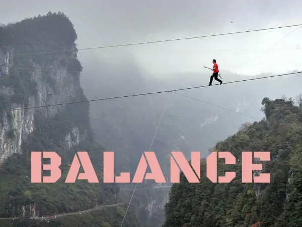
Balance
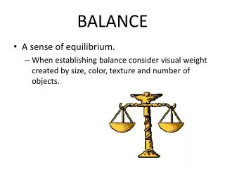
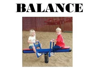
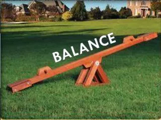
Balance. Distributing visual weight on a page. Balance: formal. Most non-graphic designers play safe with formal, or symmetrical balance. Balance: formal.

Balance
E N D
Presentation Transcript
Balance Distributing visual weight on a page
Balance: formal Most non-graphic designers play safe with formal, or symmetrical balance.
Balance: formal Formal balance is appropriate for formal work, such as diplomas, certificates and wedding invitations. Usually, however, it looks stiff and boring. Asymmetrical or dynamic balance creates dynamic tension, or movement, in a design by grouping elements so that they informally balance. Dynamic balance requires a lot more skill, and so beginners tend to avoid it.
Dynamic balance An element’s size, color, and even white space surrounding play a role in dynamic balance. It’s intuitive rather than mathematical. That makes it more difficult to achieve.
Dynamic balance The redesign below of the party invitation is more interesting than formal symmetry, but also somewhat awkwardly unbalanced.
Balance: dynamic How about this? Better, but now the enormous spider on the right makes the design visually tilt to that side.
Balance: dynamic Choosing a 10 percent screen (tint) lightens the visual weight of the large spider to balance better with other elements of the design.
Balance in photography Nature can provide examples of nearly symmetrical balance.
Balance in photography Most of the time, though, the photographer must try to create balance from the jumble of reality in front of her. The photo below is obviously heavy on the right.
Balance in photography Below the photo is more balanced. The sign’s arrow puts visual weight on the right, but it’s balanced by the boy walking in the opposite direction.
Balance in photography Strong, isolated focal points are visually heavy. In this case, the bus is somewhat balanced by the orange foliage and expanse of orange color on the water at right.
Balance in advertising Symmetry is used in advertising as it is in graphic design: for a formal, elegant look.
Balance in advertising Most ads aim for asymmetric, dynamic balance. The Bacardi ad shows a carefully orchestrated interplay of highlight and shadow.
Balance in advertising This ad cleverly uses the visual weight of the plane’s bulbous flight deck to dynamically balance the offset text.
Balance in advertising Some advertisements are hard to analyze for balance, but then…do we care?
Balance exercise The flyer illustrated on the next slide symmetrically balanced. Suggest a more dynamic balance. How could we add contrast and emphasis? Typeface is times. What might be a more interesting and appropriate typeface?
Alignment Alignment is related to balance; as we change alignment, we also need to consider changes to balance. Like balance, we tend to sense alignment intuitively. Designs displaying poor alignment “just don’t feel right,” although sometimes we can’t say exactly why.
Alignment In this ad, text alignment is close, but not perfect.
Alignment By pulling the headline level with the graphic, removing white space between meeting time, and pulling that text to line with the right of the graphic, we can make the ad feel subtly more organized.
Alignment As you know, grids offer designers a way to organize text and other elements on a page. They are seldom used for flyers and advertisements, but often used for text-based publications.
Alignment Sometimes you’ll want to skip the standard grid structure for, say, a photo layout. Principles for that are similar to general alignment principles: Group related elements: headlines and copy, addresses, web URLs, lists, etc. Group or consolidate white space. Avoid spreading items around a page. It looks chaotic.
Alignment This photo layout needs alignment work. Photos and cutlines are set in no particular alignment, and white space is trapped.
Alignment We’ve aligned photos and cutlines, and grouped white space.
Alignment Exercise: Organize the inconsistent and cluttered alignment in the business card below.